
The Village at Manny Corners
THE GOODS
Brand Strategy
Tone of Voice
Brand Architecture
Visual Identity
Brand Book
Once known as Cappie’s Drive-In, this beloved roadside stop in Amsterdam, NY has been reimagined for a new era. With new ownership came a bold vision: to transform the property into a vibrant destination for food, fun, and community.
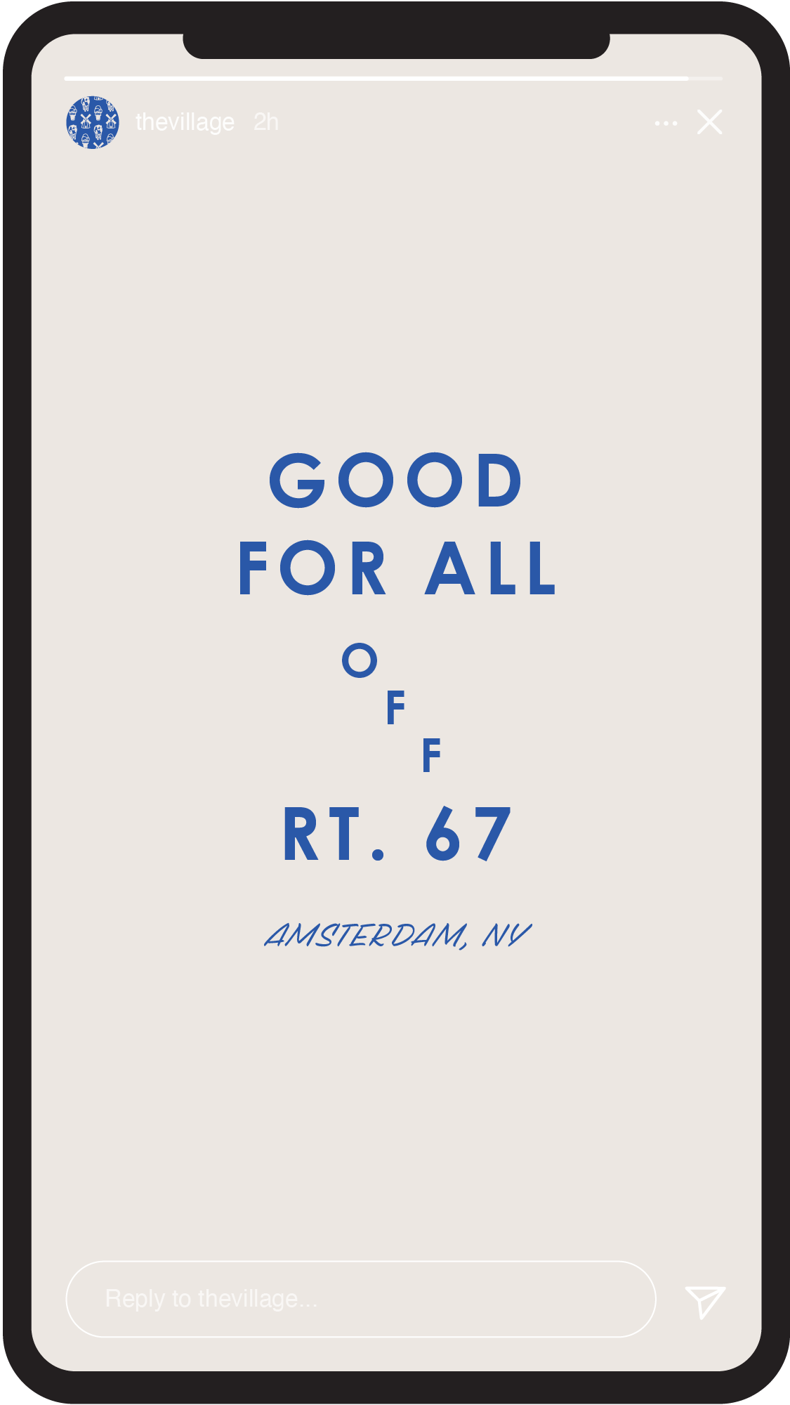
Our challenge was to build a brand from the ground up that could honor the past while energizing what’s next. We began by crafting a brand strategy and tone of voice rooted in one simple, powerful idea: goodness. From this foundation came the tagline “Good for All,” the heartbeat of the brand. The tone of voice is warm, witty, and grounded in local pride. It's genuine with a wink.
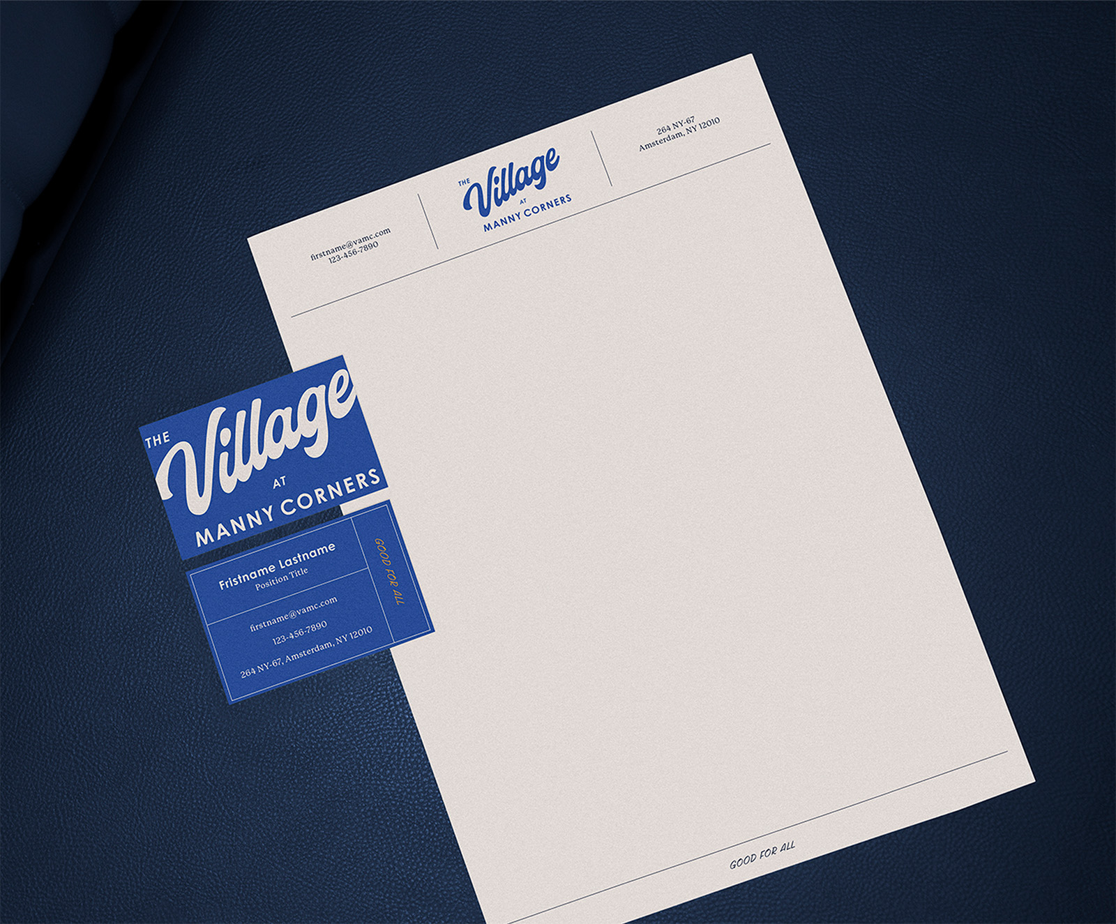
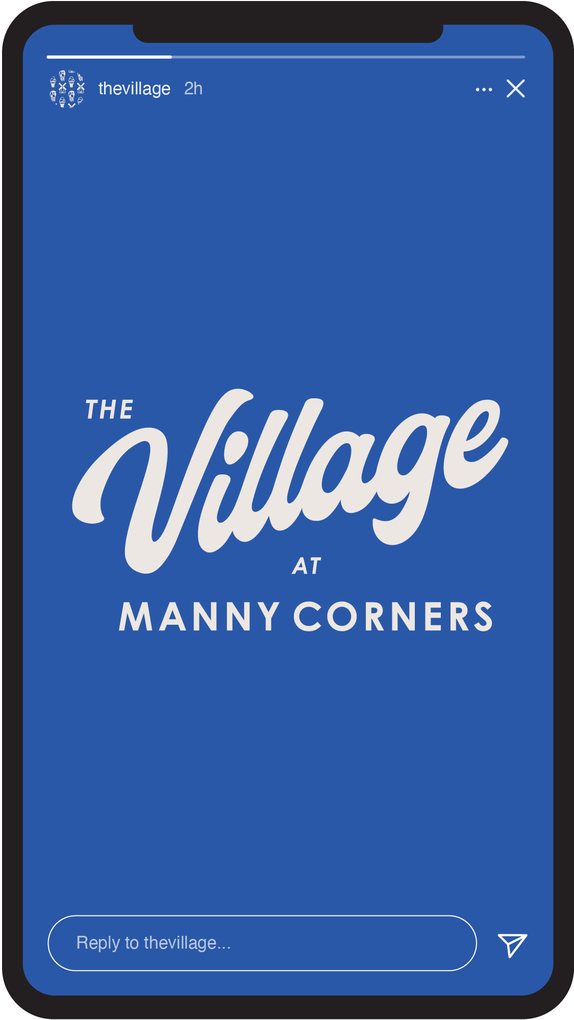
Visually, we brought this strategy to life with an identity system that draws from Amsterdam’s heritage and gives it a contemporary twist. Inspired by our mood board, the design combines vibrant color, vintage-inspired typography, and authentic regional references to create an aesthetic that’s upbeat yet hardworking.


Dreamweaver Blue is our primary color. It's inspired by the city’s legacy of carpet weaving and a nod to the dreams being woven for its future.


To support expansion, we developed a flexible naming system that gives each concept its own spotlight: The Roadhouse, The Creamery, The Fairway. Each entity has its own custom logo lockup, color palette, and playful icon (spot the windmill, ice cream cone, and cow) while remaining visually connected through the parent brand.


Credits
Noble Signs — Wordmark Refinement
Typefaces: Century Gothic Pro, P22 Mackinac Pro, Scribo Pro Caps
Building brands that
defy convention with sophistication.
Stay in touch.
© 2026 MA'AM Creative, LLC | MA'AM is a registered trademark of MA'AM Creative, LLC.
