
Amber Waves Labels
THE GOODS
Label Design
Copywriting
Art Direction
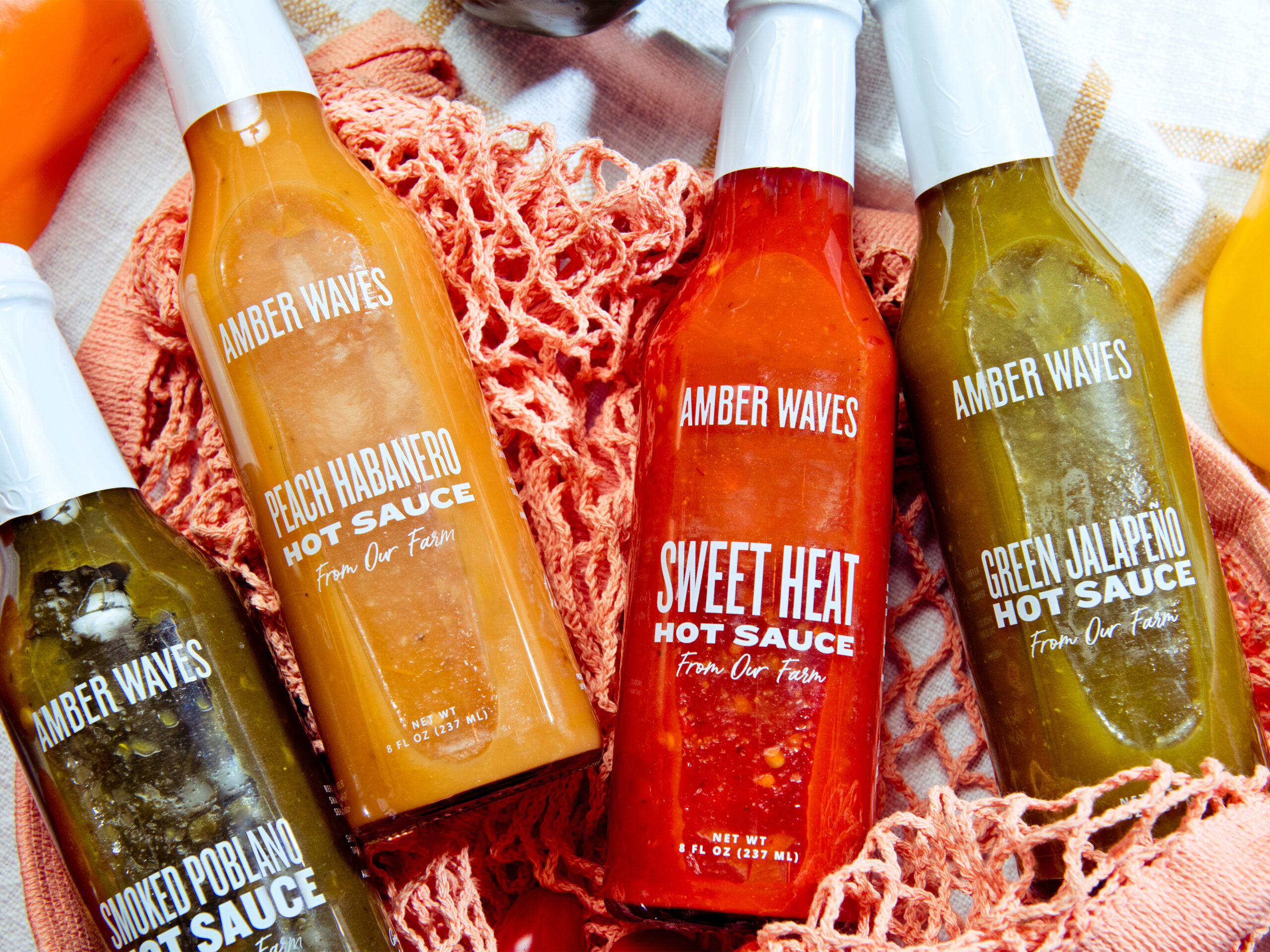
Amber Waves is a 501(c)(3) non-profit organization - an ocean-side farm, uniting food and community with the mission to provide rich educational opportunities in agriculture for aspiring growers, thoughtful cooks, and eaters of all ages. As an extension to the brand identity work we did in 2019 and 2020, we translated the brand onto product labels for farm fresh veggies, dressings, sauces, and condiments.
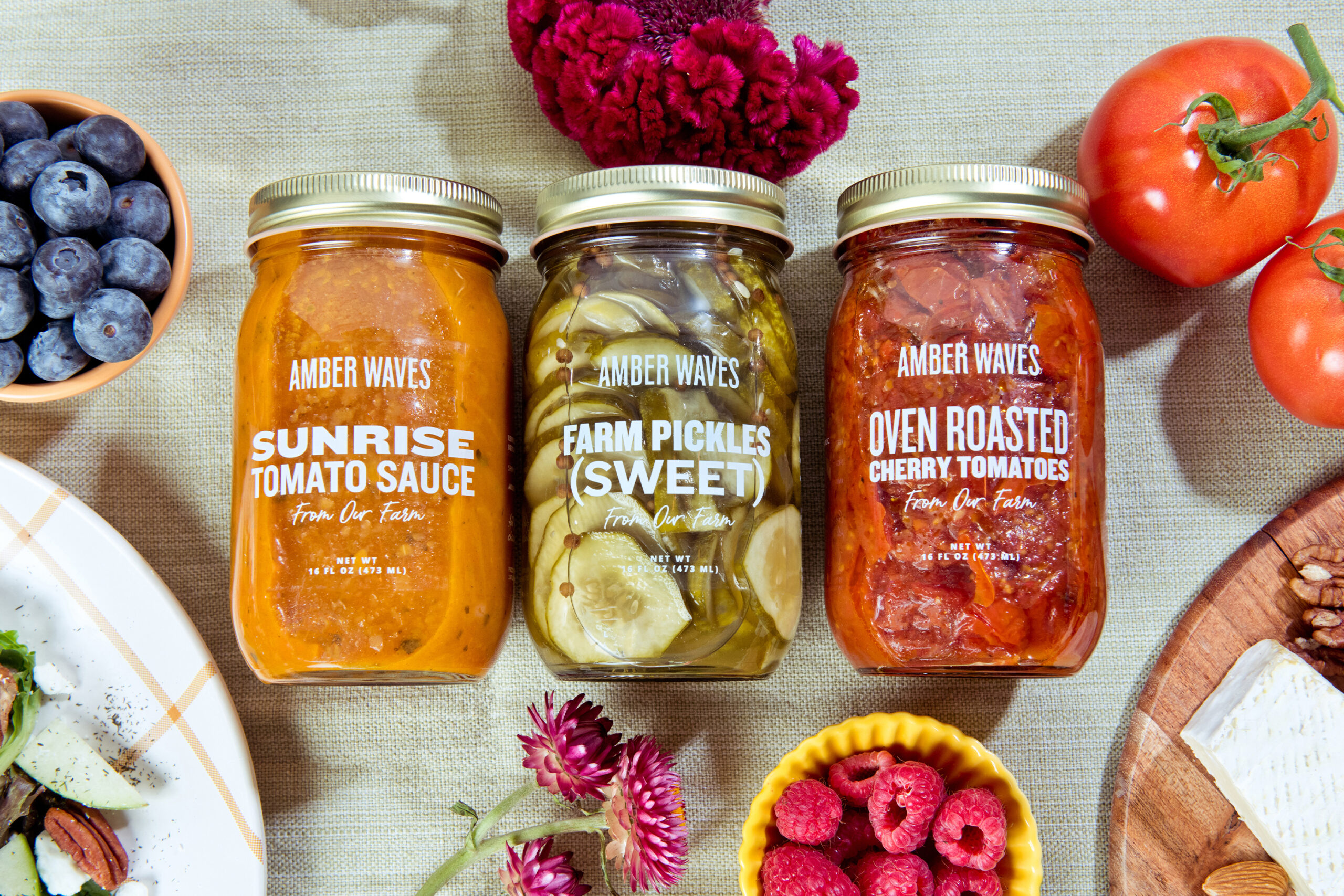
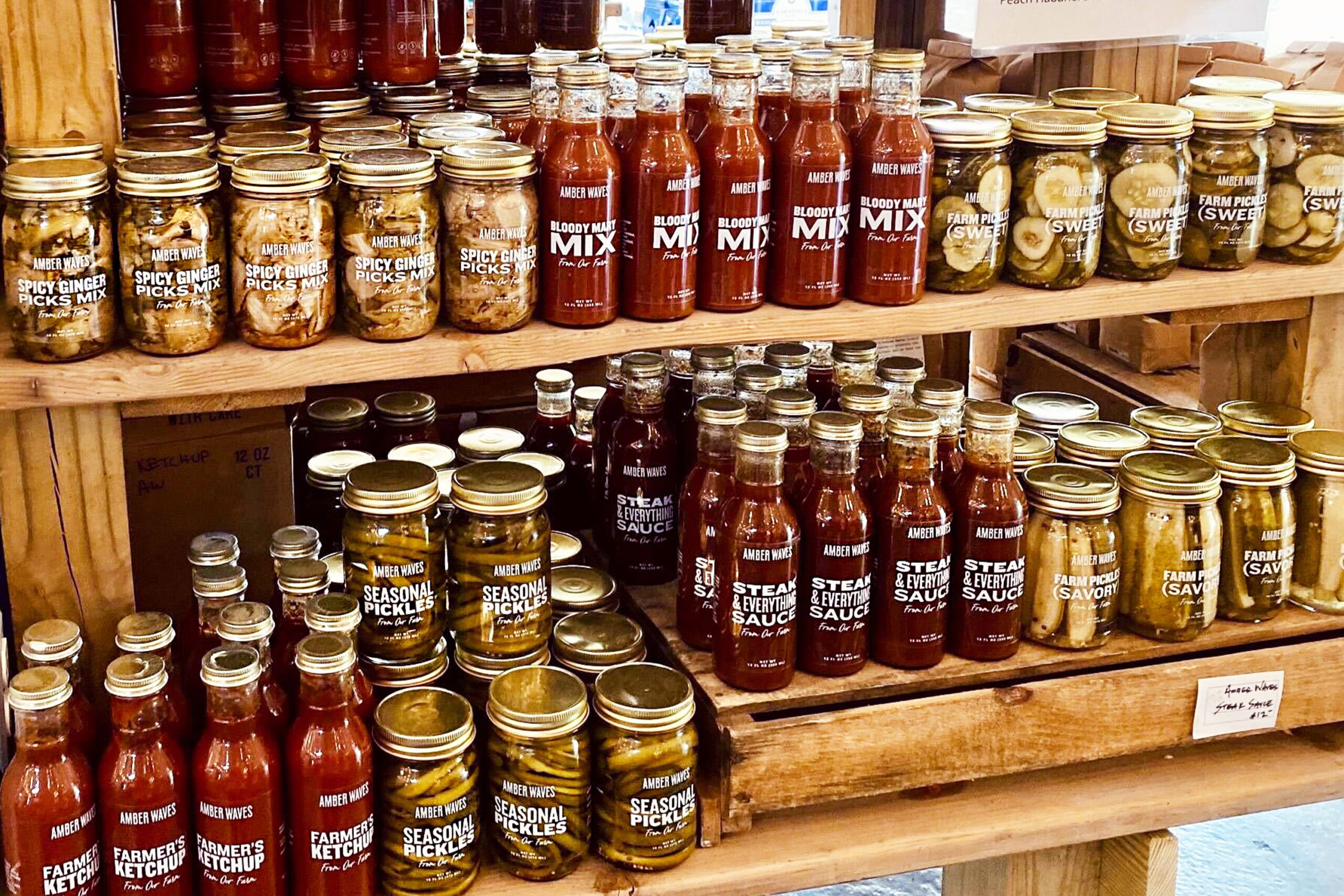
The ingredients are the star so our label design
is transparent—showing shoppers the beauty of the locally-grown ingredients and delicious concoctions.
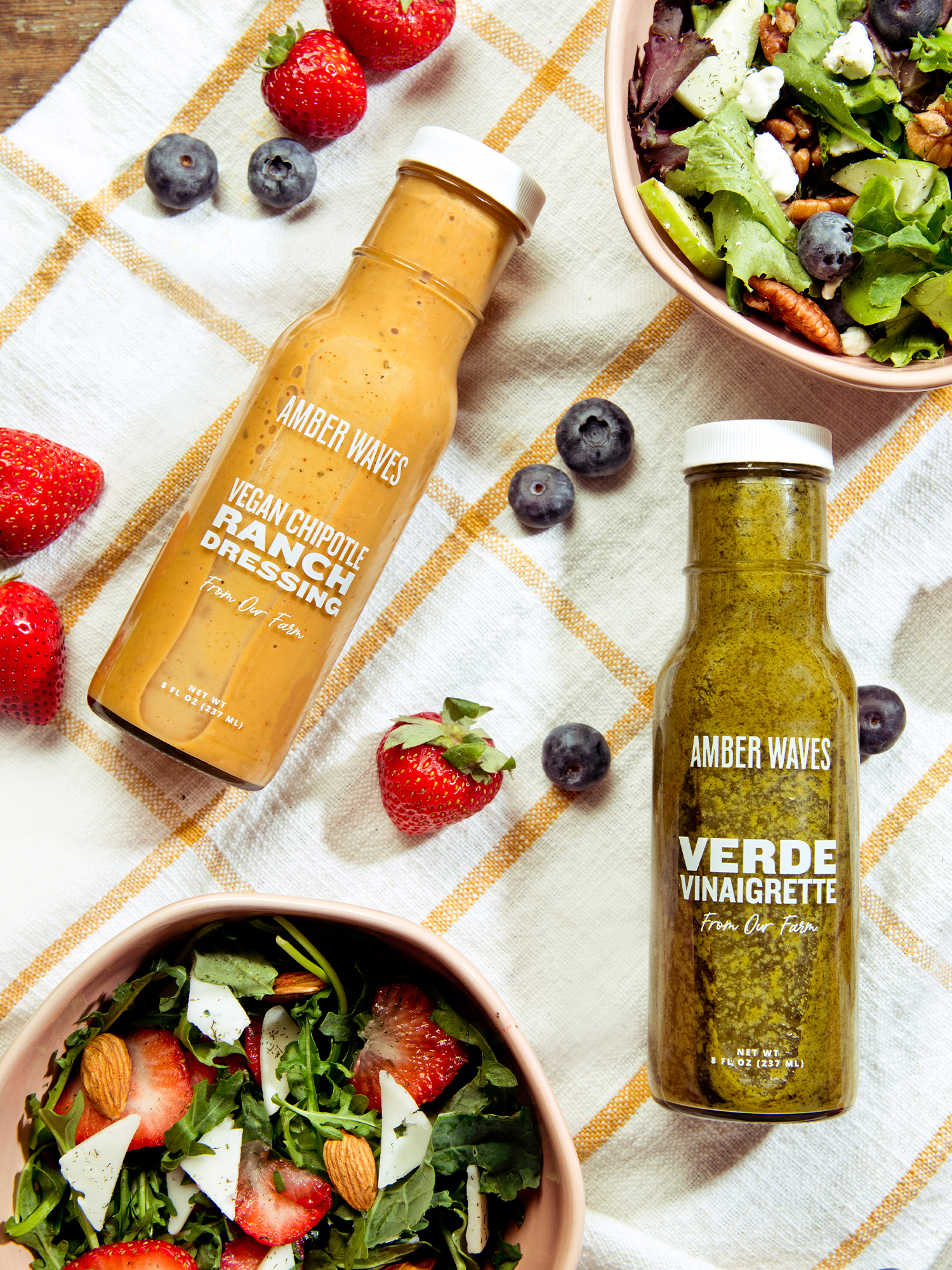
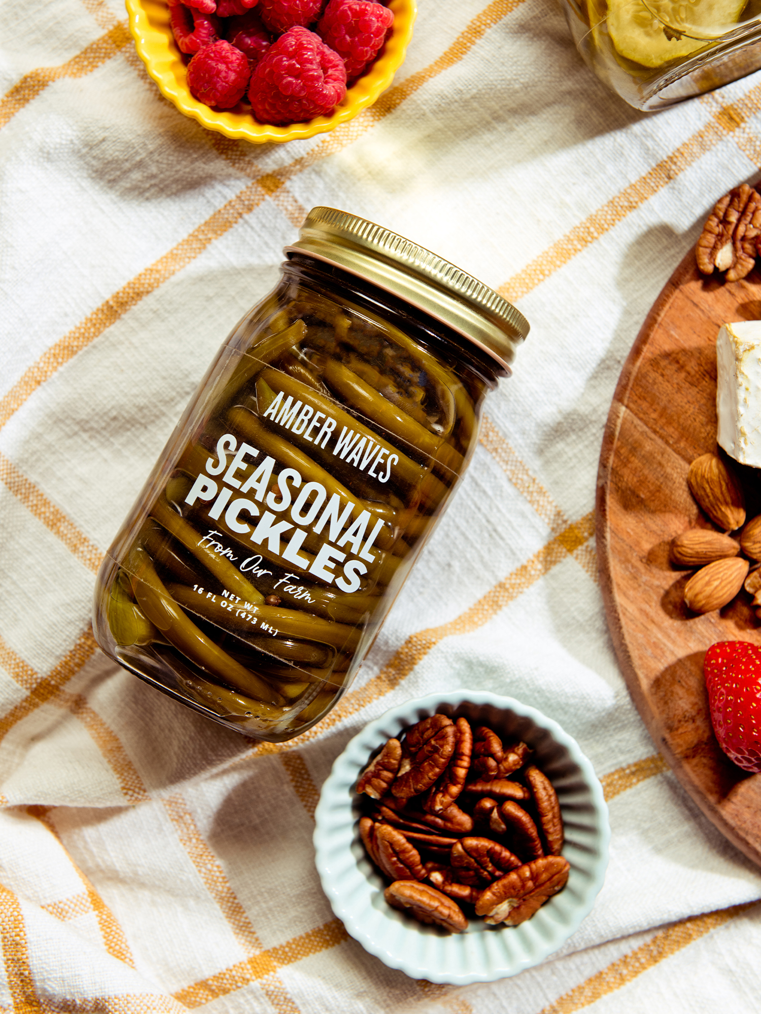
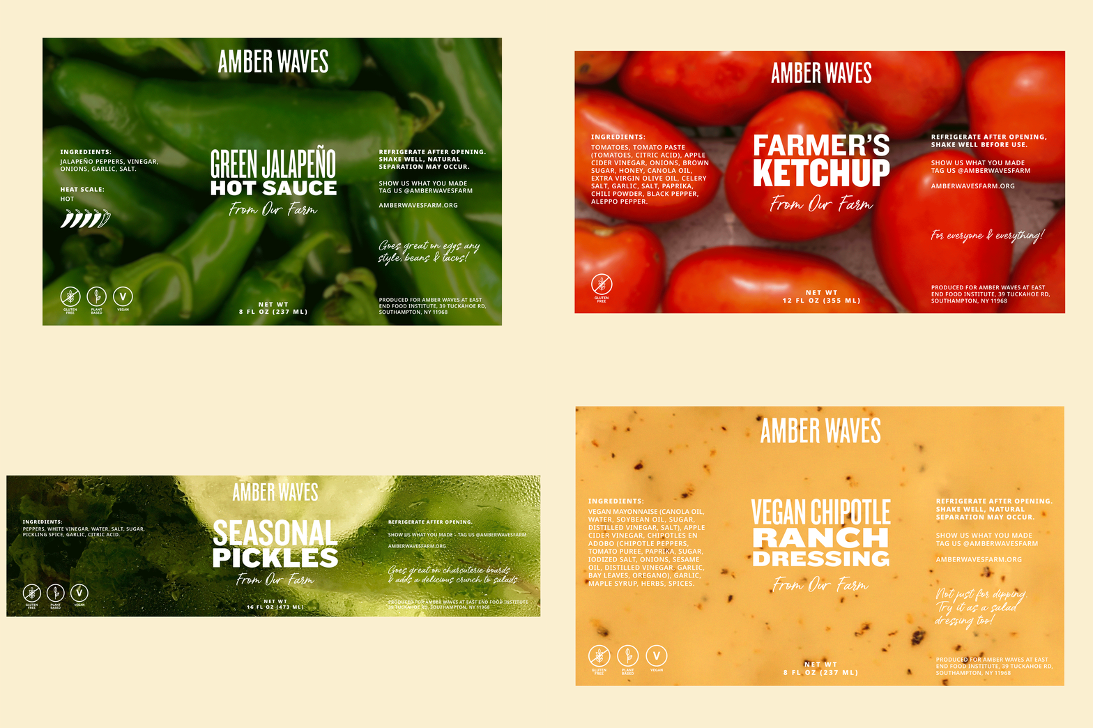
The type system uses the Knockout font in four distinct faces adding interest to each product name while the Amber Waves logo sits atop as a halo.
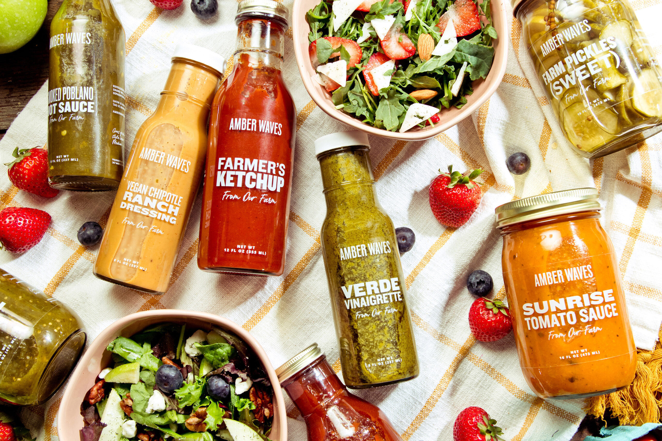
The back label features ingredients and offers ways to pair the product with your favorite foods and recipes. The vessels are reusable glass and metal jars – the perfect way to feature what’s inside without relying on expensive packaging that distracts from the products.
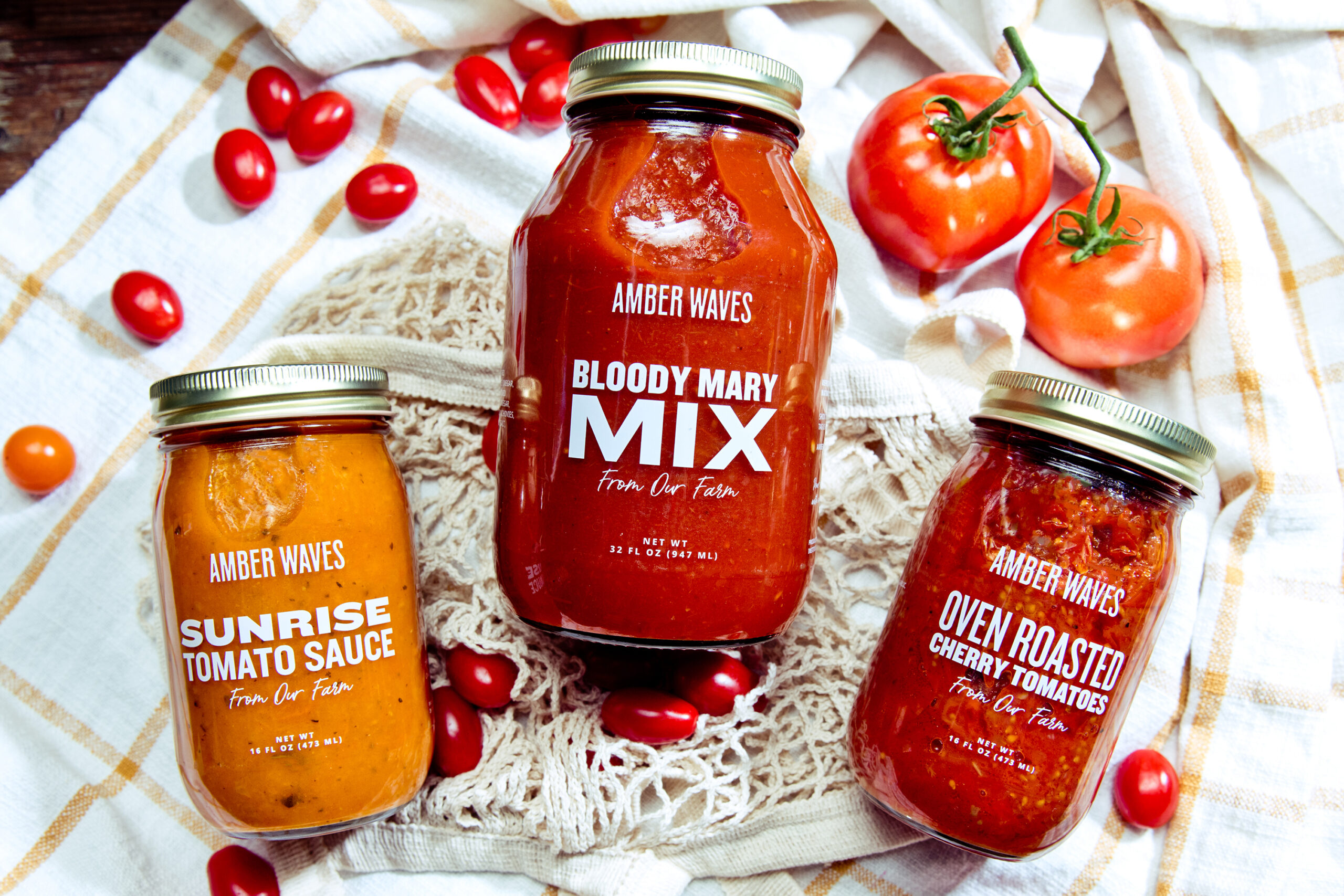
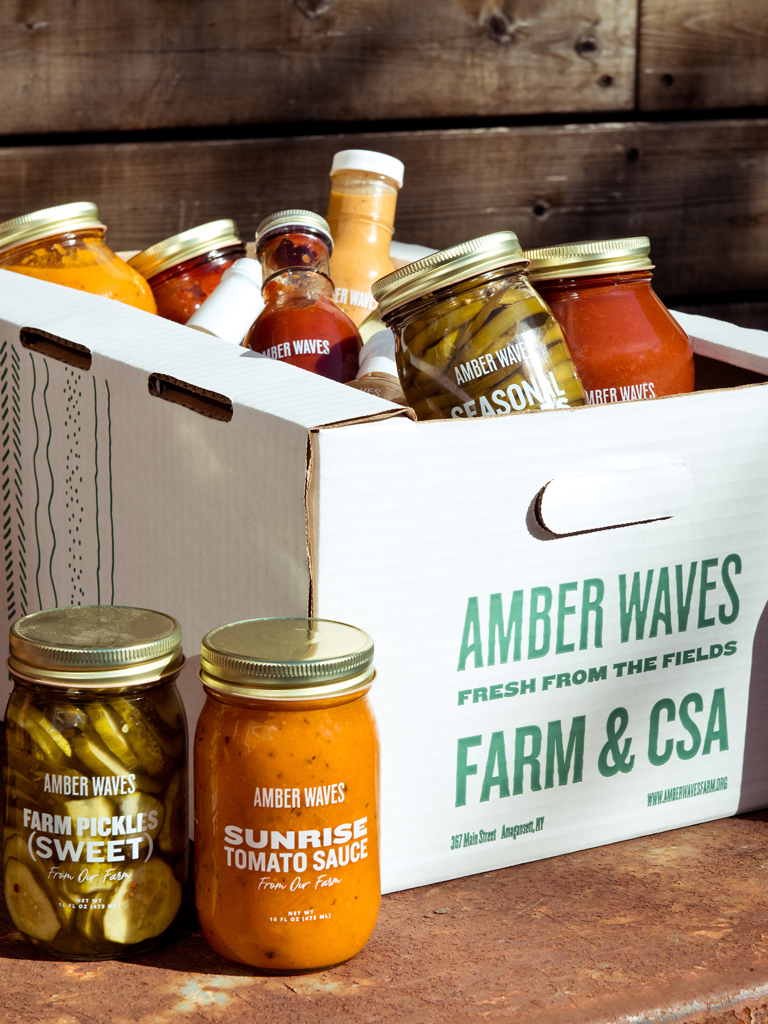
When integrated into the Market and Café at the Farm, the transparent labels and mixed typography pop off the shelf and invite shoppers to pick up, admire, and buy their favorites. Once the product is consumed, jars can be used as vases or containers for perishable and non-perishable goods.

Credits
Photography: Gabriela Herman
Typography: Knockout by Hoefler&Co.
, Hall of Fun by Konstantine Studio
Building brands that
defy convention with sophistication.
Stay in touch.
© 2026 MA'AM Creative, LLC | MA'AM is a registered trademark of MA'AM Creative, LLC.