
Glyph
THE GOODS
Brand Strategy
Naming
Visual Identity
Copywriting
Brand Guidelines
Website Design
Interior Architect Morgan Chu had a vision for a furniture line of the moment. Opposing the idea of heirlooms, he designs pieces to shape your space now; not for years to come. Glyph combines a subtle sensibility with innovative design. Inspired forms, intriguing materials and a touch of eccentricity come together to create the inimitable: a suite of pieces that capture the independent spirit of contemporary style.
From this comes our mission: to design pieces that inspire a lifestyle of unexpected comfort.
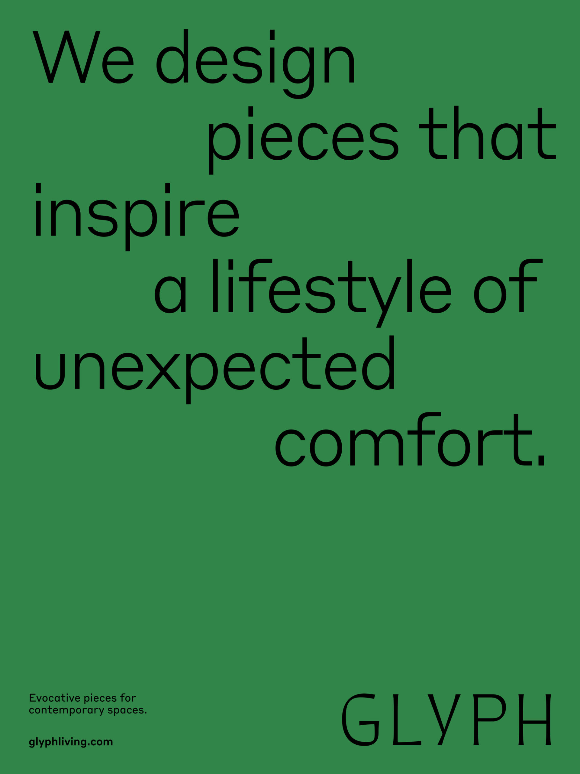
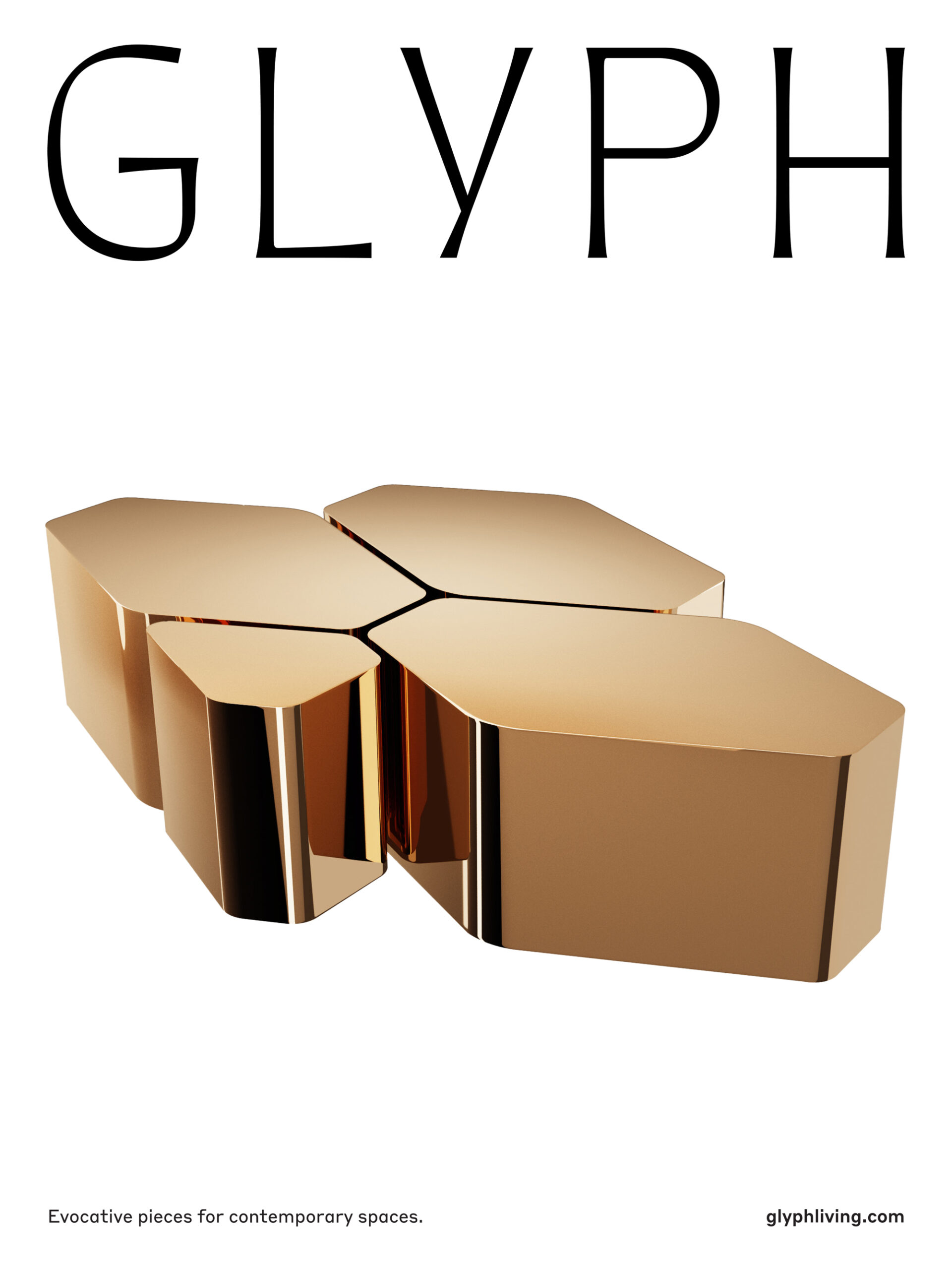
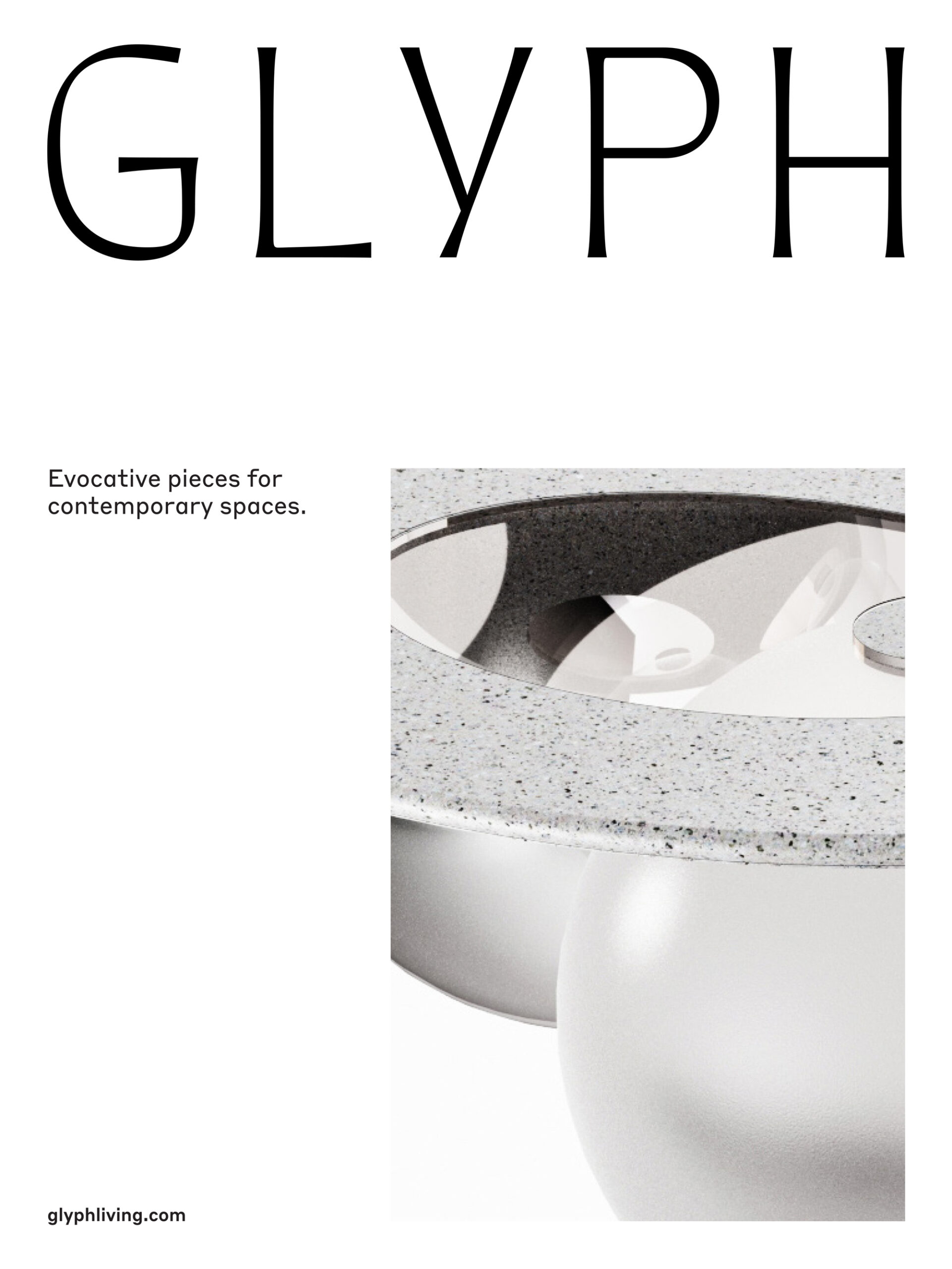
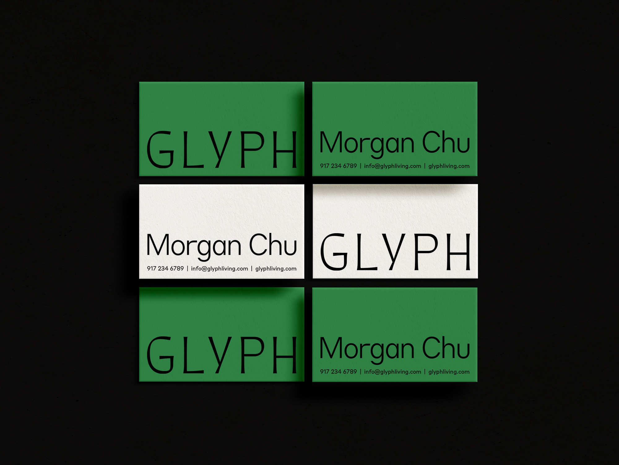
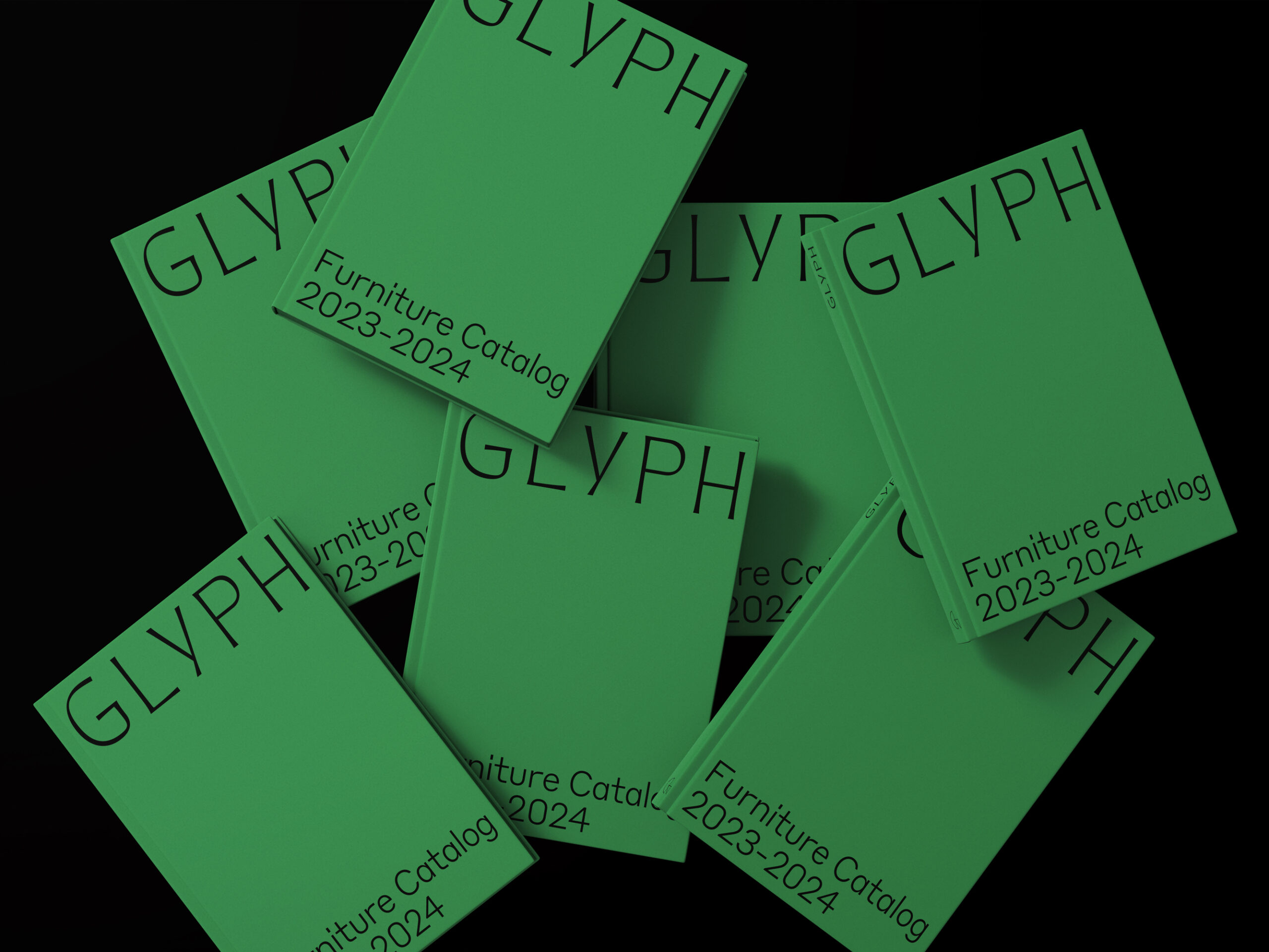
Unexpected is the underpinning of our visual identity system. From playfully placed typography and glyph forms to our primary color Acrylic Green, the system is distinctly nuanced.
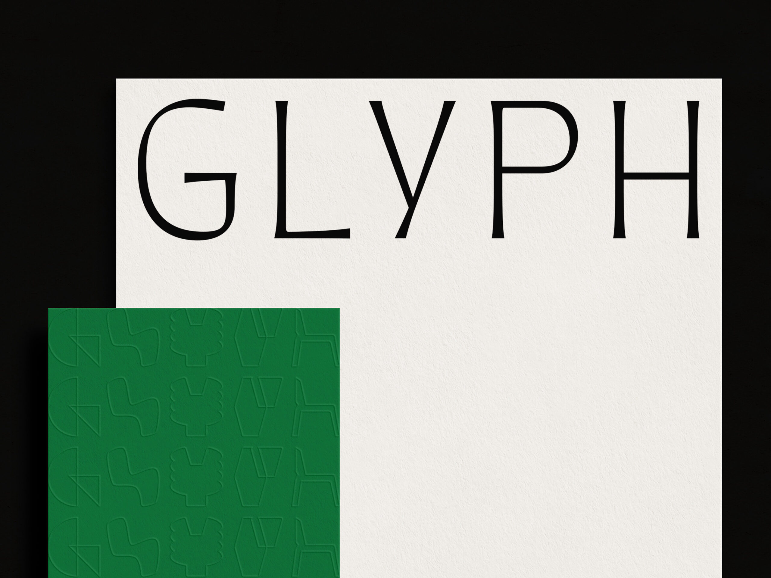
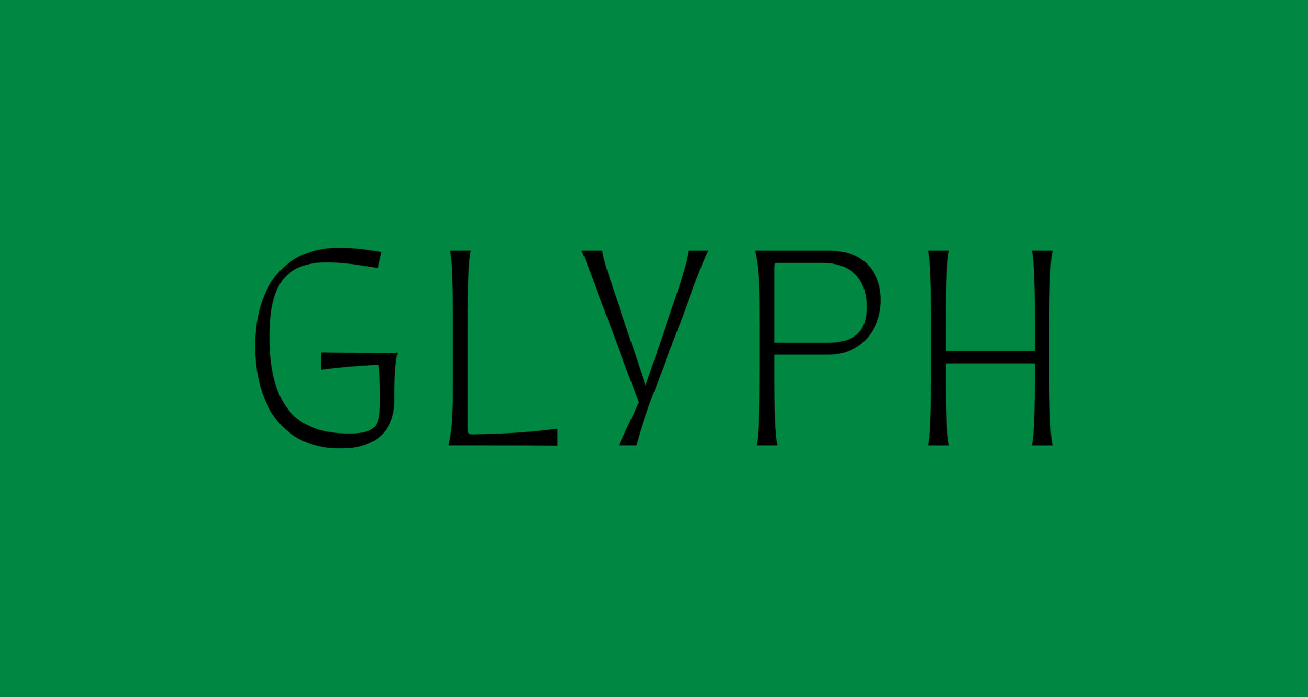
Our logo typeface Quiverleaf from Connary Fagen, Inc., telegraphs movement and reflects the curvatures of the furniture. Juxtaposed with this fluid typeface is our symbolic mark – an abstraction of the letter G. Together, these styles combine into an eclectic expression.
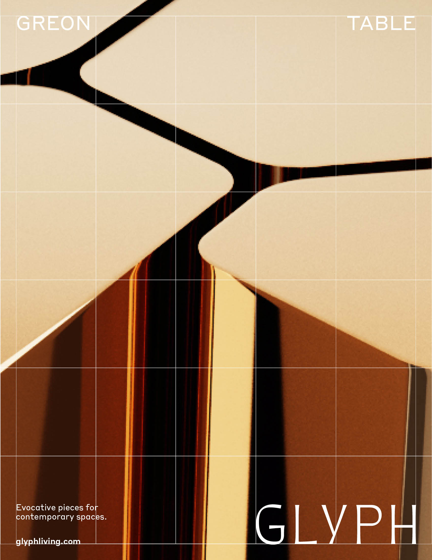
Styrene B from Commercial Type by Berton Hasebe and Ilya Ruderman, is our brand typeface, a sans serif that compliments the unconventional shapes of the wordmark. A geometric font with unexpected details, it’s used in three weights, Light, Regular and Medium.
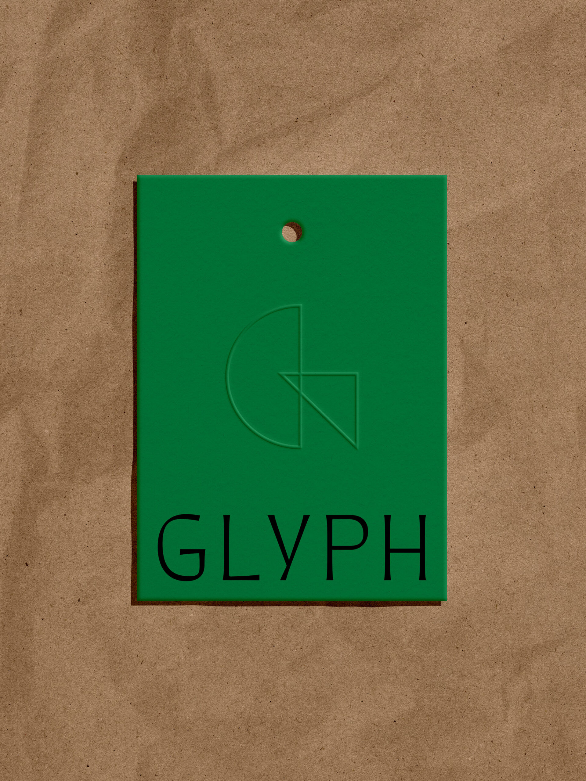
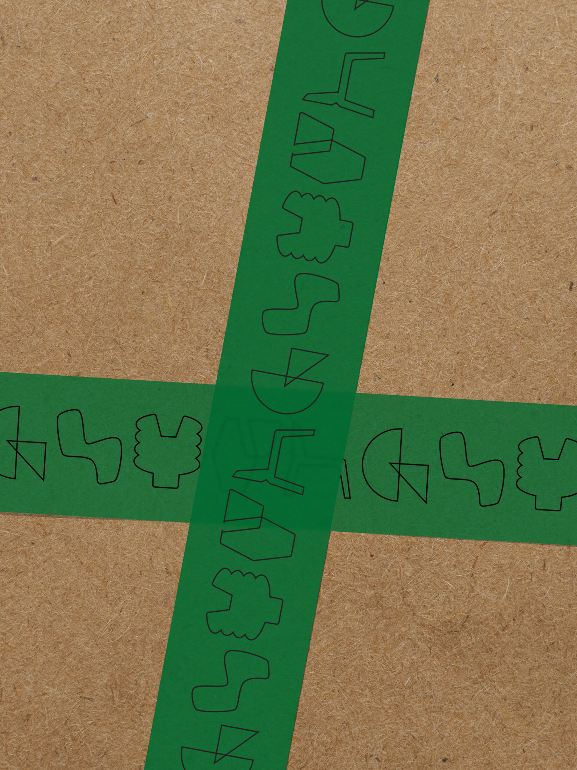
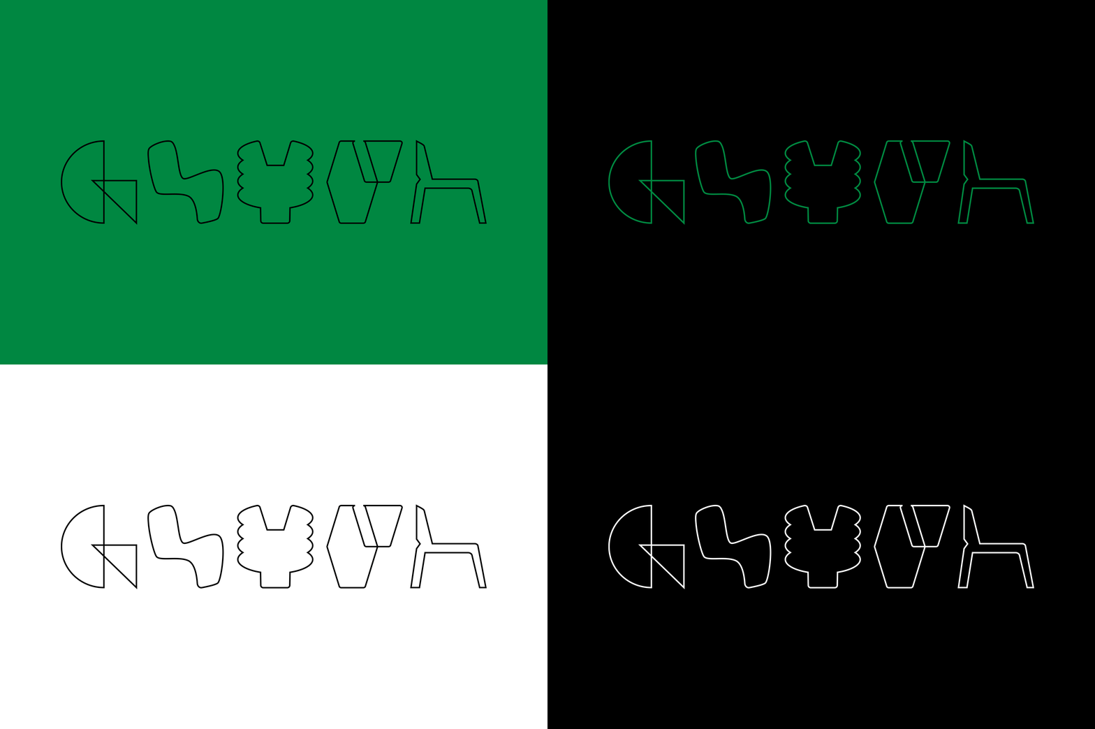
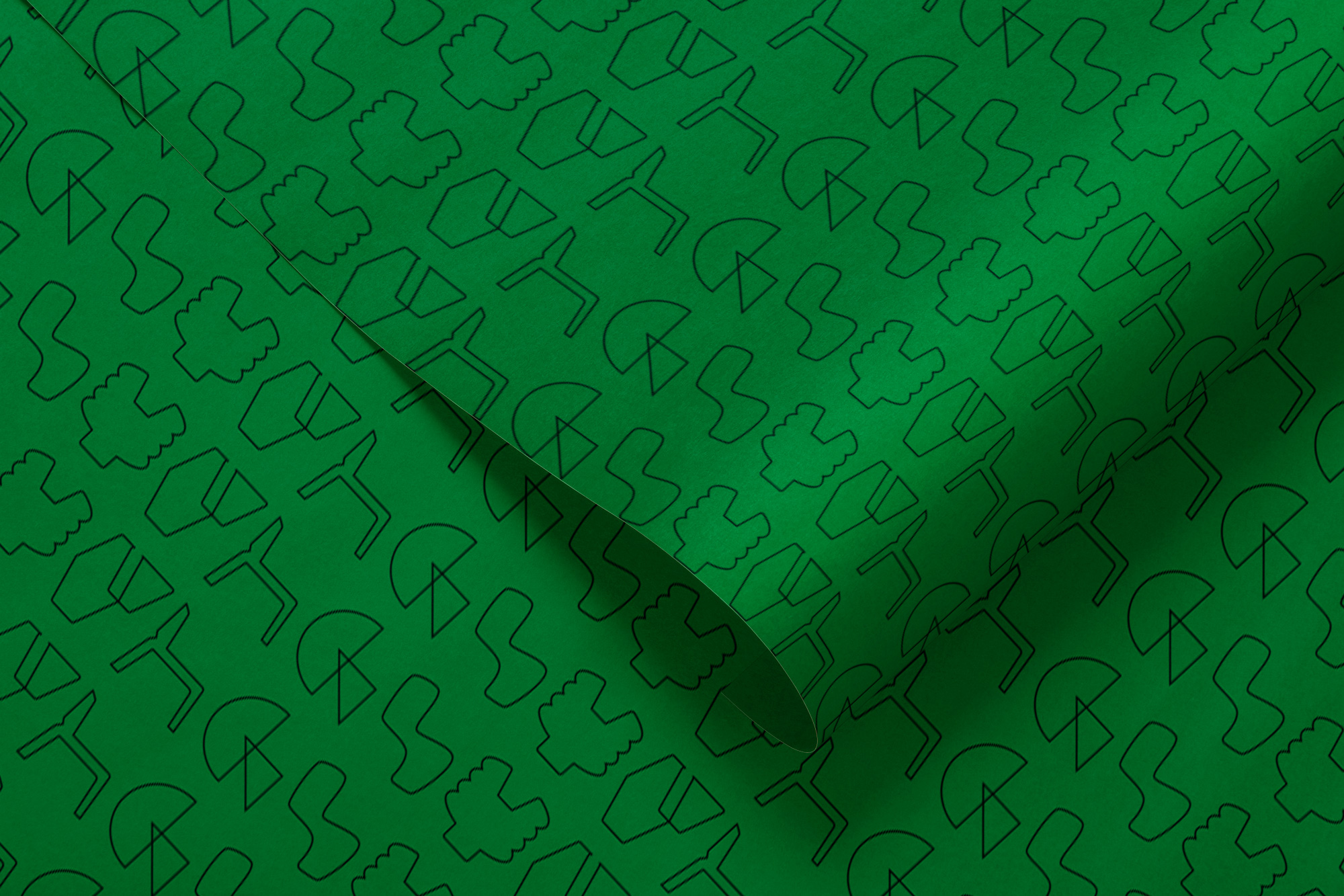
The system is supported by glyph patterns that can be used to form the namesake or as individual letter / symbols.
Our grid system is based on our five glyphs, thus creating five columns and six rows where the information can be placed.
Credits
Copy by Amelia Stein
Building brands that
defy convention with sophistication.
Stay in touch.
© 2026 MA'AM Creative, LLC | MA'AM is a registered trademark of MA'AM Creative, LLC.