
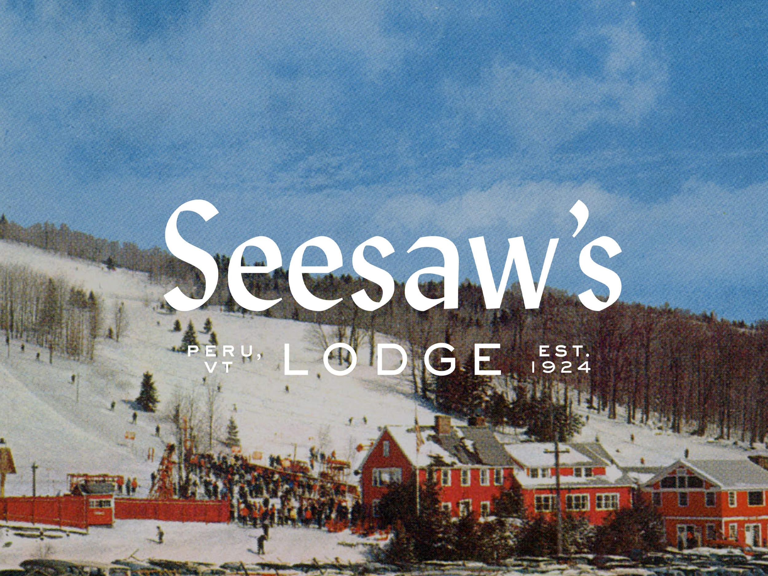
Seesaw's Lodge
THE GOODS
Naming
Brand Positioning
Visual Identity
Marketing Collateral
HEADER PHOTO
Carleton Allen
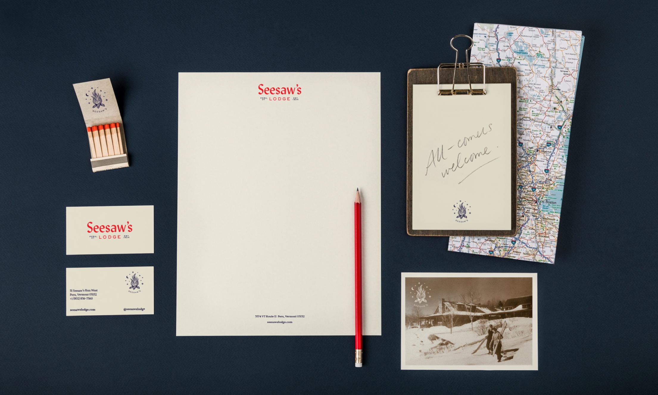
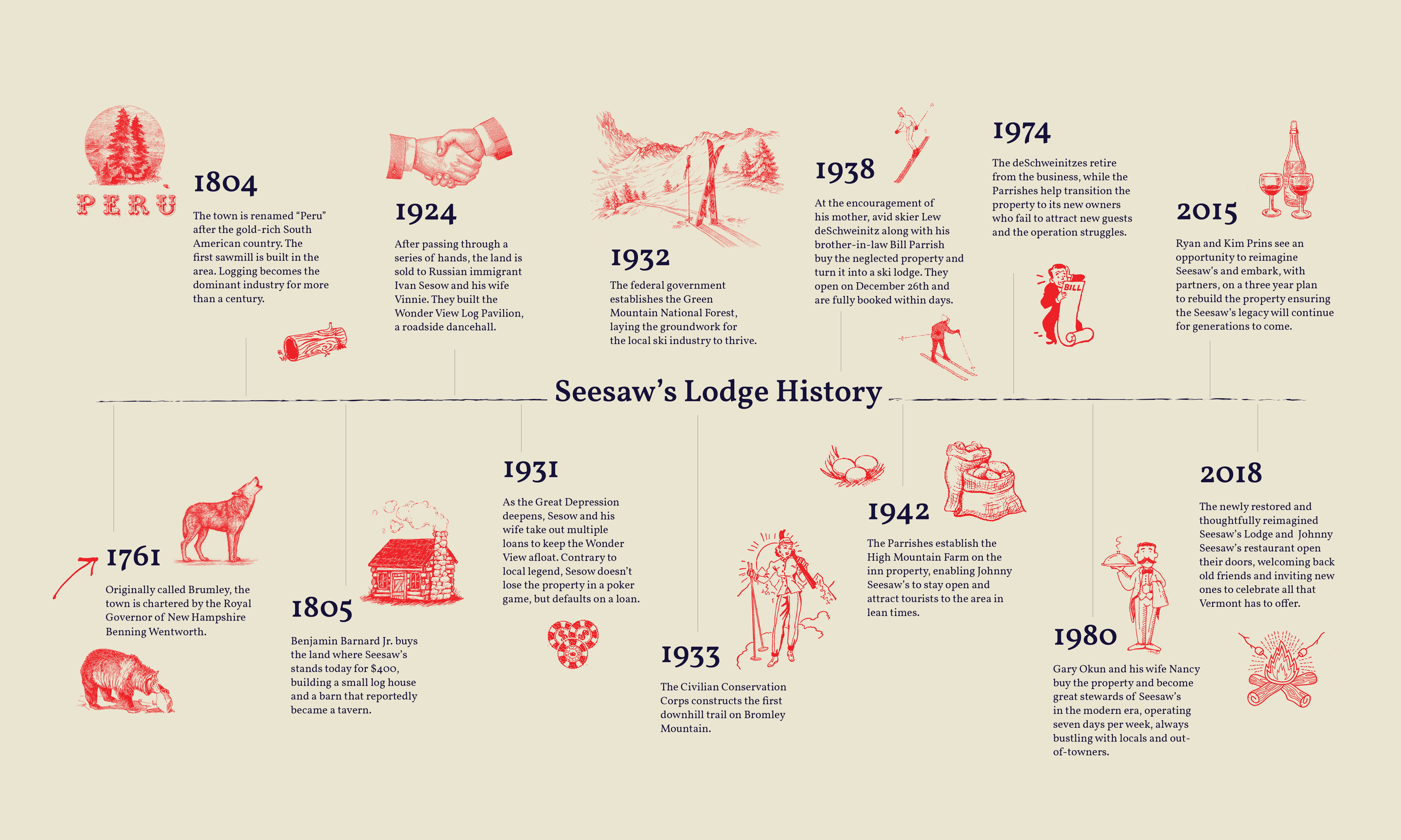
We partnered with the new owners of Johnny Seesaw’s to revitalize the brand identity of the historic inn, which was established in 1924 and has served as a destination for locals and former presidents alike.
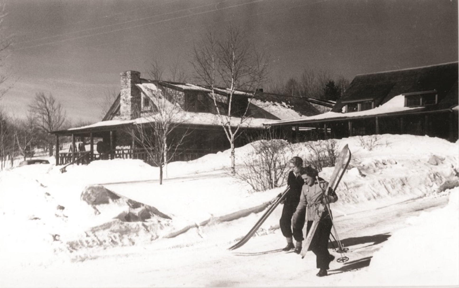

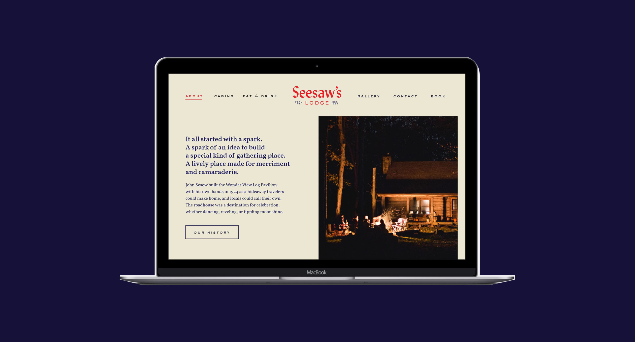
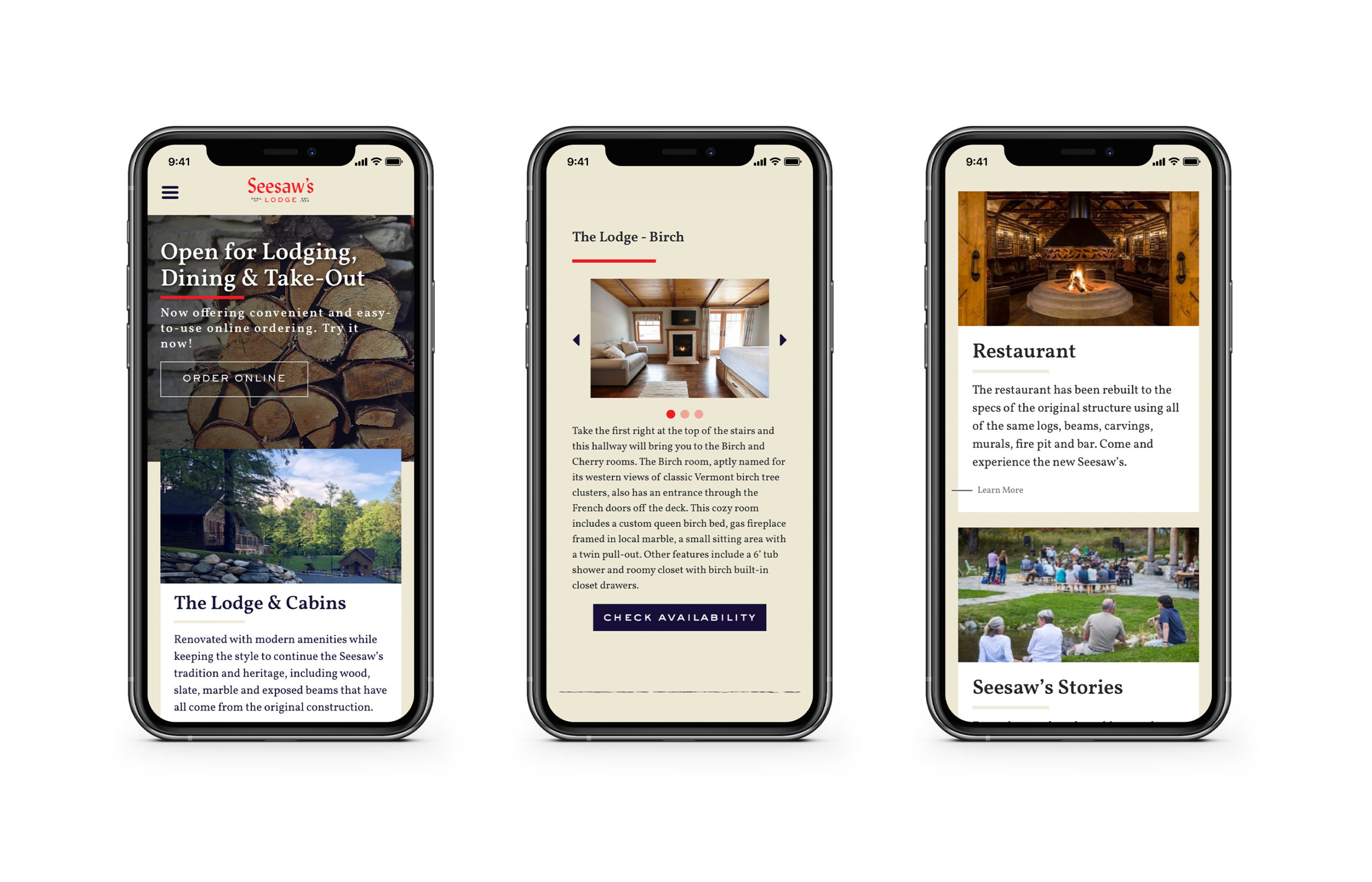
To pay homage to the inn’s rich history while imagining a fresh future, we evolved its name to Seesaw’s Lodge, which is reminiscent of a destination rather than a place.
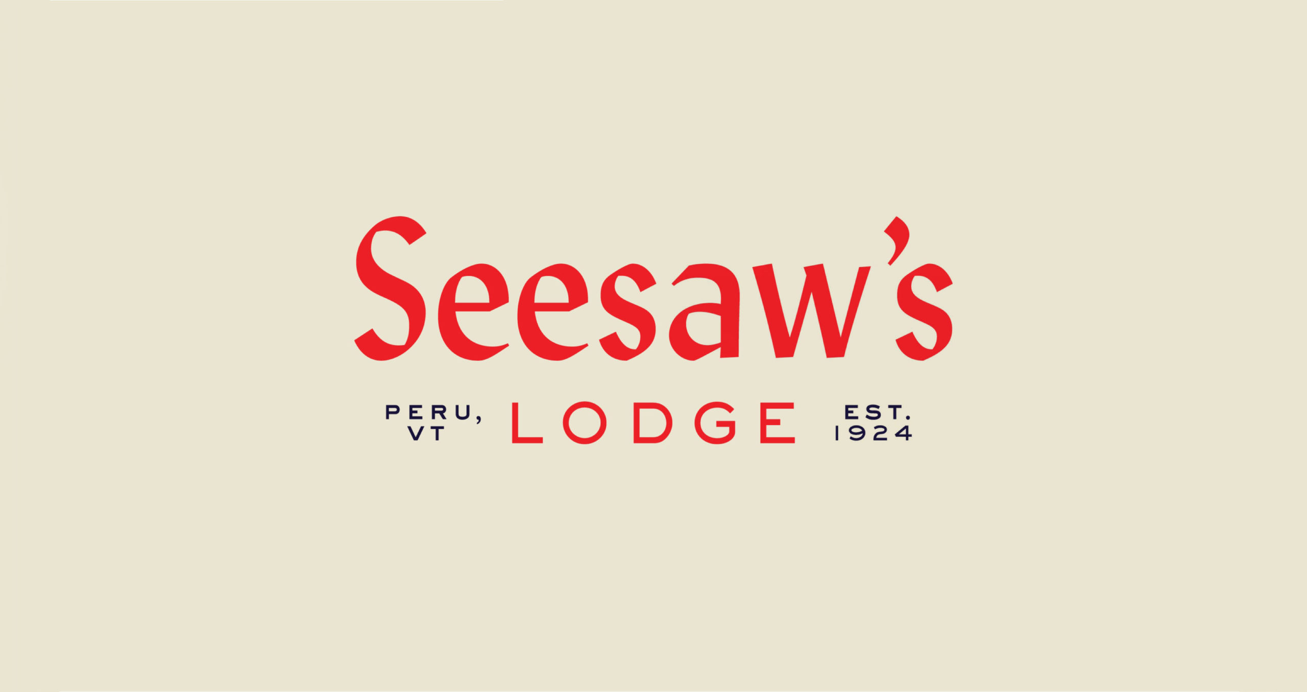
We then developed a distinctive typeface with a chiseled appearance that recalls the area’s woodcarving culture. The wordmark’s red color nods to the inn’s earlier days.
We paired the new logo with an original campfire graphic inspired by the firepit situated at the heart of the inn’s signature restaurant. The firepit is not only a memorable part of the Johnny Seesaw experience, it also signifies the brand’s incredible ability to create a sense of camaraderie among its guests.


Johnny Seesaw’s
THE GOODS
Visual Identity
Menu System
Materials Procurement
Collateral & Menu Design
After branding Seesaw’s Lodge, our next step was reimagining the inn’s flagship restaurant: Johnny Seesaw's.

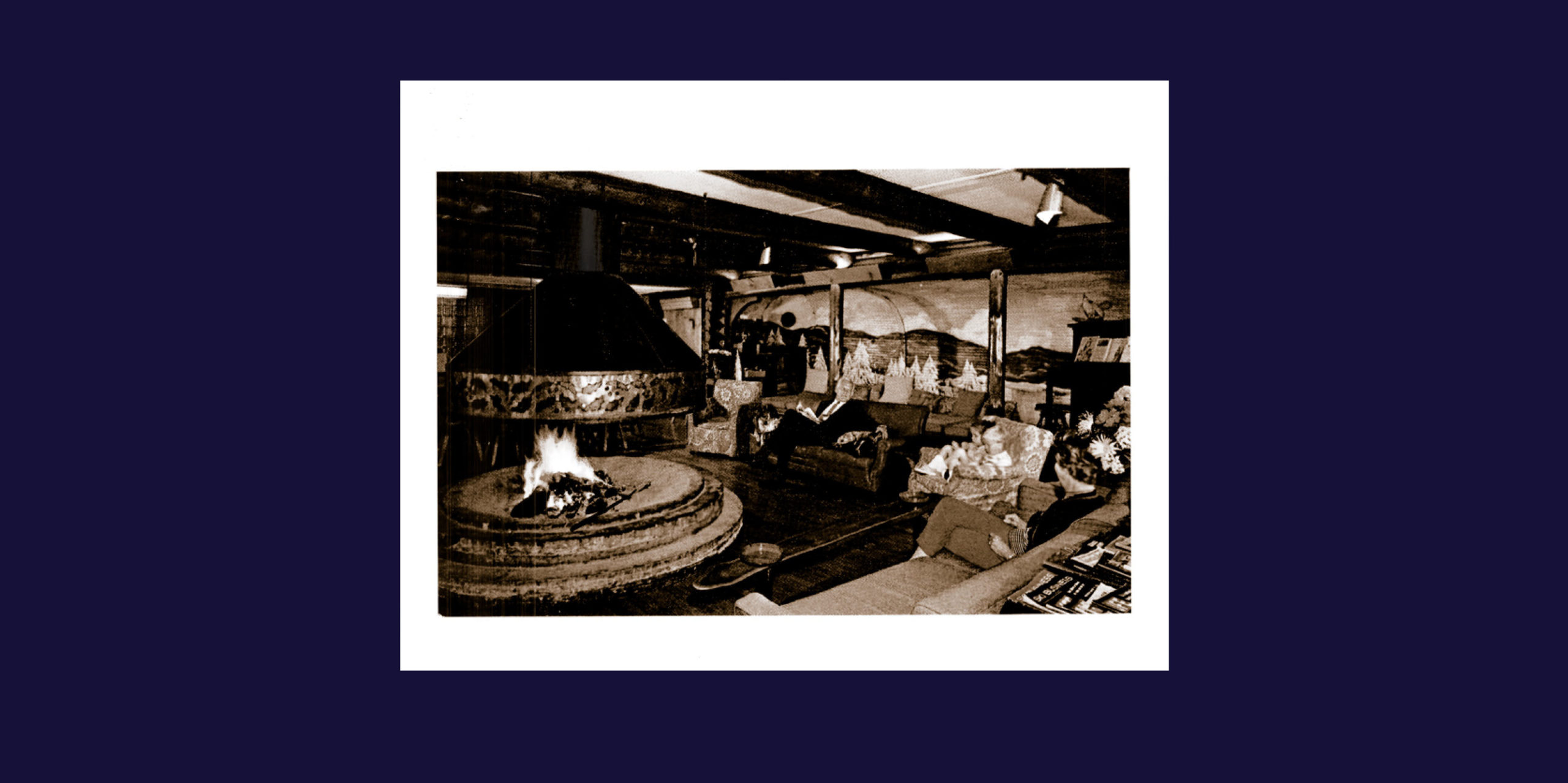
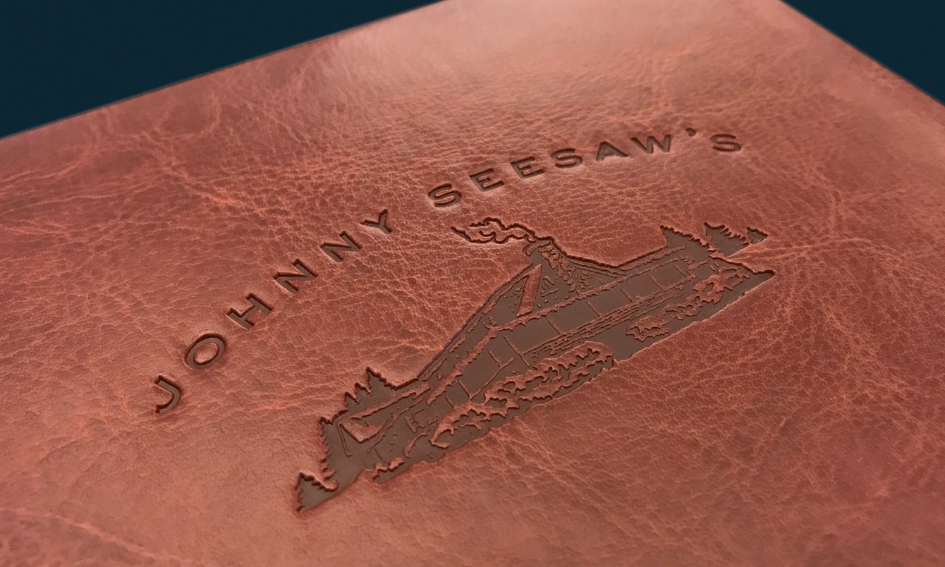
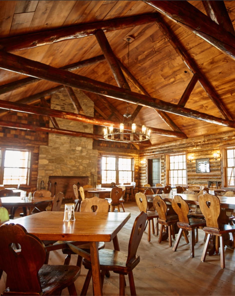
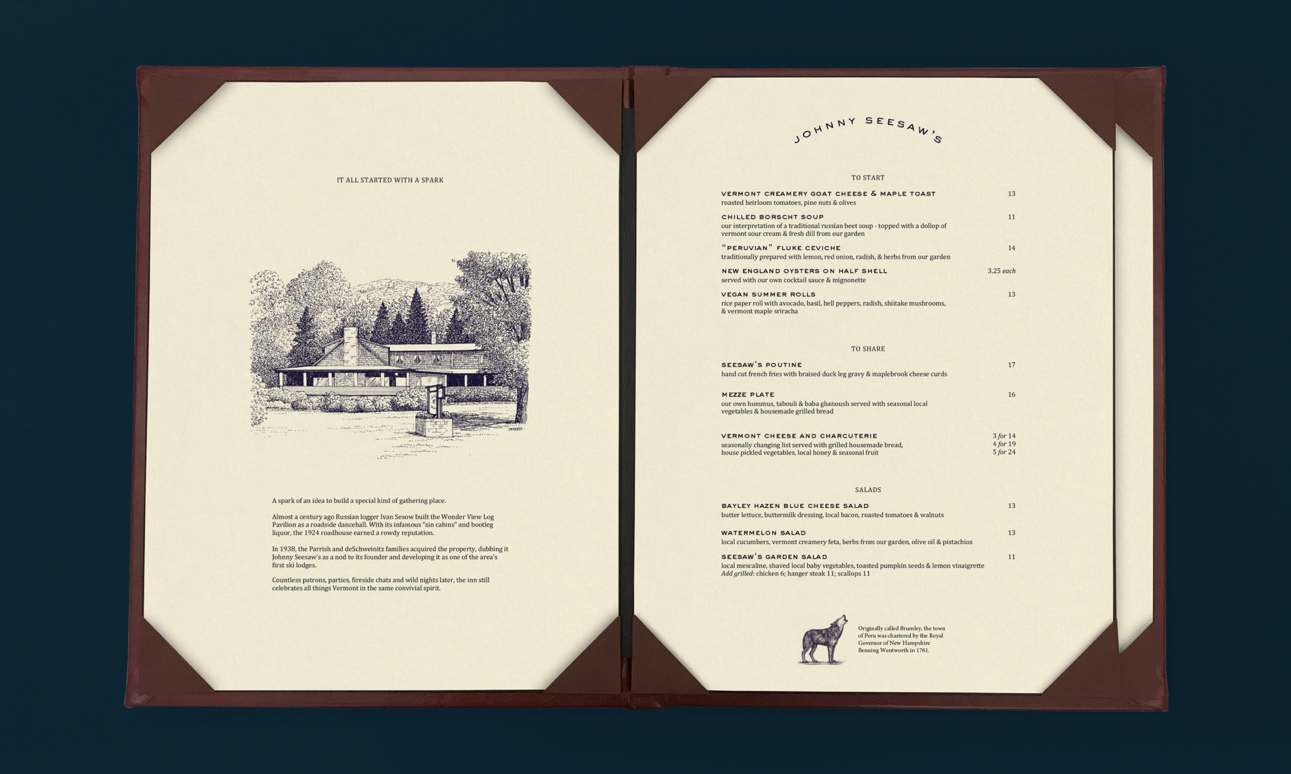
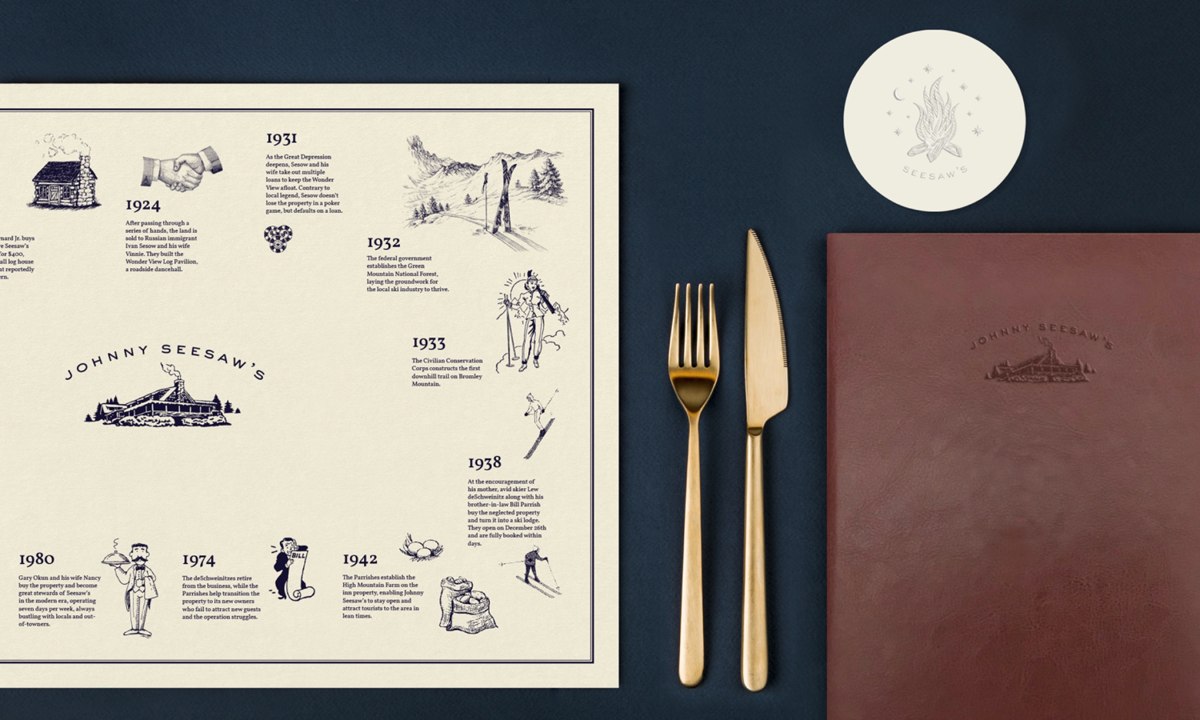
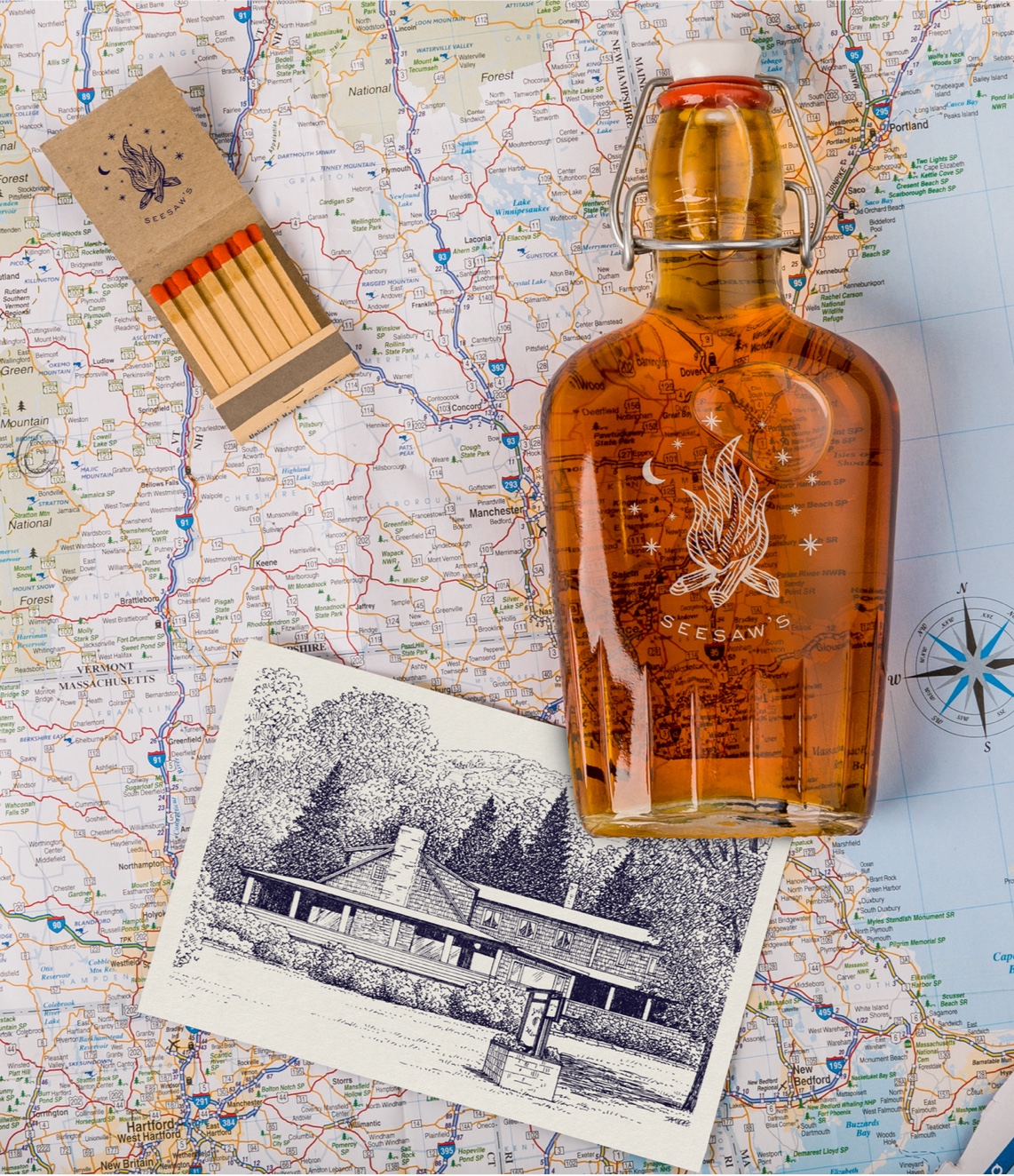
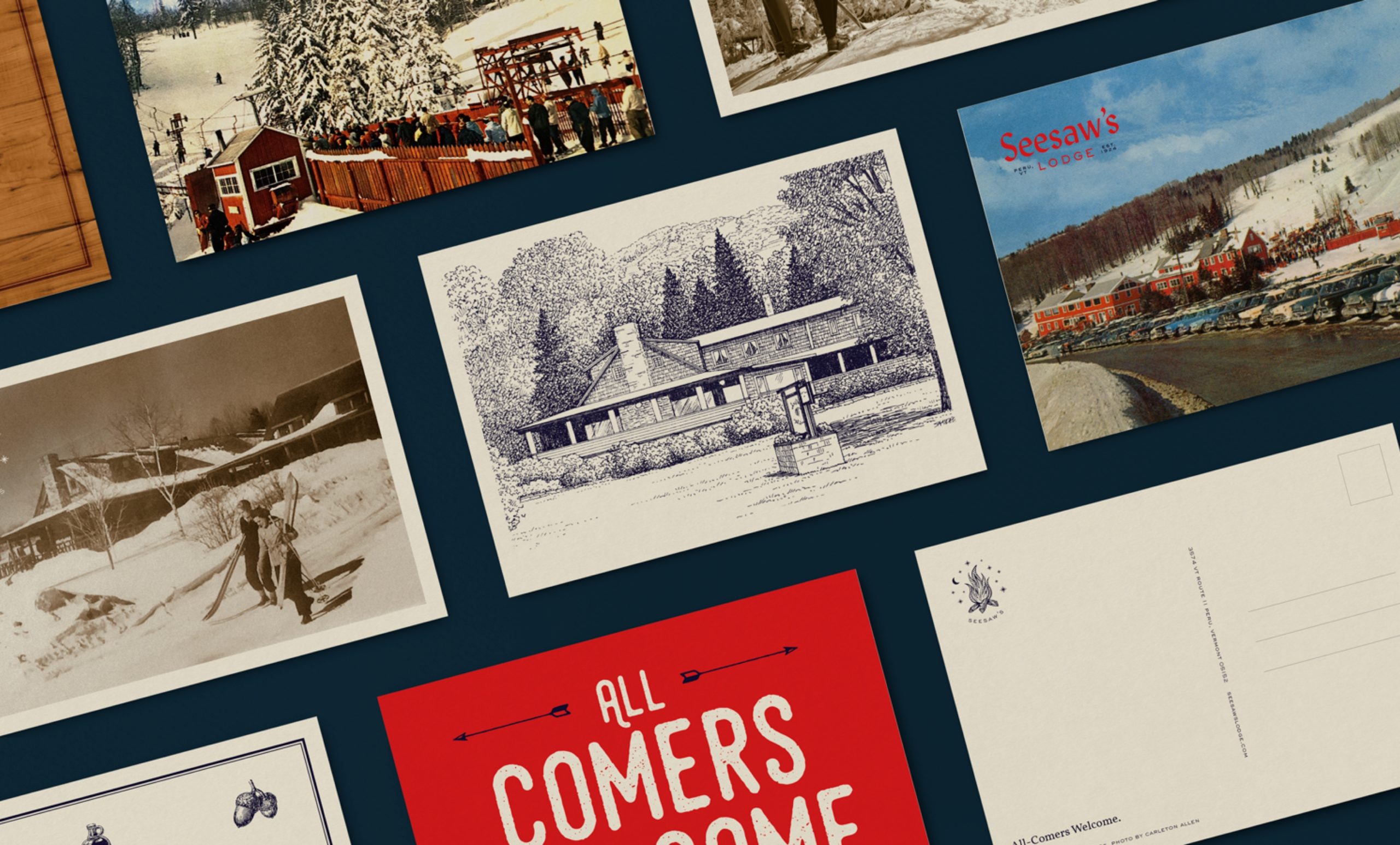
The restaurant’s new identity, like its name, is rooted in its history — from an engraving-style logo inspired by the lodge’s original facade to menu materials, like leather and wood, that complement the log cabin aesthetic.
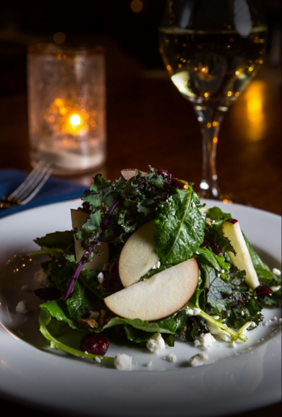
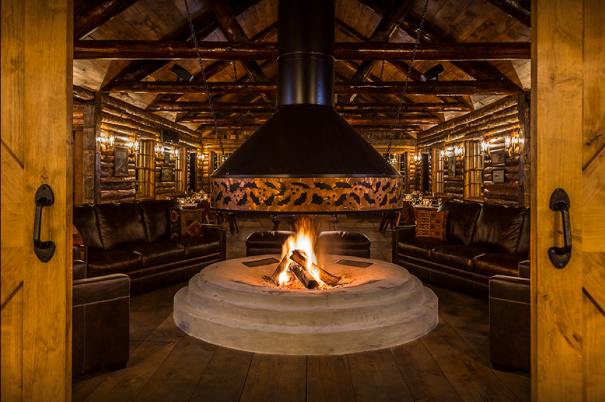
Vintage and current photos are courtesy of Seesaw’s Lodge.
Building brands that
defy convention with sophistication.
Stay in touch.
© 2026 MA'AM Creative, LLC | MA'AM is a registered trademark of MA'AM Creative, LLC.