Amber Waves
THE GOODS
Brand Architecture
Brand Strategy
Positioning
Copywriting
Visual Identity
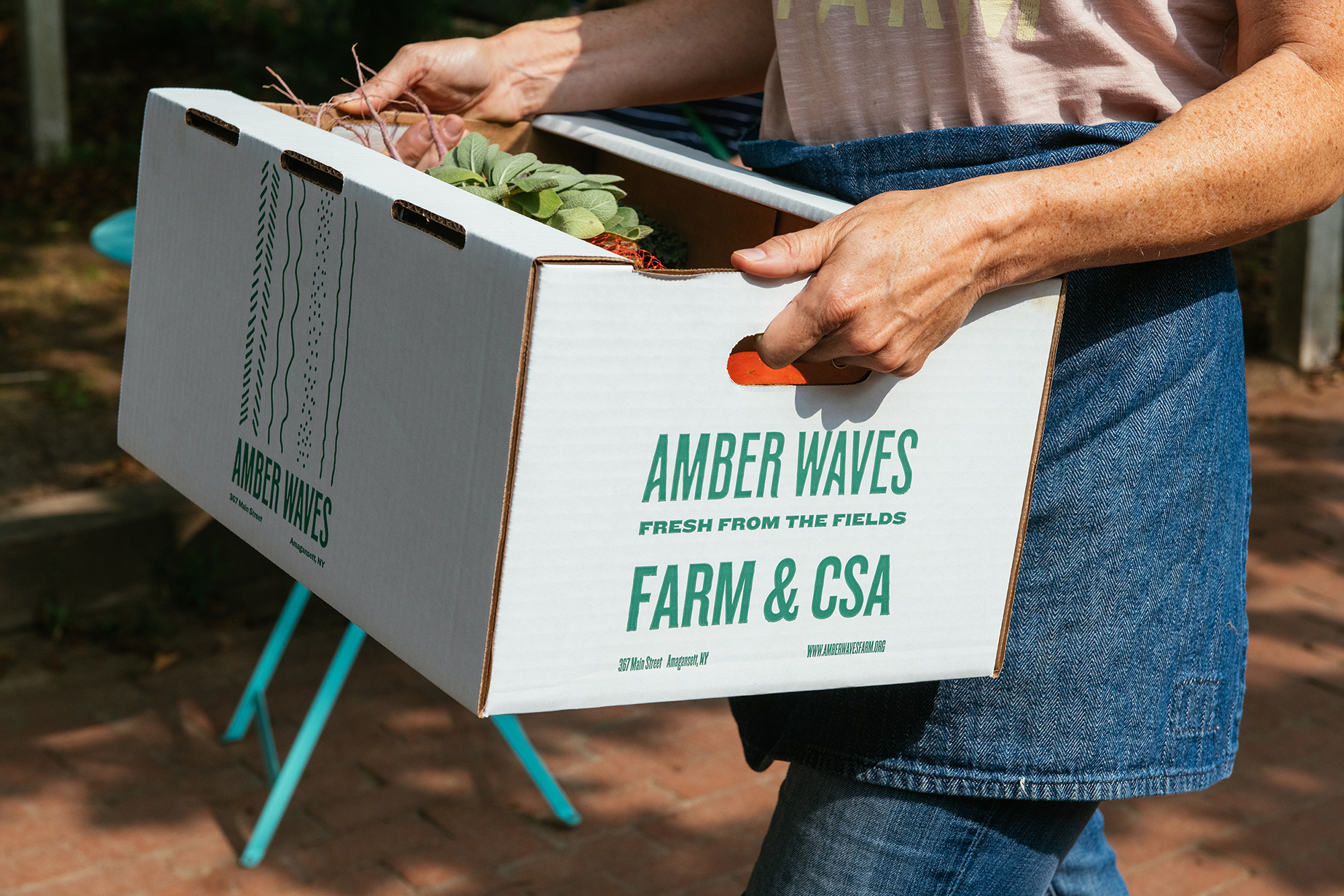
Packaging
Marketing Collateral
Photography Art Direction
PHOTOGRAPHER
Gabriela Herman
Amber Waves Farm co-founders Katie and Amanda contacted us following their ten-year company anniversary, with big plans to expand the business. Our first phase of collaboration focused on establishing the brand strategy, positioning, and overall business architecture with the aim to scale.
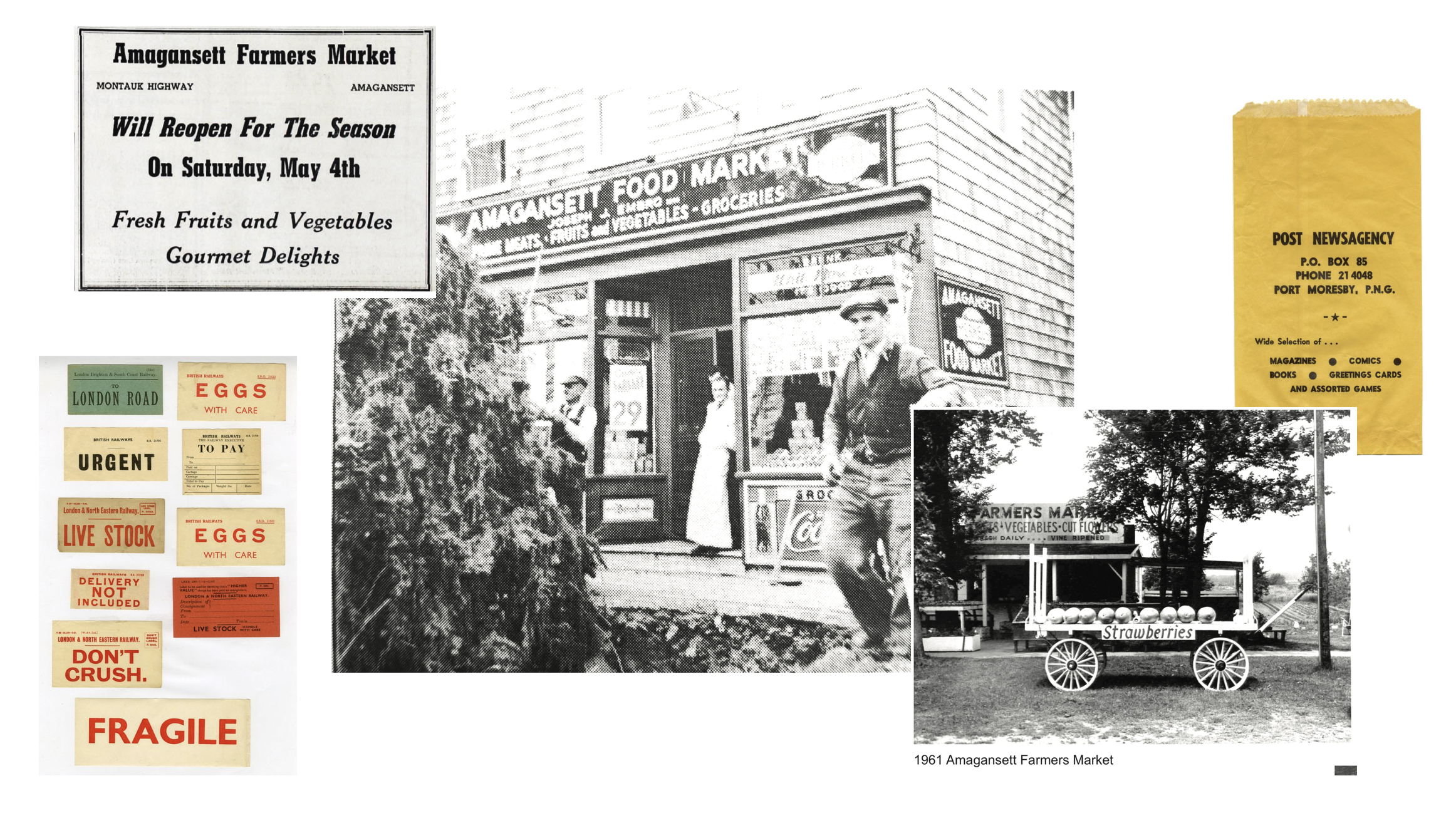
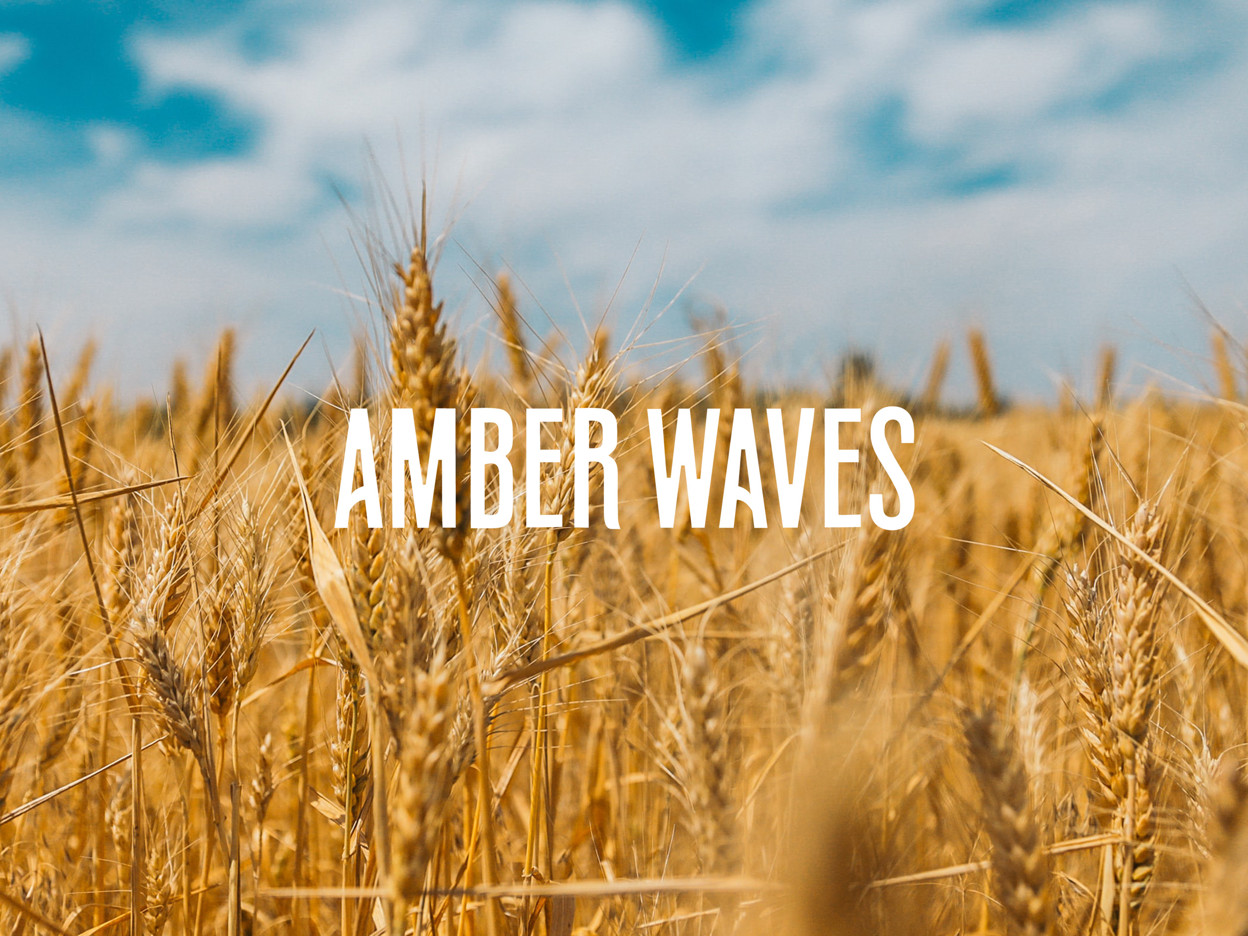
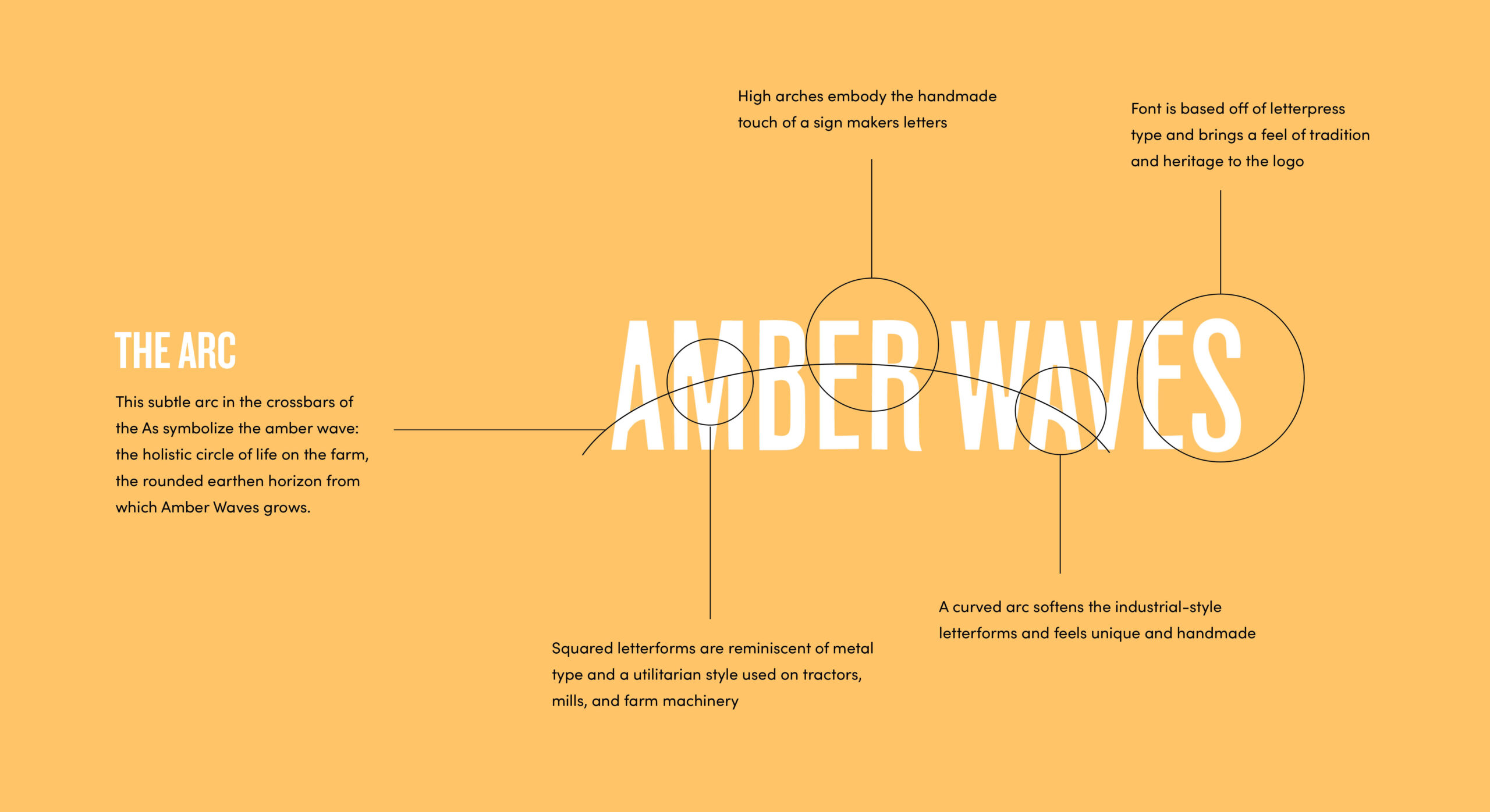
To ground the identity, we sought inspiration from legacy general store marquees that employed striking typography in varying weights. The result embodies what happens “between” the Amber Waves, specifically: a rich heritage inspiring a new generation and the passionate embrace of community, local agriculture, nourishment, and joy.
The brand architecture was also designed to support each branch of the company with its own hero colorway.
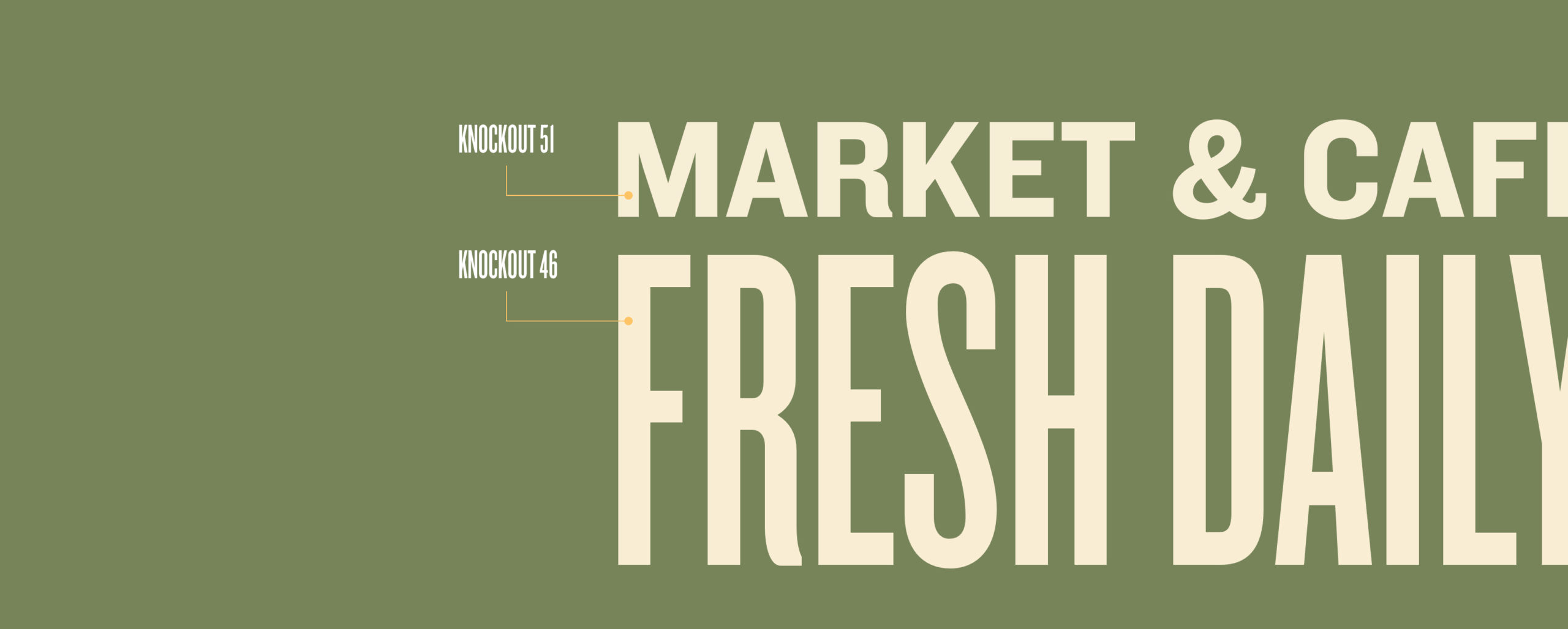
This breadth is also reflected in the brand typography. Together, four typefaces create hundreds of combinations, ensuring printed collateral, posters, and social posts remain playful, fun, and unique.
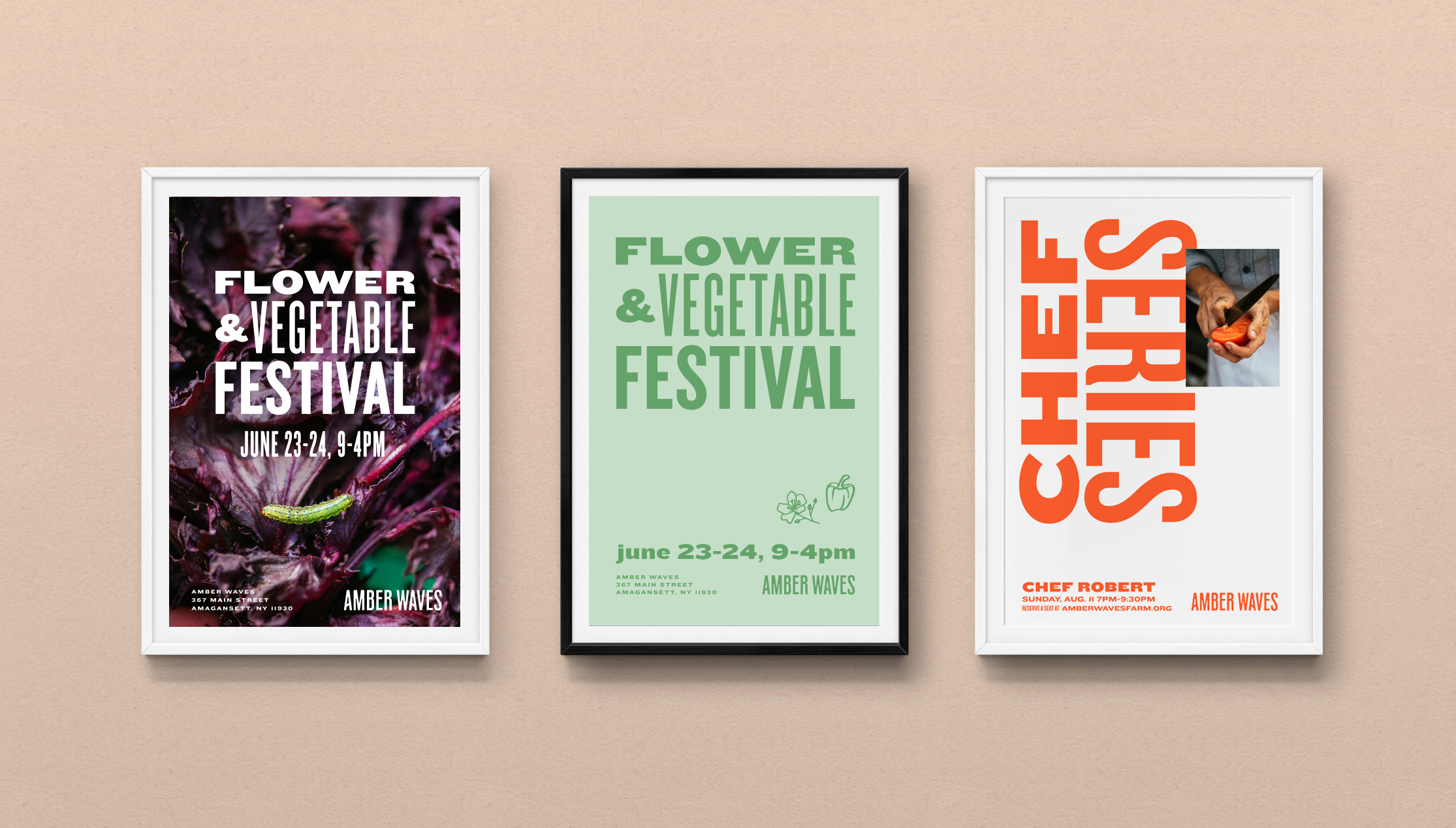
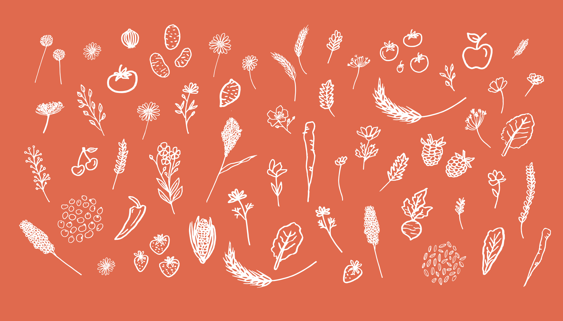
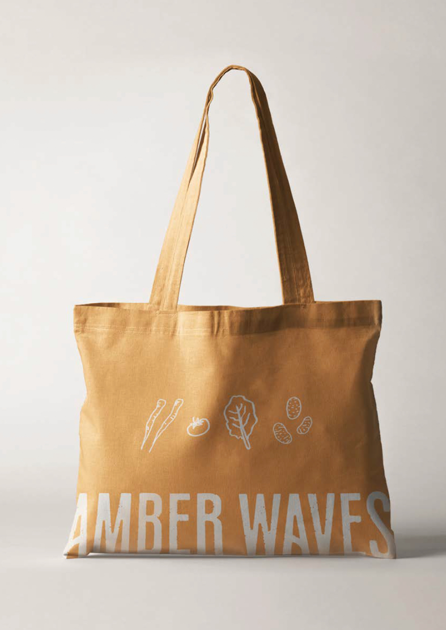
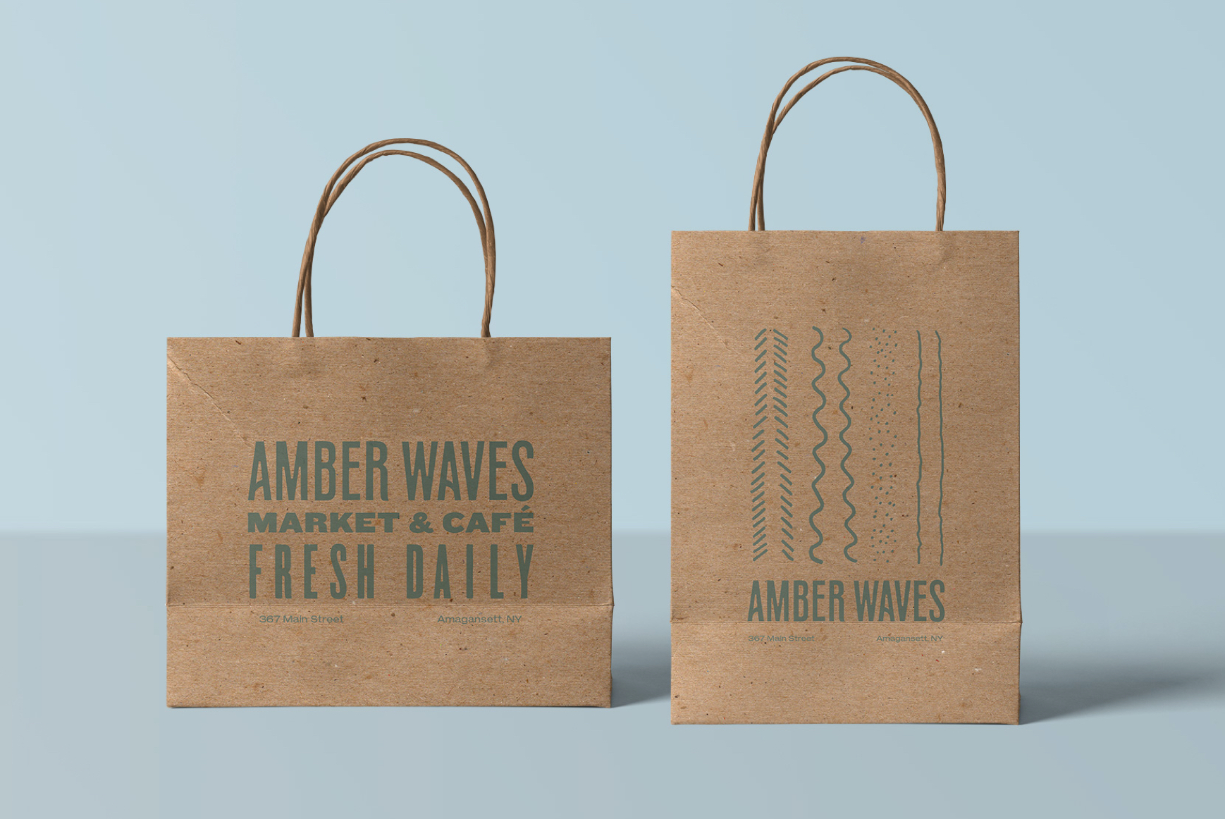
Custom illustrations featuring lighthearted line art add charm and nuance to printed collateral, posters, merch, and bags.

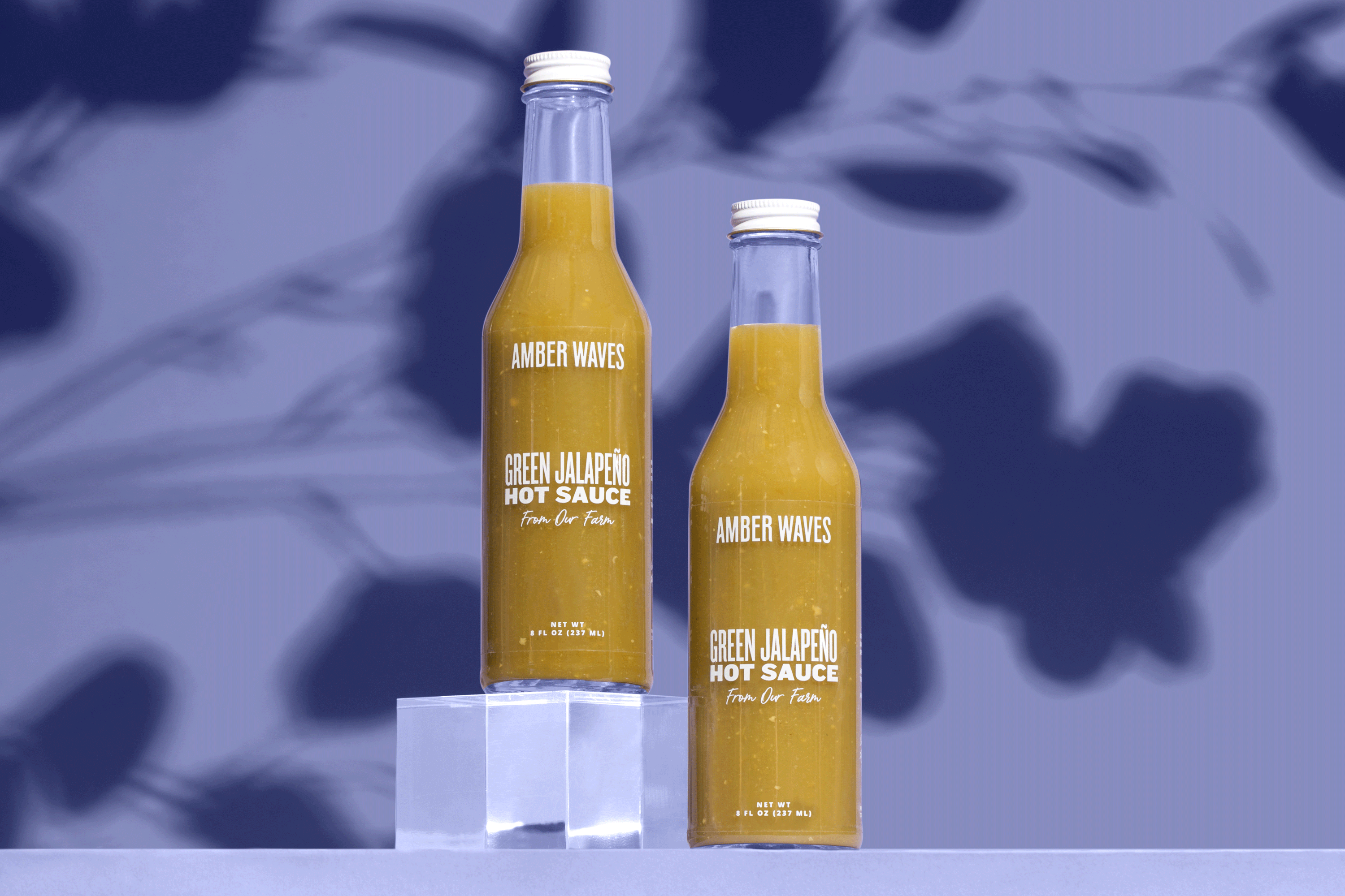
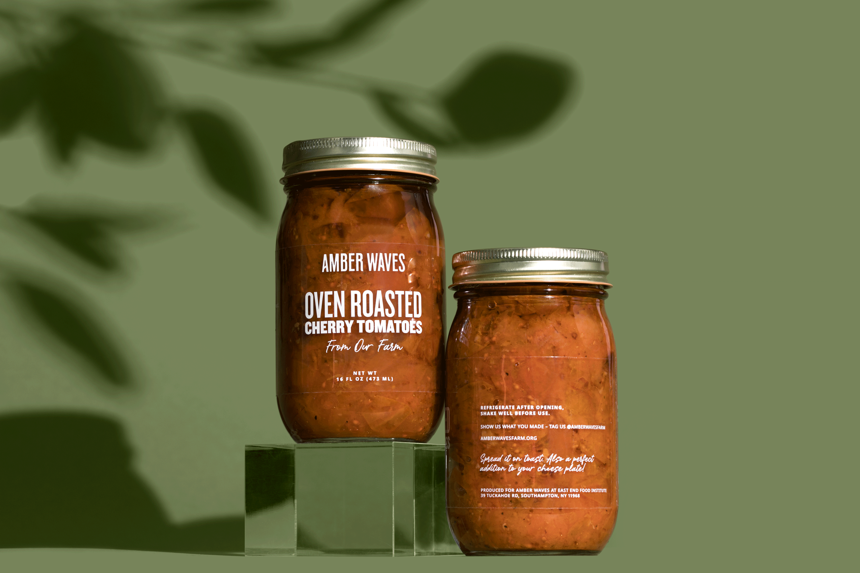
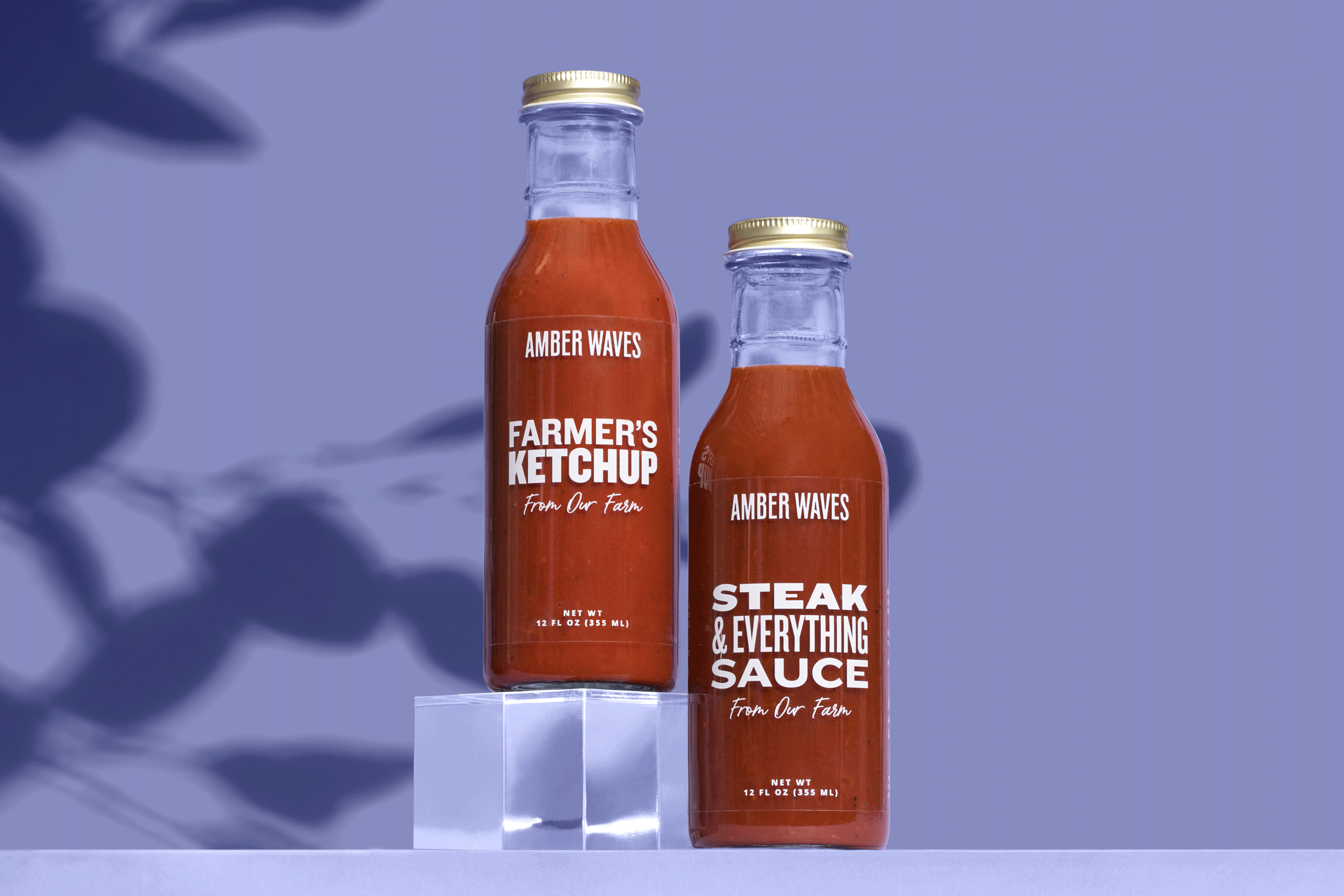
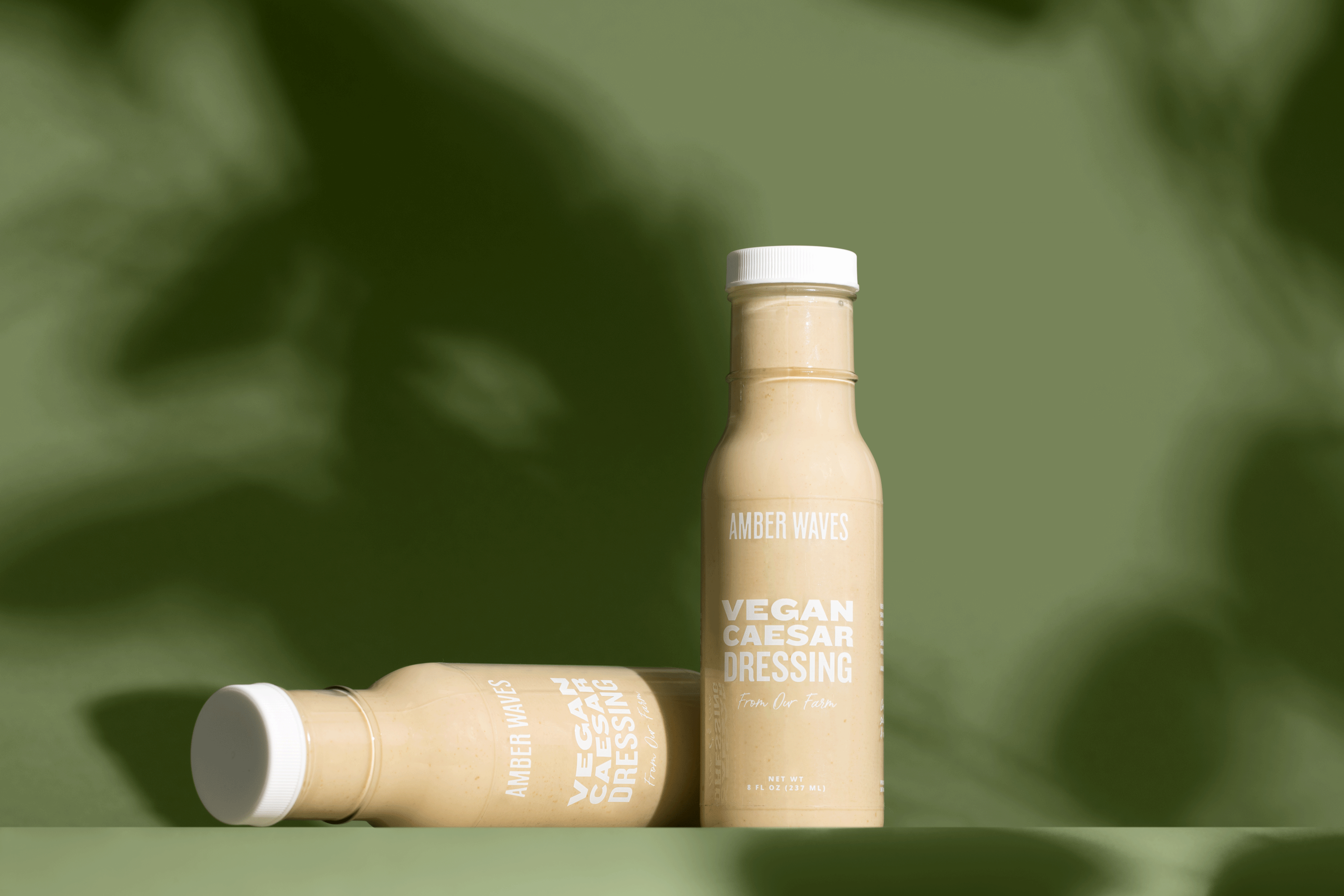
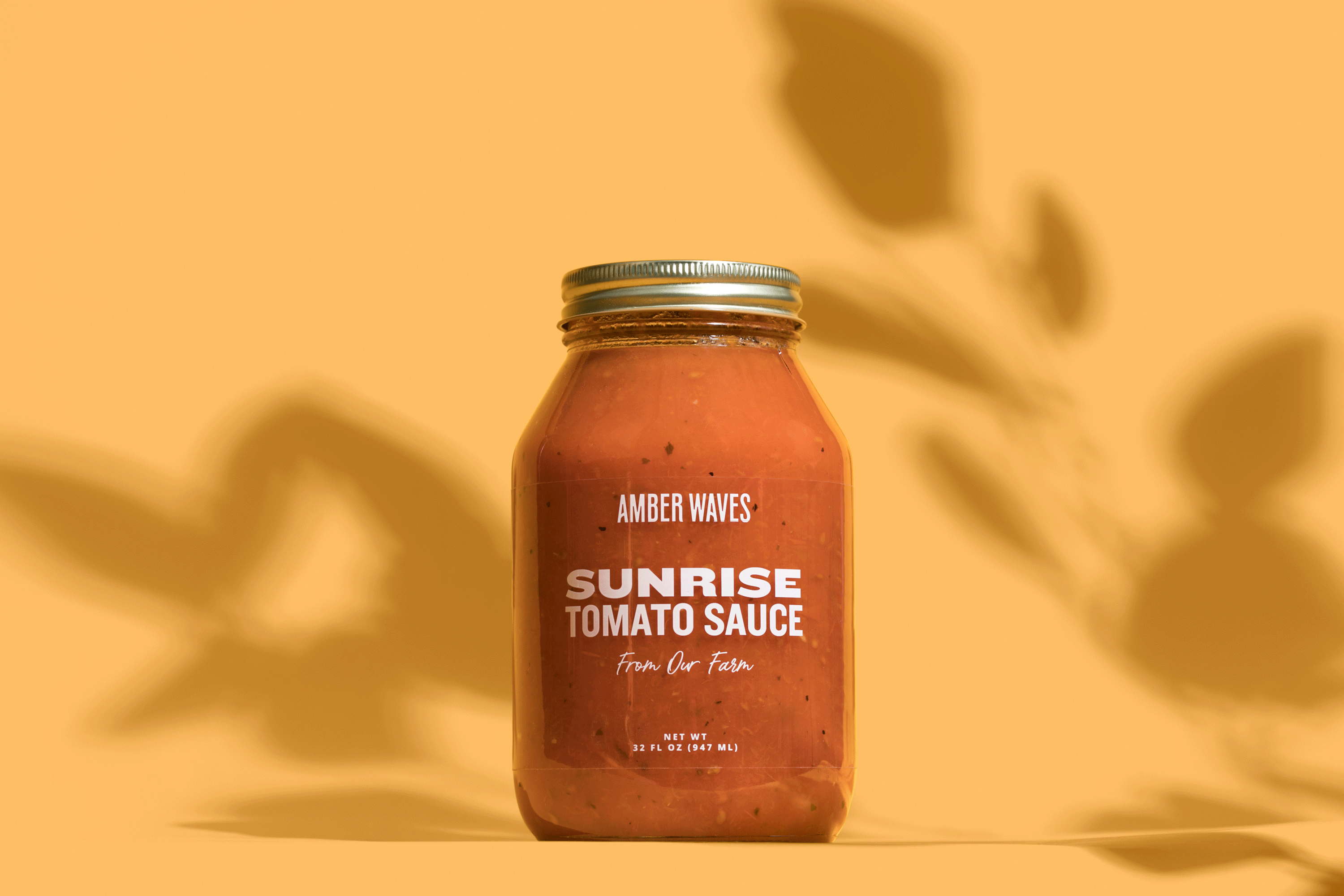
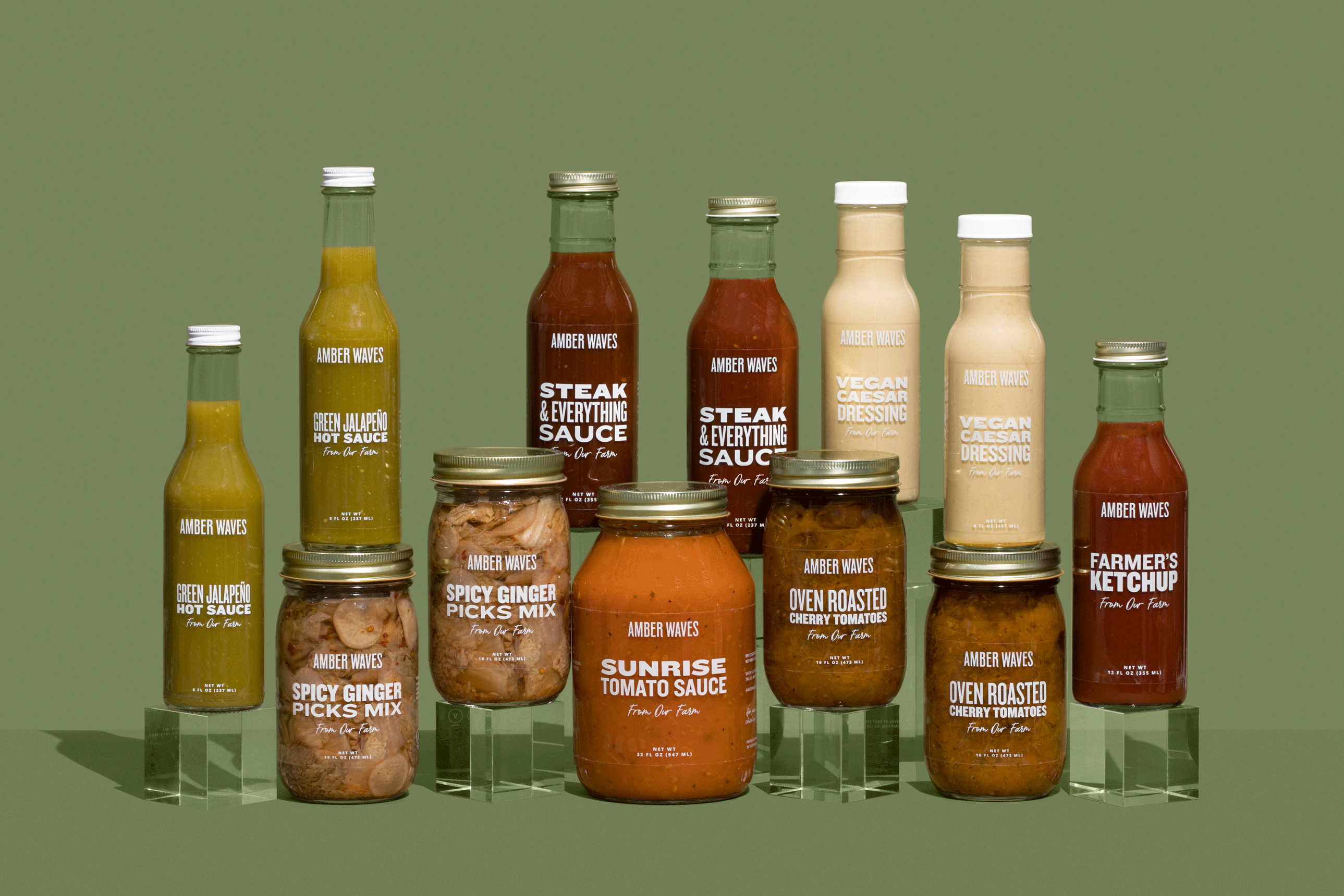
Our transparent label design showcases the farm’s heritage logo as a halo above the product name, allowing the ingredients to show through, celebrating the manifestation of the farm’s harvest - ready to enjoy at home!
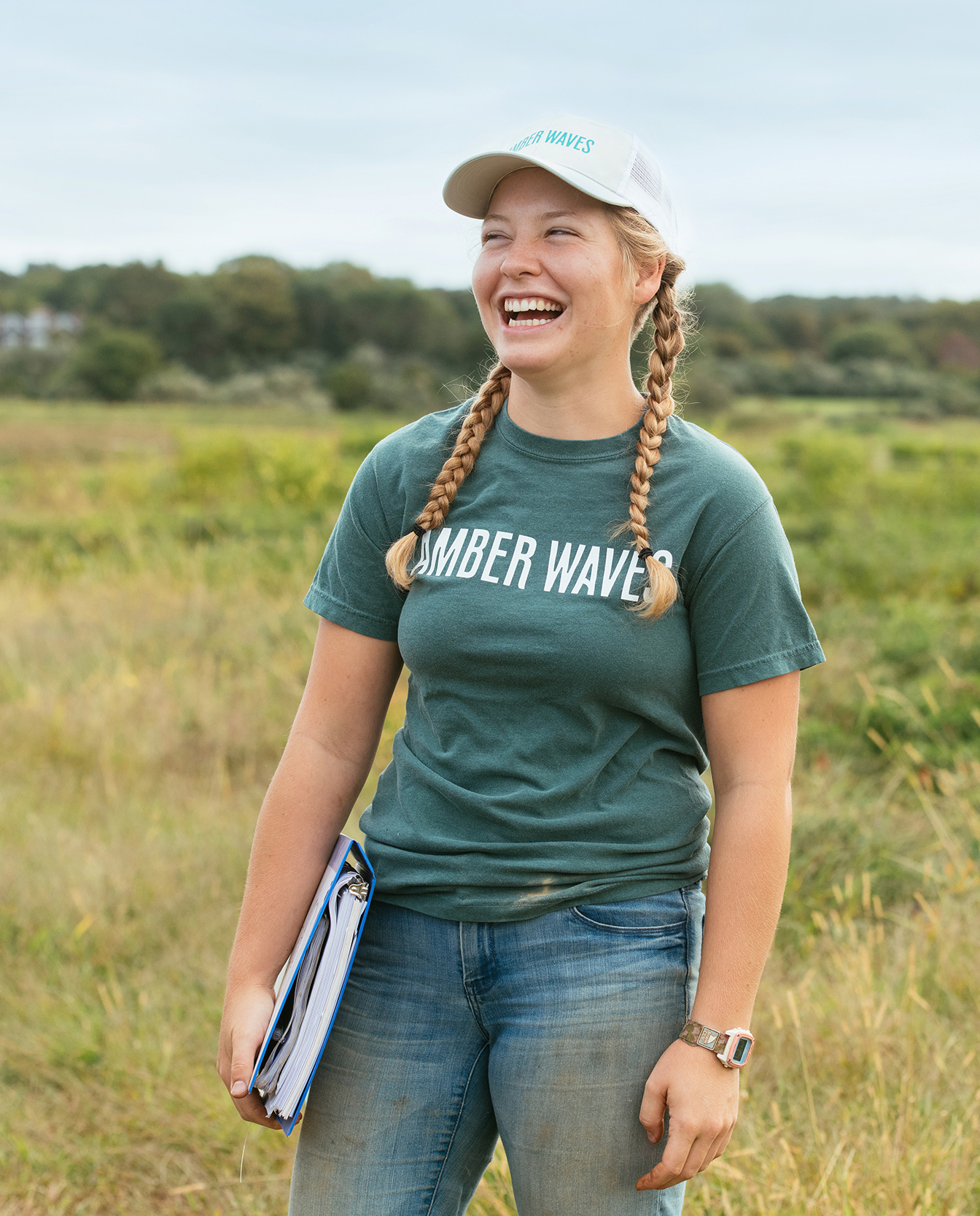
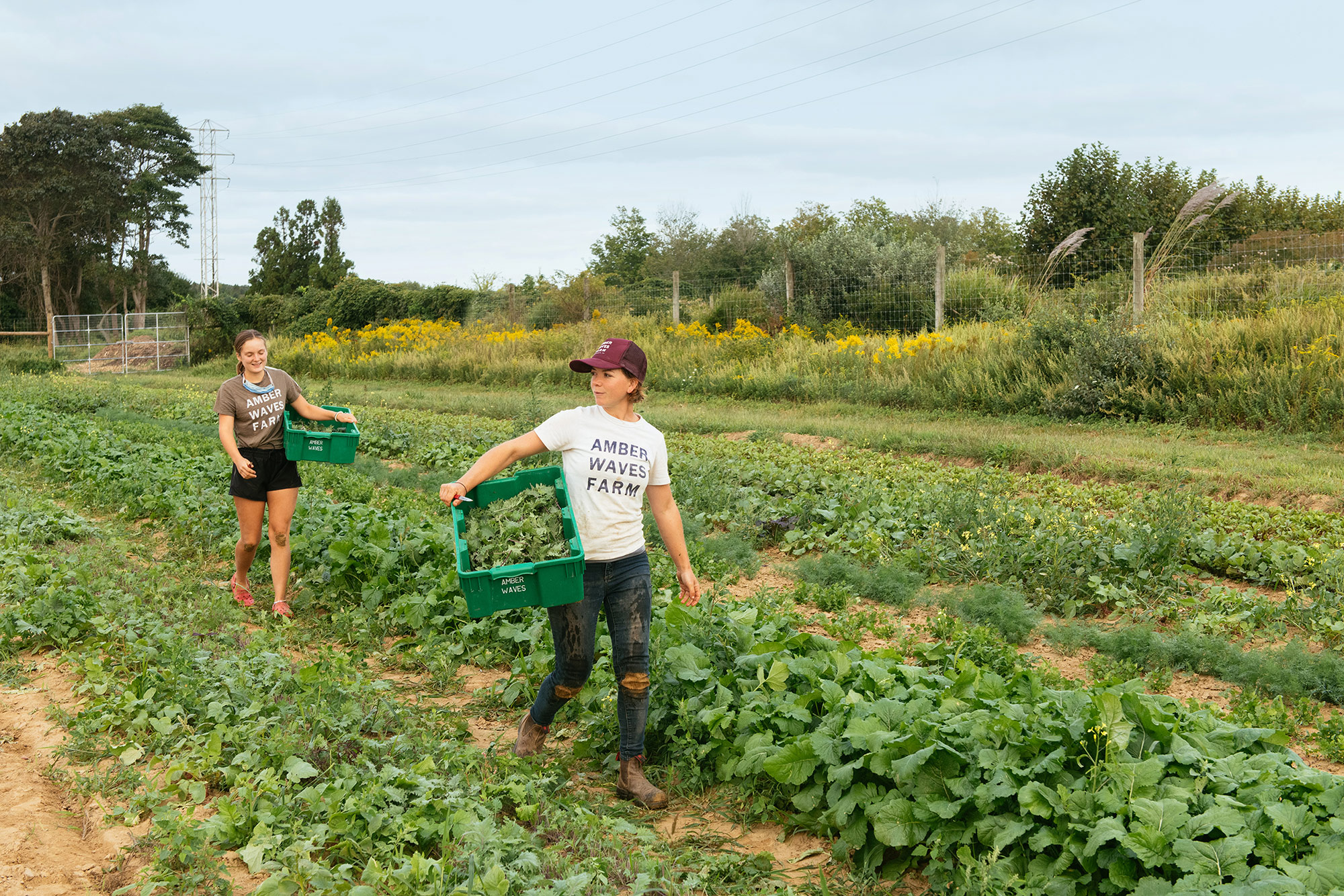
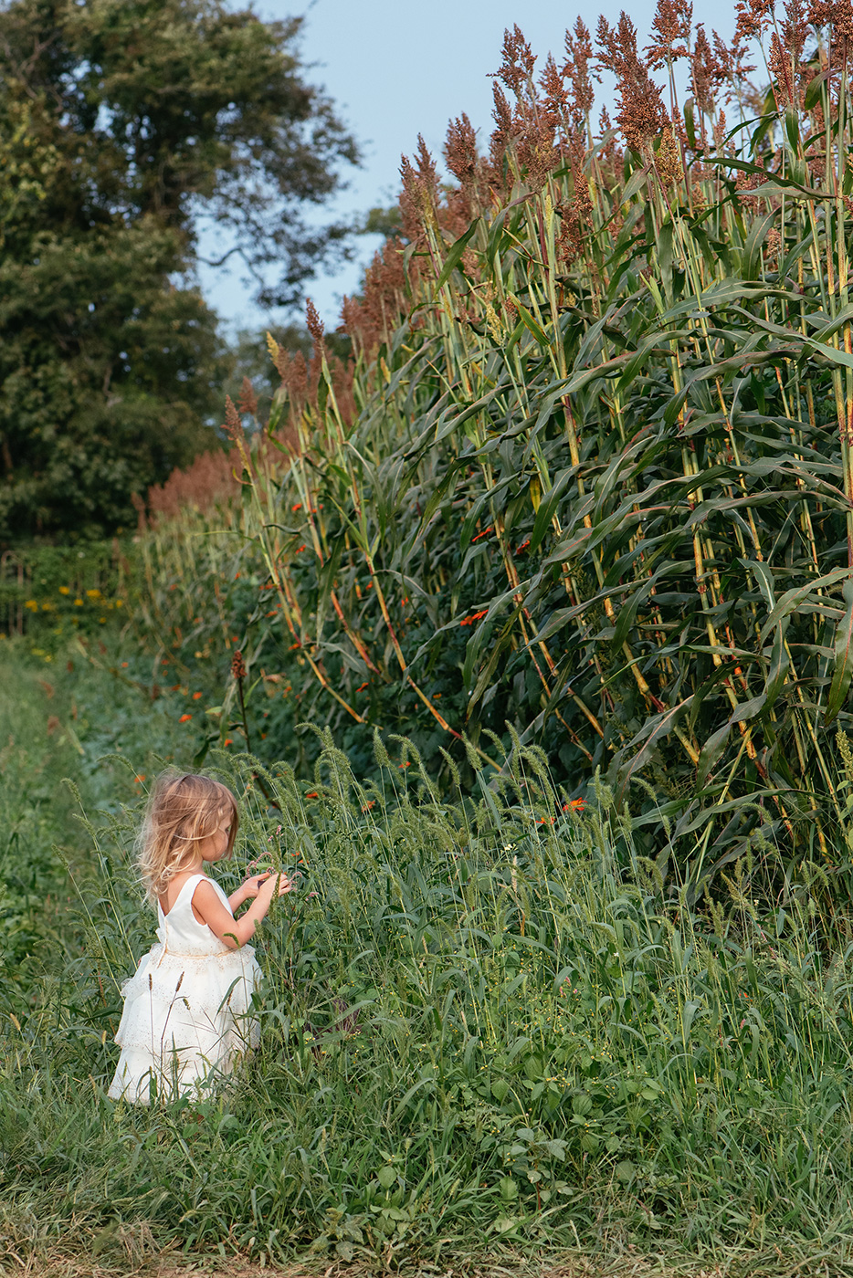
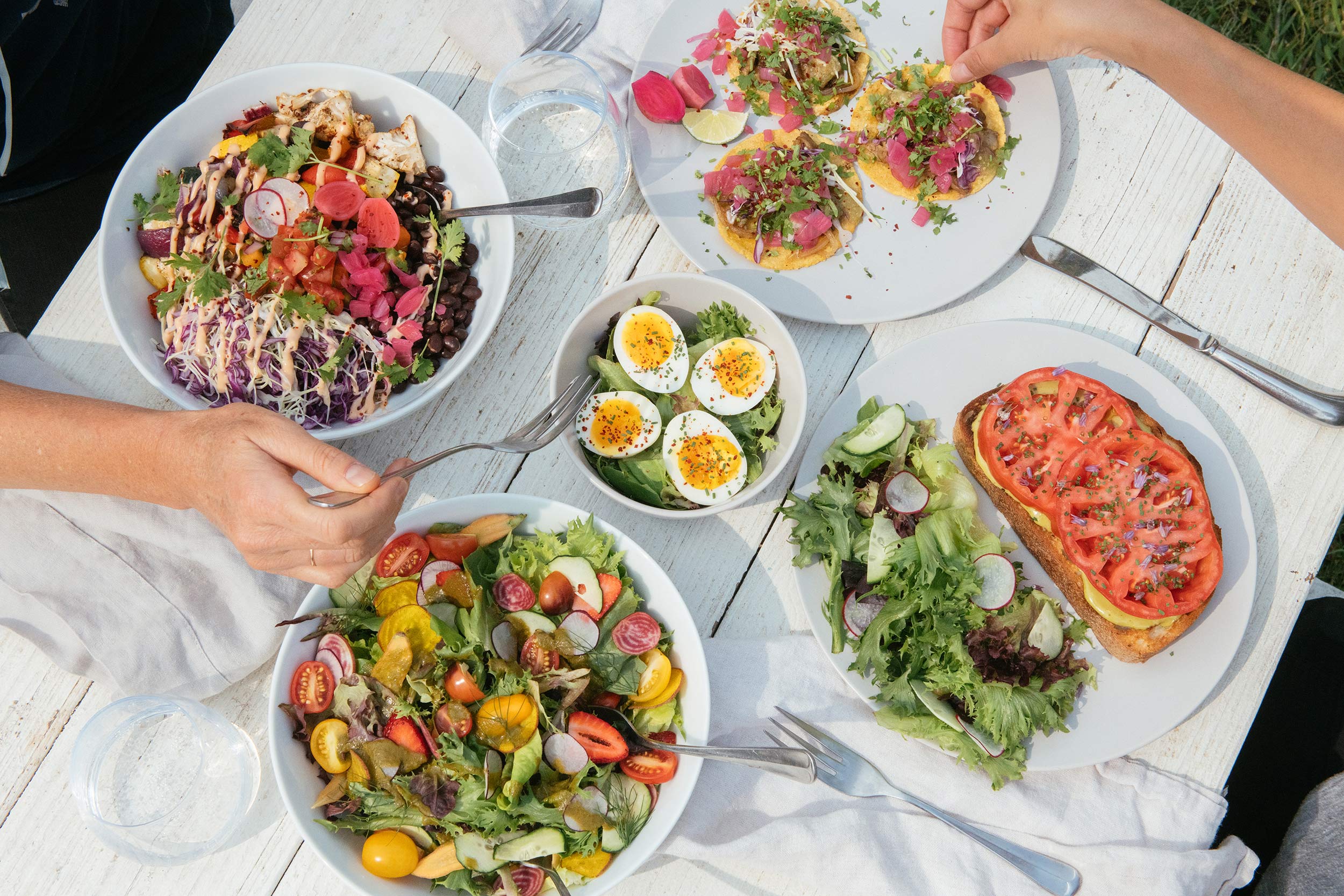
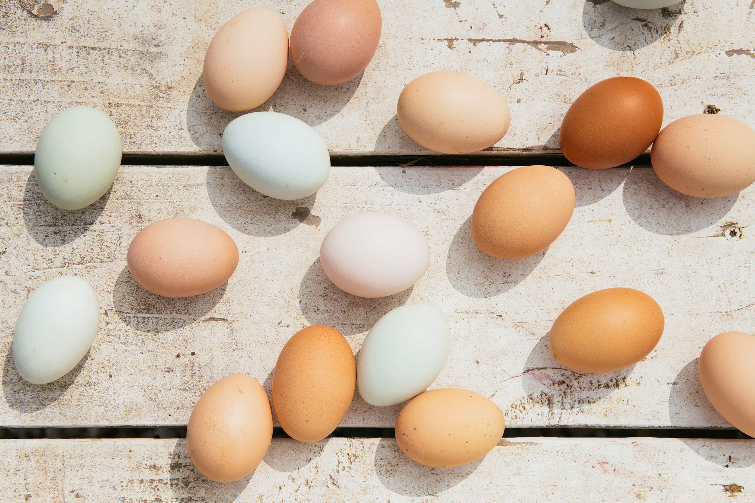
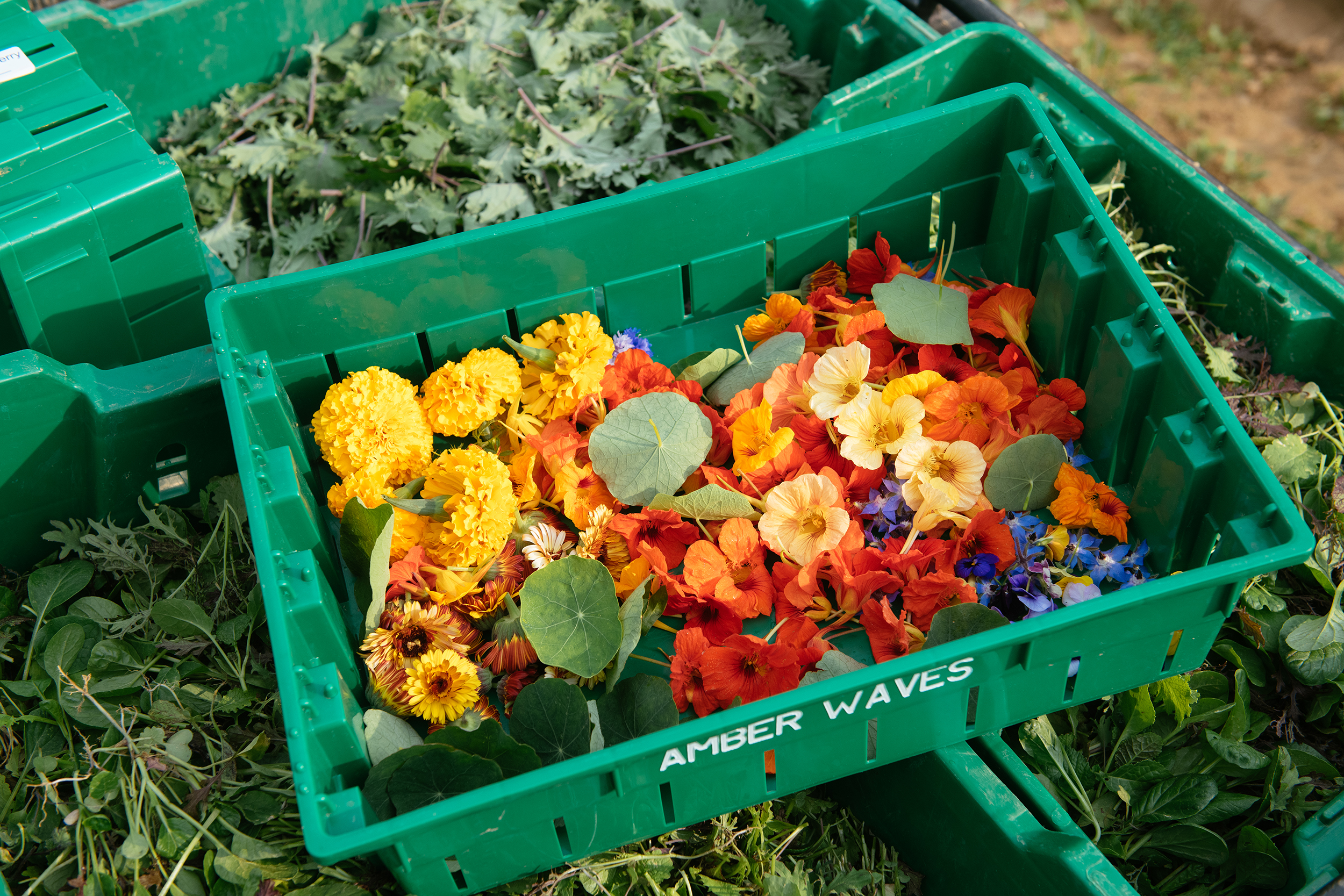
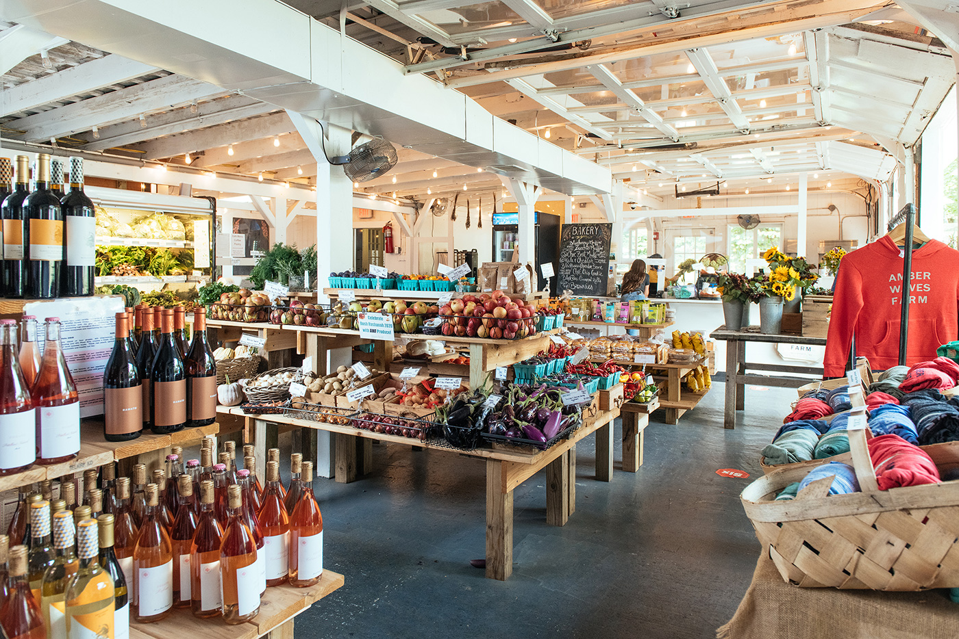
Our photography style, shot by Gabriela Herman, beams with natural light and focuses on the land, the food, the people, and the magic experienced at Amber Waves.
Building brands that
defy convention with sophistication.
Stay in touch.
© 2026 MA'AM Creative, LLC | MA'AM is a registered trademark of MA'AM Creative, LLC.
