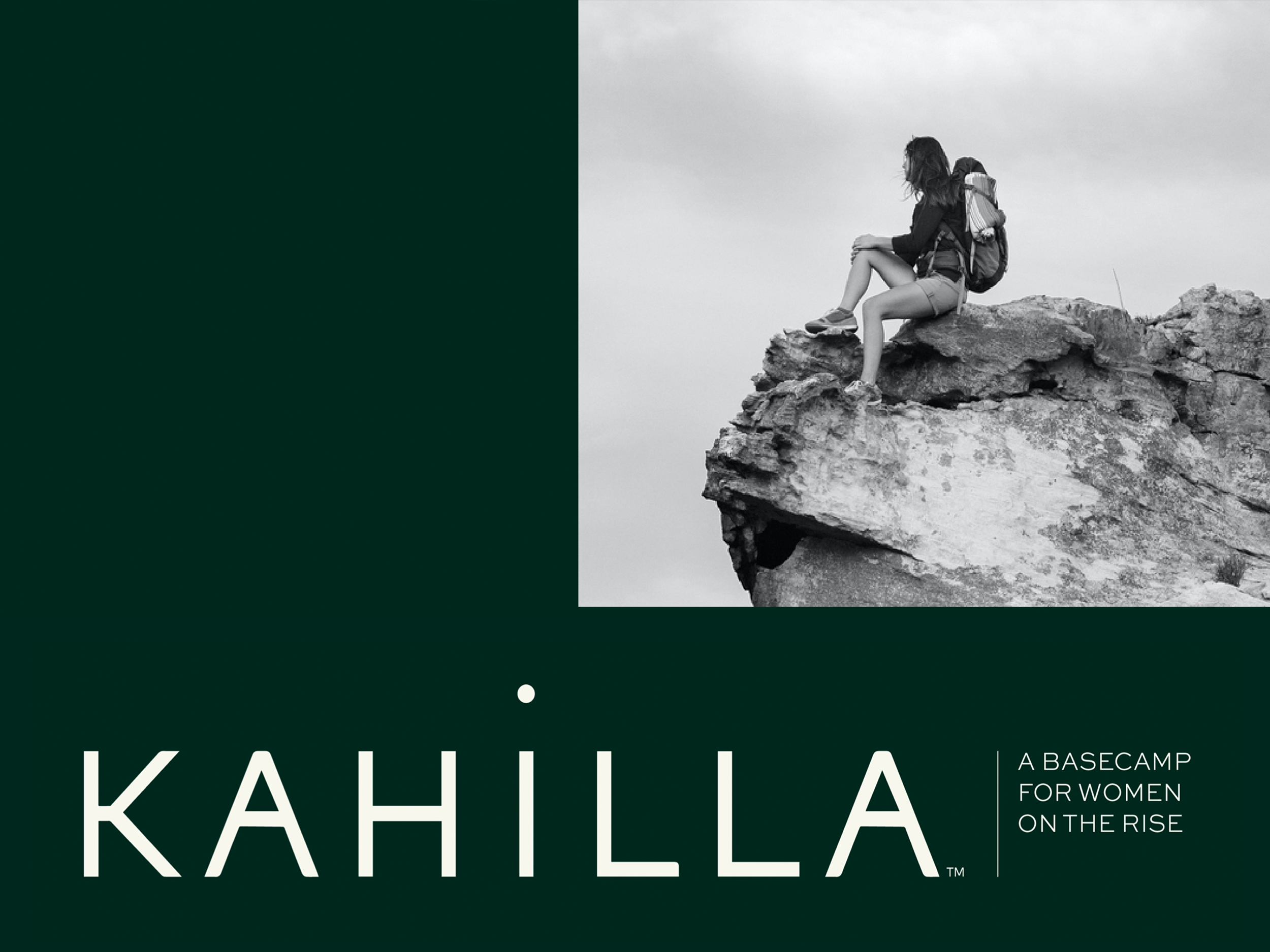
Kahilla
THE GOODS
Messaging Strategy & Copywriting
Visual Identity
Collateral Design
Website Design & Copy
Art Direction
Digital Templates
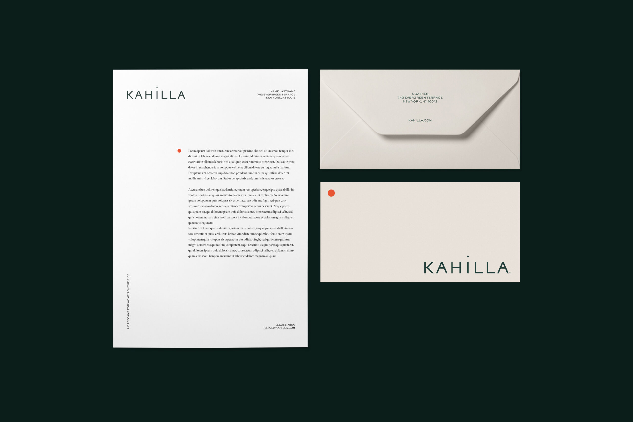
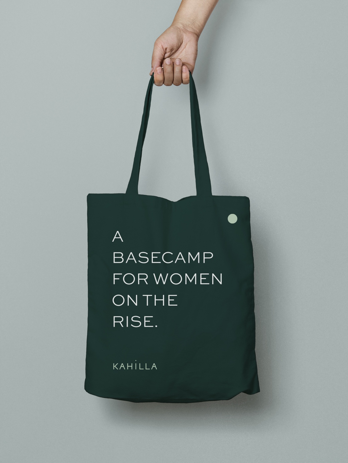
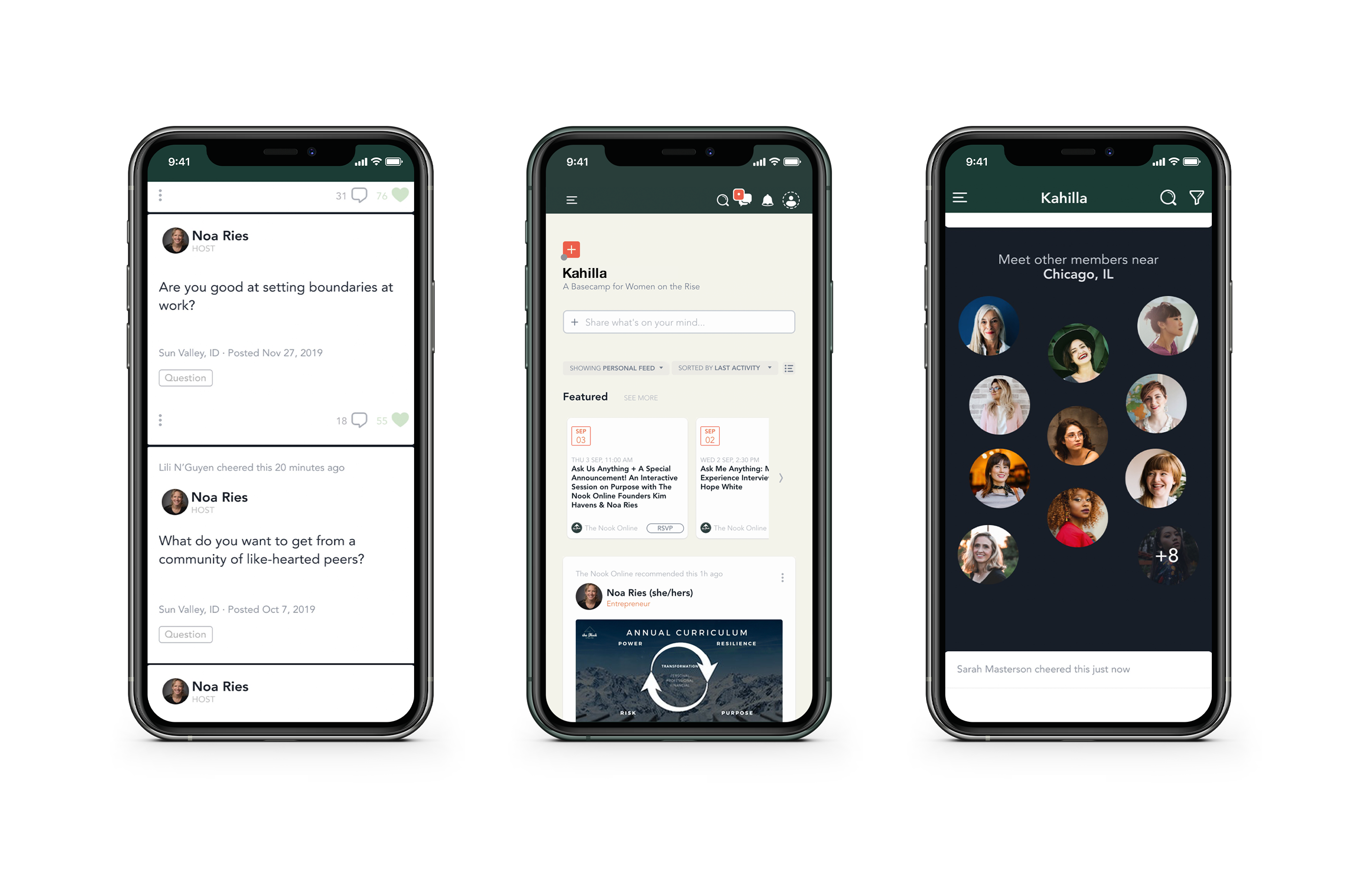
As The Nook Online’s founders prepared to scale their business model, they enlisted us to develop an identity to align with their company’s new name: Kahilla, which refers to a group of people united by a common goal. Starting with branding and extending into design, communications strategy, and messaging across all collateral — including Kahilla’s website — we articulated the company’s commitment to empowerment and inclusivity.
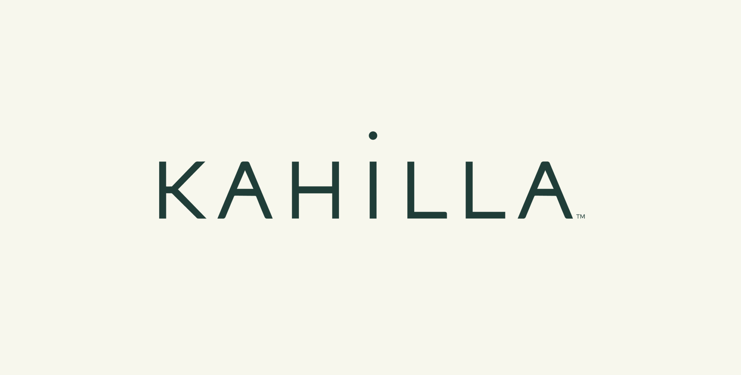
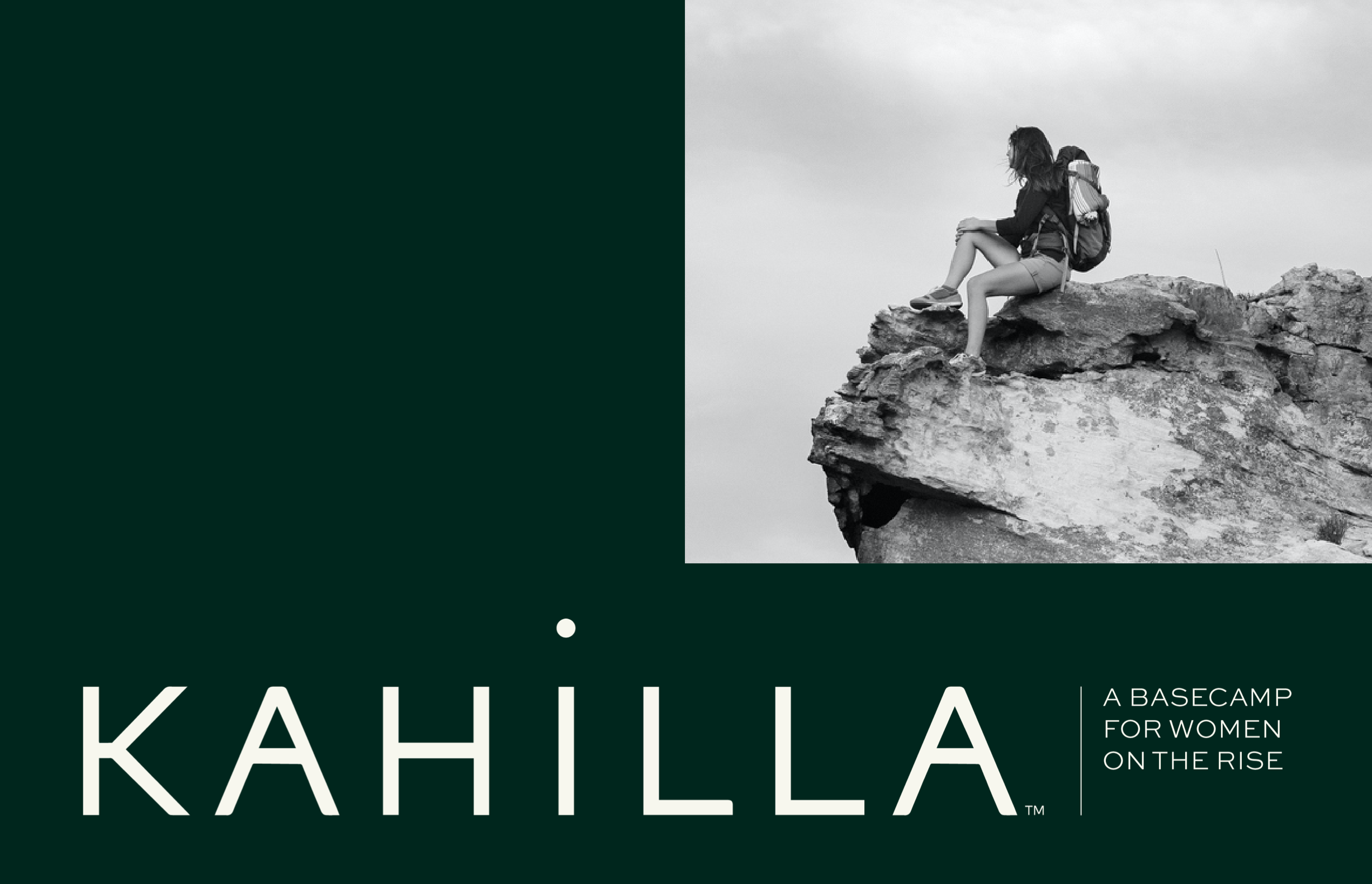
The Kahilla logo embodies community. Its solid, block letterforms imbue the wordmark with a strong and balanced foundation, while the elevation of its members is signified by the dot of the the “i” rising above its base. Together, these elements express Kahilla’s identity as a “basecamp for women on the rise.”
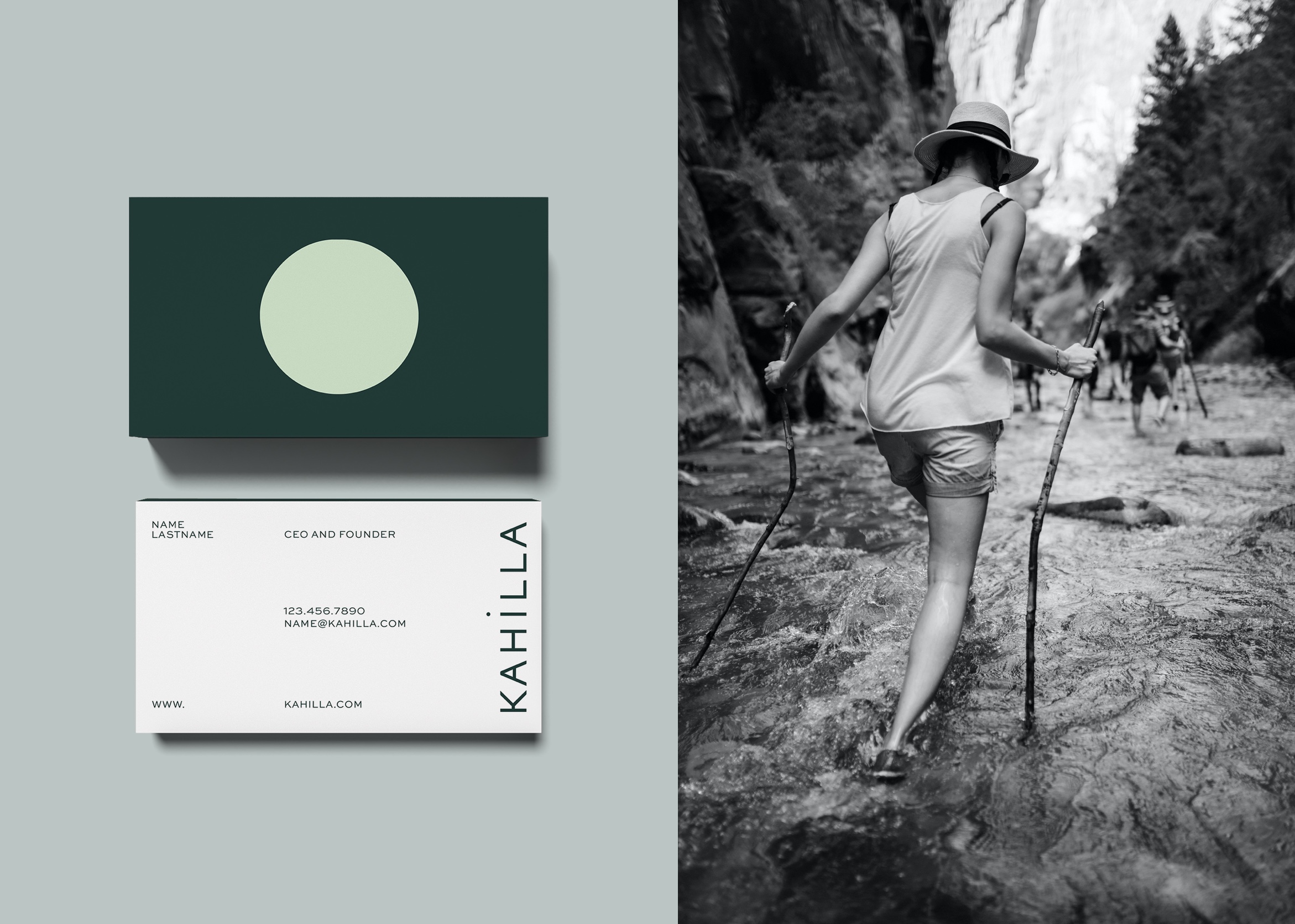
Similarly, the brand icon (a circle) symbolizes the Kahilla basecamp and serves as a visual distinguisher, leading viewers on a webpage, highlighting headlines, and adorning foundational brand collateral.


We also developed email templates to communicate events, monthly schedules, and community support.


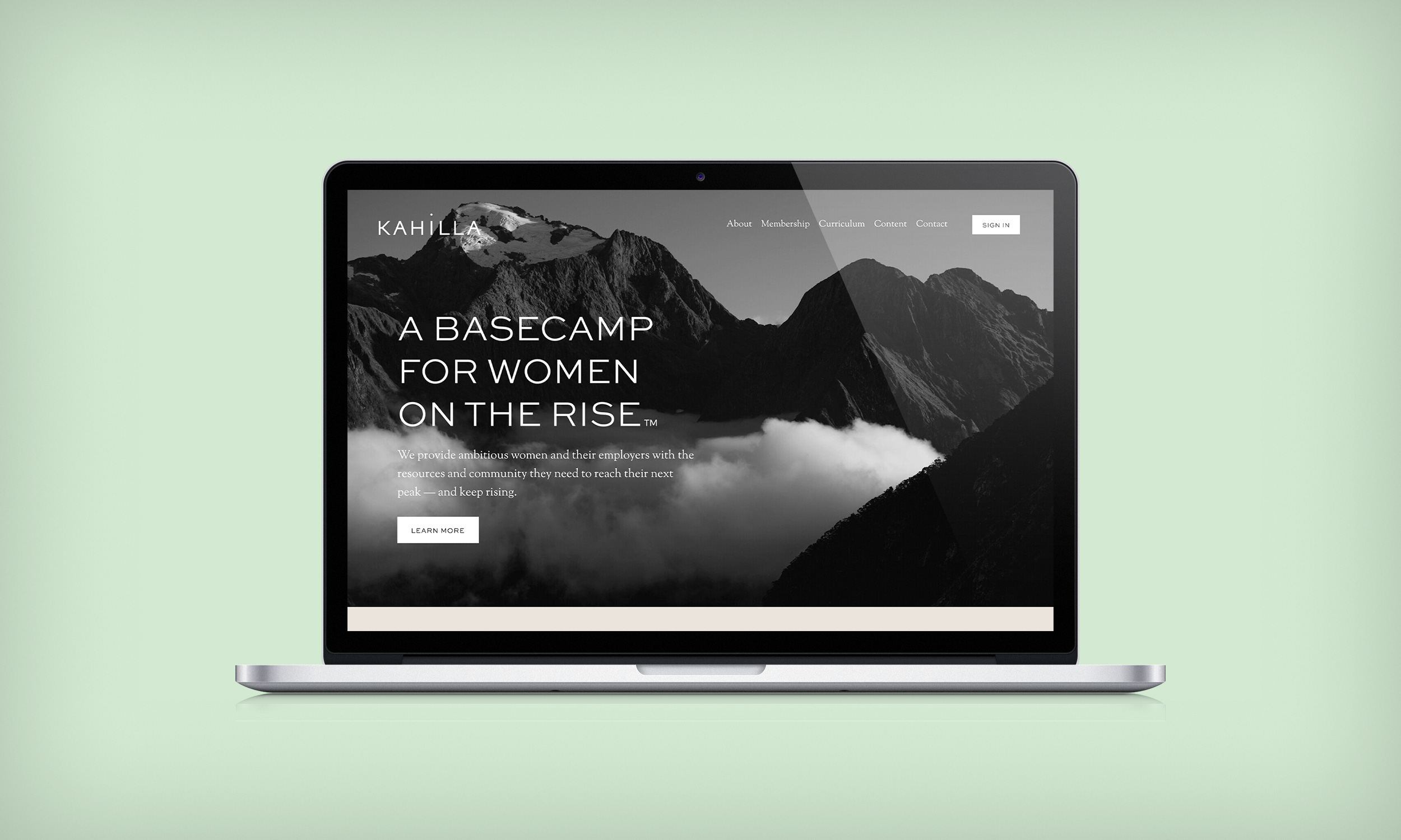
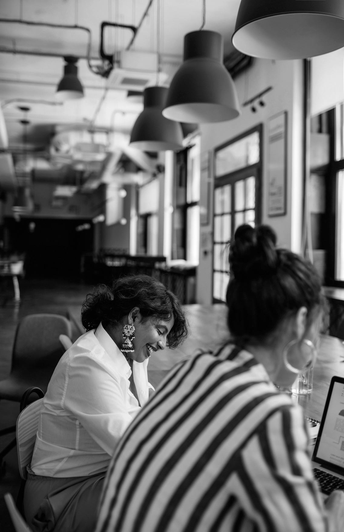

Finally, to underscore Kahilla’s strong ties to both community and nature, we developed a directional photography approach that pairs black and white imagery with colorful accents drawn from the brand’s new color palette.


Building brands that
defy convention with sophistication.
Stay in touch.
© 2024 MA'AM Creative, LLC | MA'AM is a registered trademark of MA'AM Creative, LLC.
