
Marriott Design Lab
THE GOODS
Brand Strategy
Naming
Tone of Voice
Visual Identity
Brand Guidelines
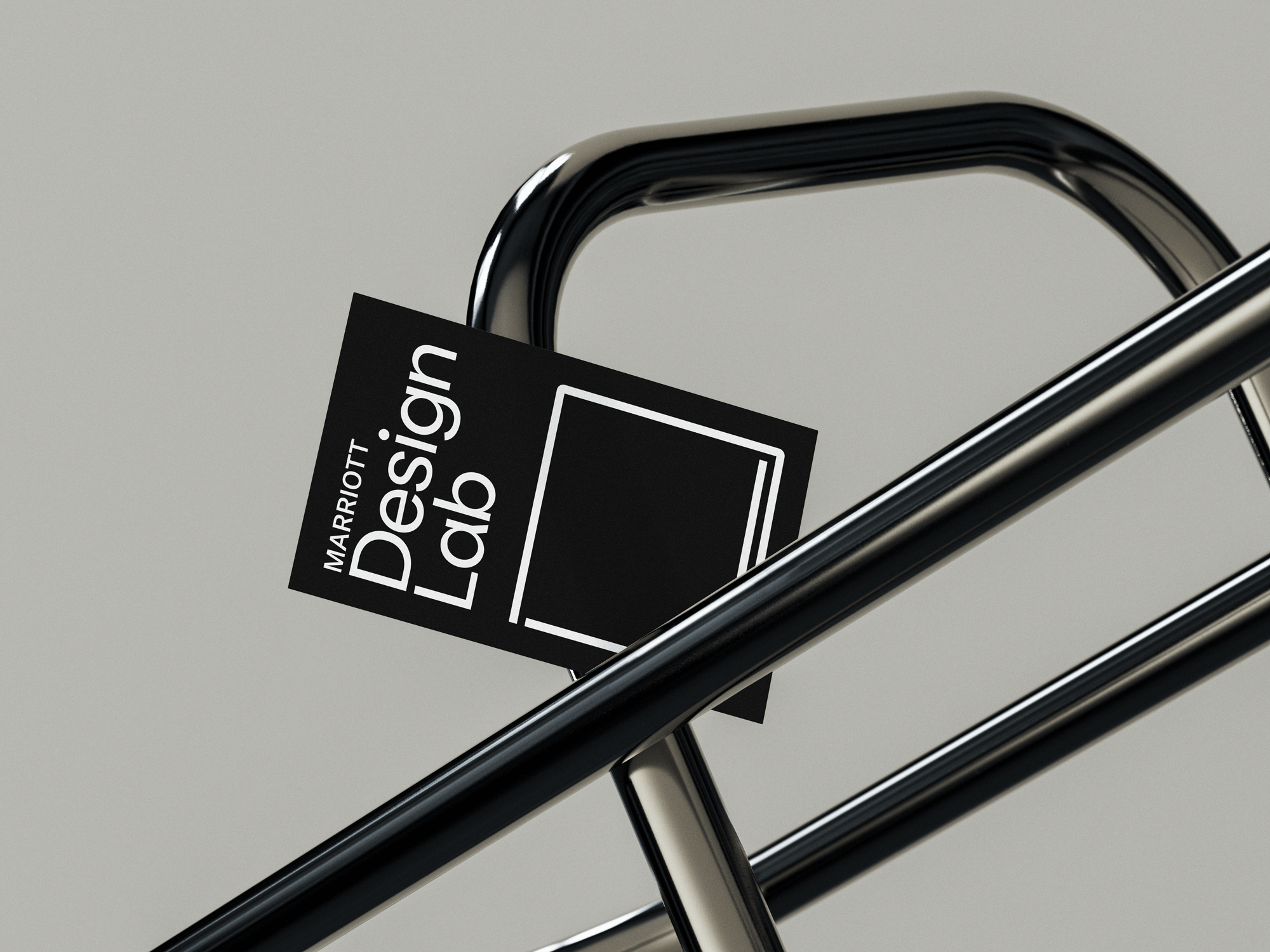
As the largest hospitality company in the world, Marriott International is poised to define the future of the industry. We partnered with the Global Design Strategies team to develop the strategy, naming, and visual identity for their design lab, leading guest experience and tech innovation for the organization.
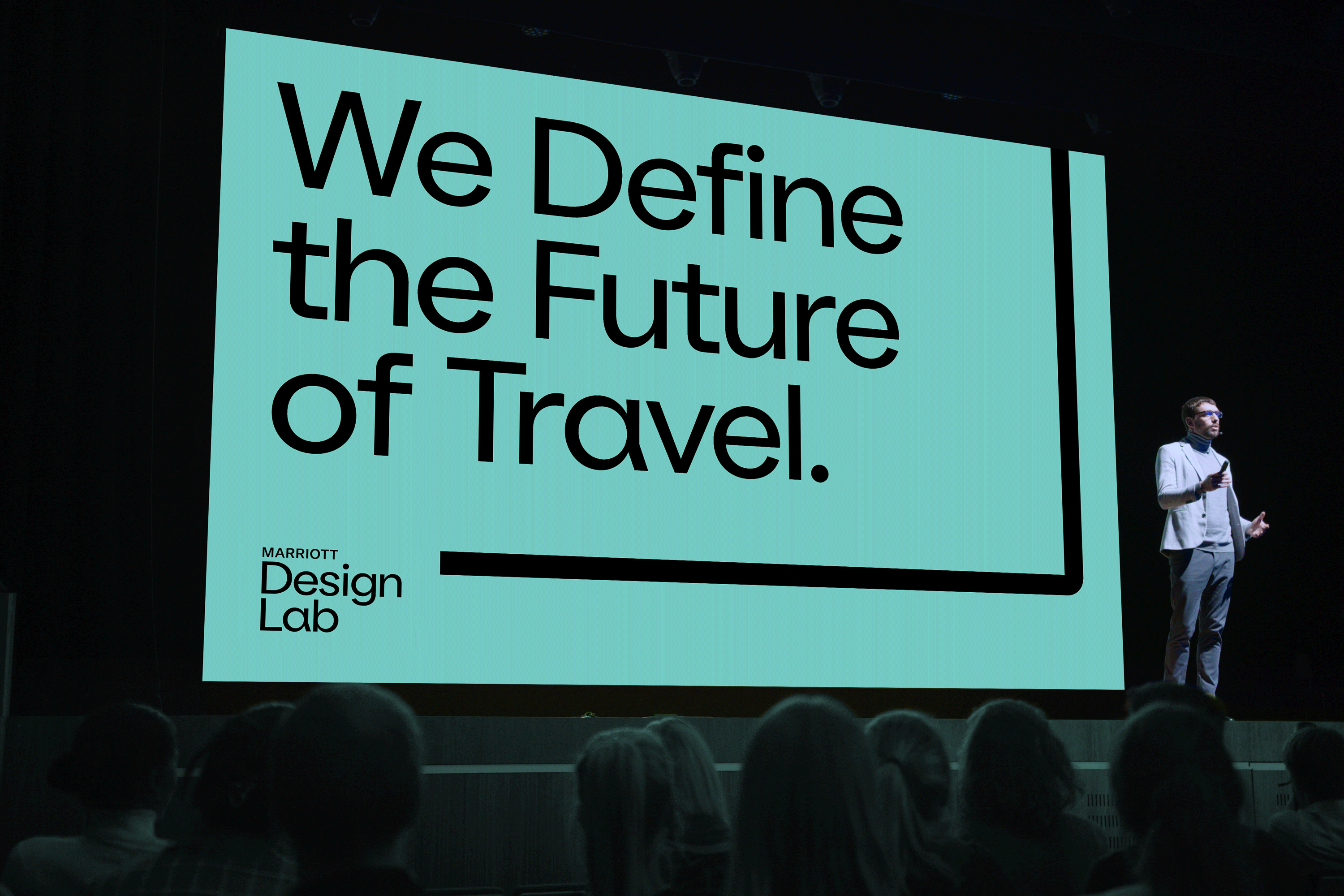
Our strategic territory, “the future of travel,” places Marriott at the center of this endeavor. Industry expertise, responsible data, and strategic partnerships come together to set the groundwork for what will make travel even more memorable.
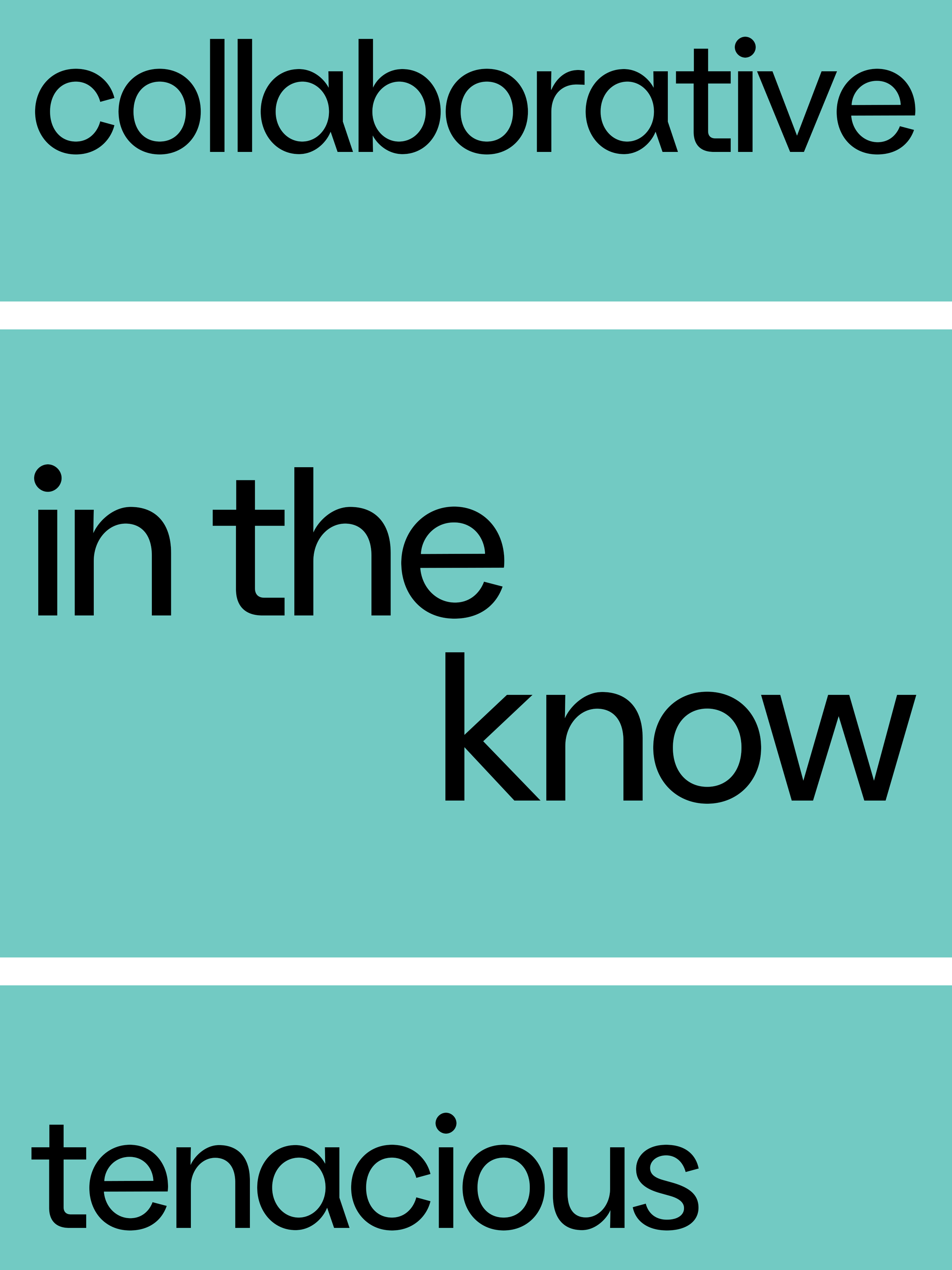
We built the brand story around this idea and developed core values to set the tone for all involved in bringing concepts to market. With tonal values like ‘in the know,’ ‘collaborative,’ and ‘tenacious,’ the brand voice is balanced yet self-assured.
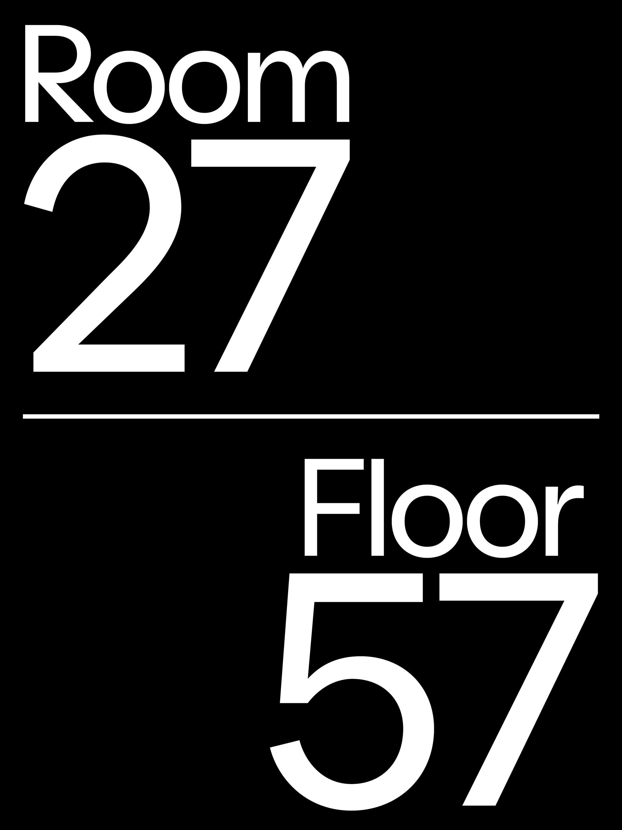
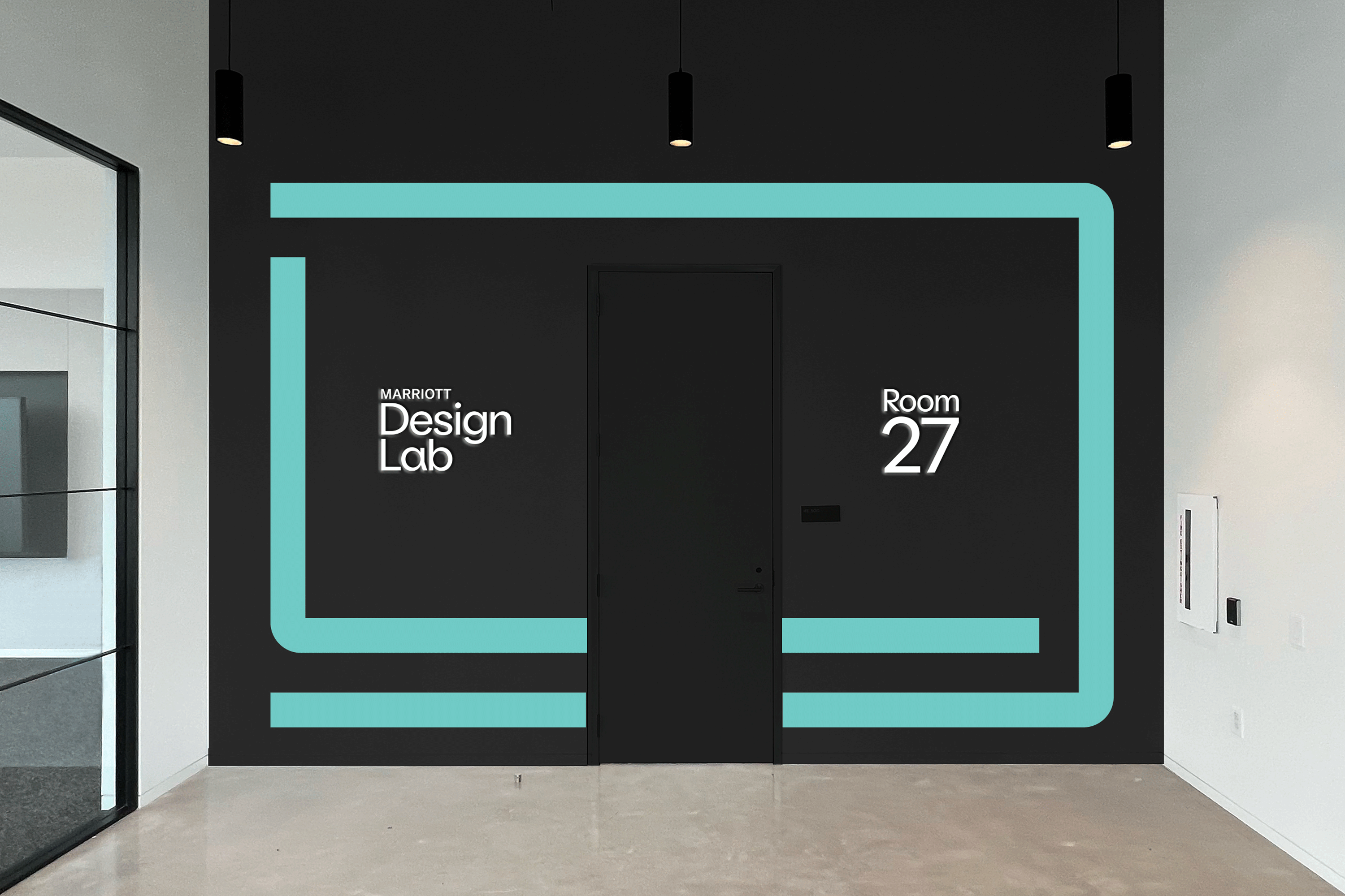
To round out the strategy we created a naming system for the physical spaces in their new corporate headquarters. The R&D space is ‘Room 27’ as a nod to company’s founding in 1927. ‘Floor 57’ for 1957, when the first Marriott hotel was opened, is the guestroom testing space.
The visual identity was inspired by the idea of the white space or white box where research and development happens. It’s a blank canvas, a dynamic space where ideas grow and contract, where solutions are tested and refined, where there is no limit to possibility.
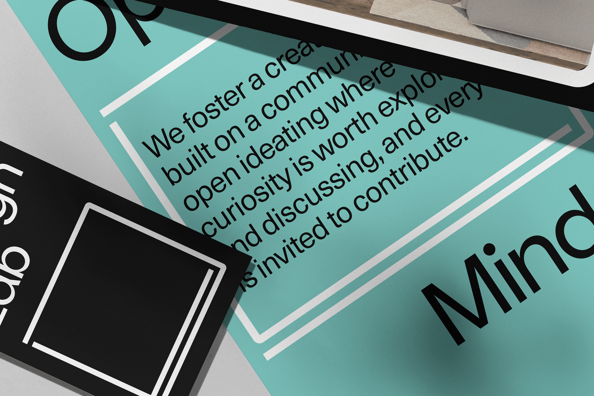
Using a DL monogram that recreates that physical space, we developed a system that highlights the information dynamically. The letters serve as brackets or a frame around important copy, or as a line graphic drawing your eye to content.
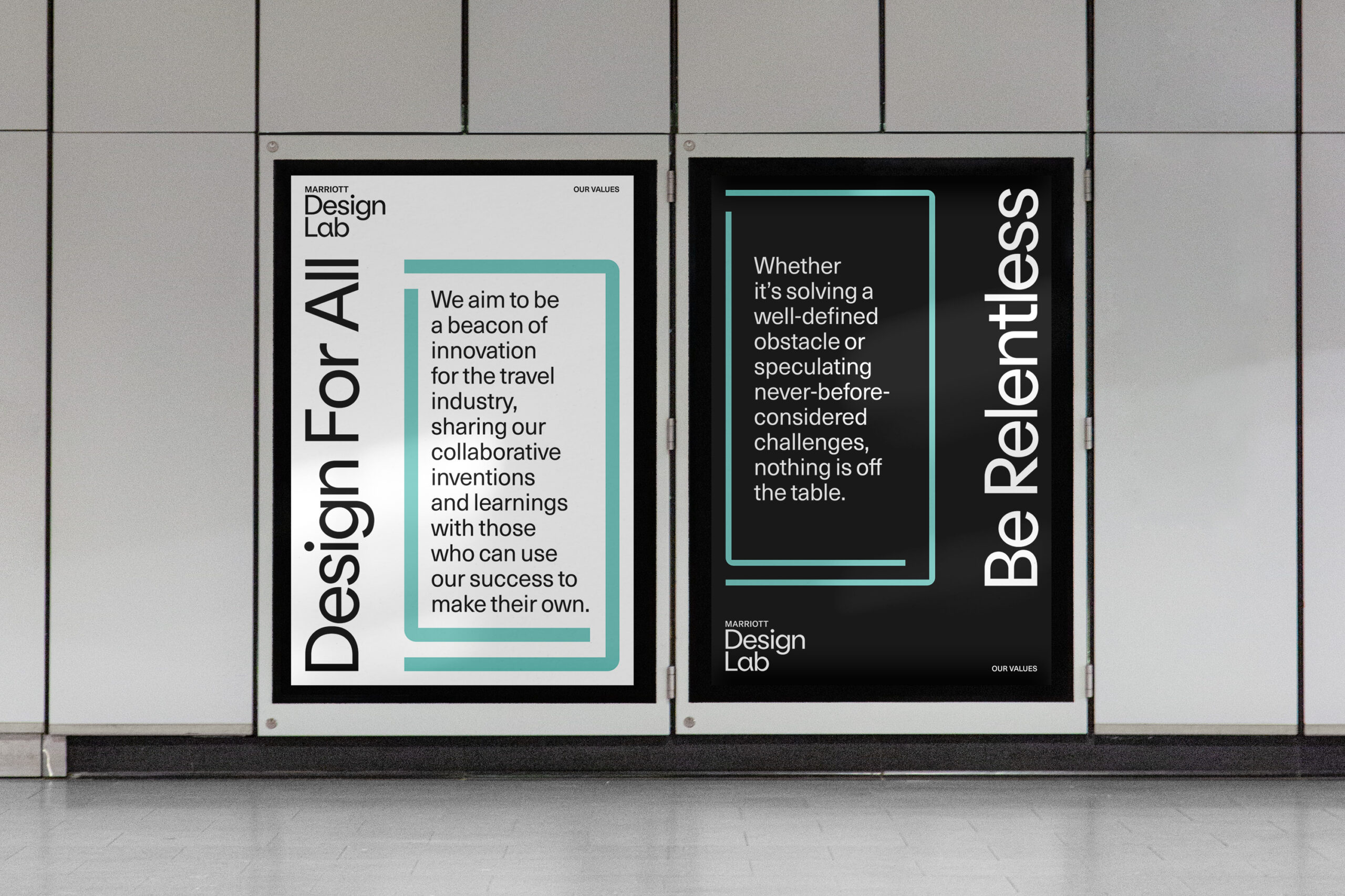
For typography we chose Oatmeal Pro as our primary typeface, for logo and headlines, and Neue Haas Unica as a secondary for body copy. Oatmeal Pro expresses curvatures of letters like "f" and "a" with a flair of personality, giving it a human element. This combines with the clean sans serif of Neue Haas Unica to make copy friendly and clean.
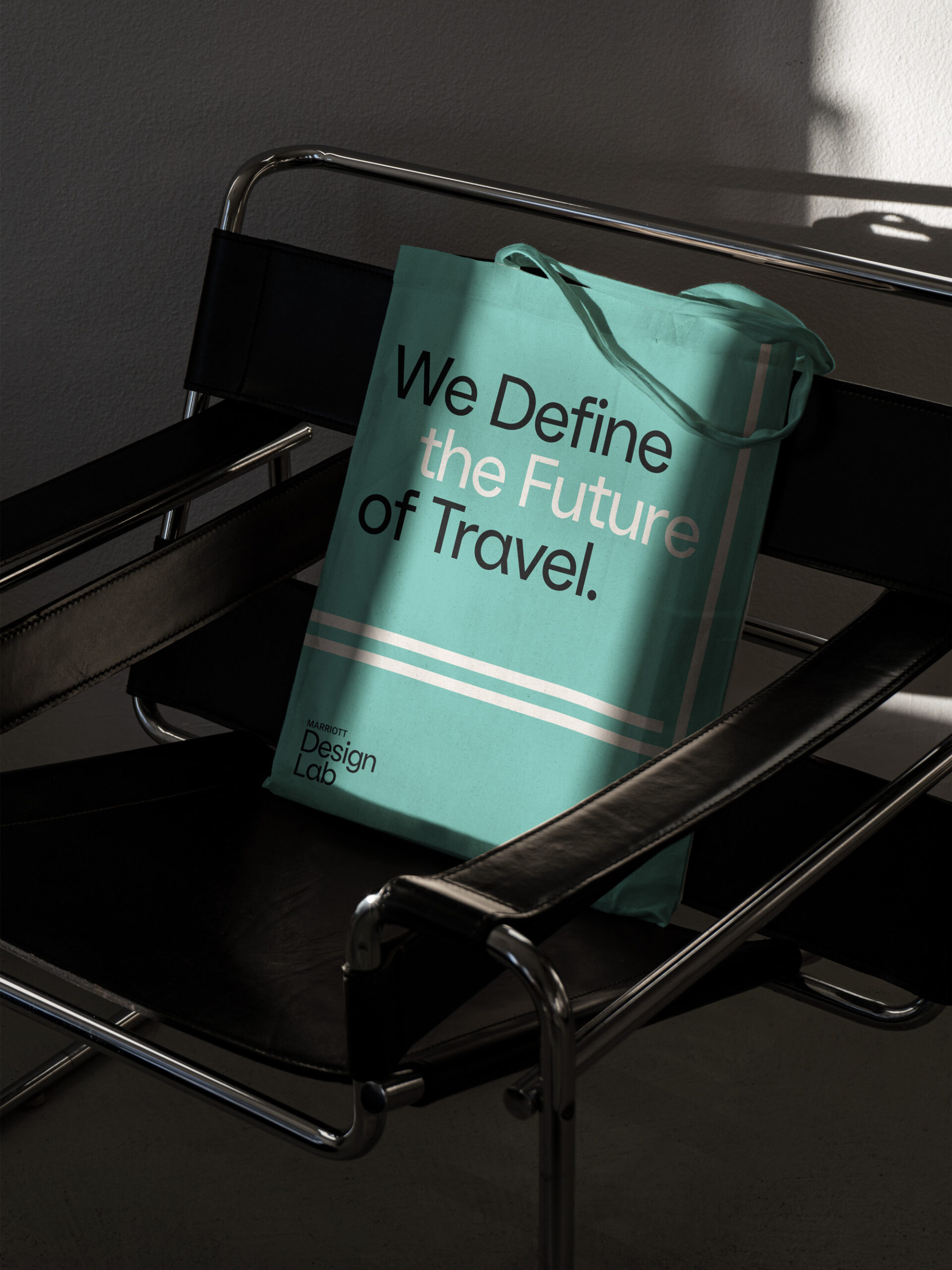
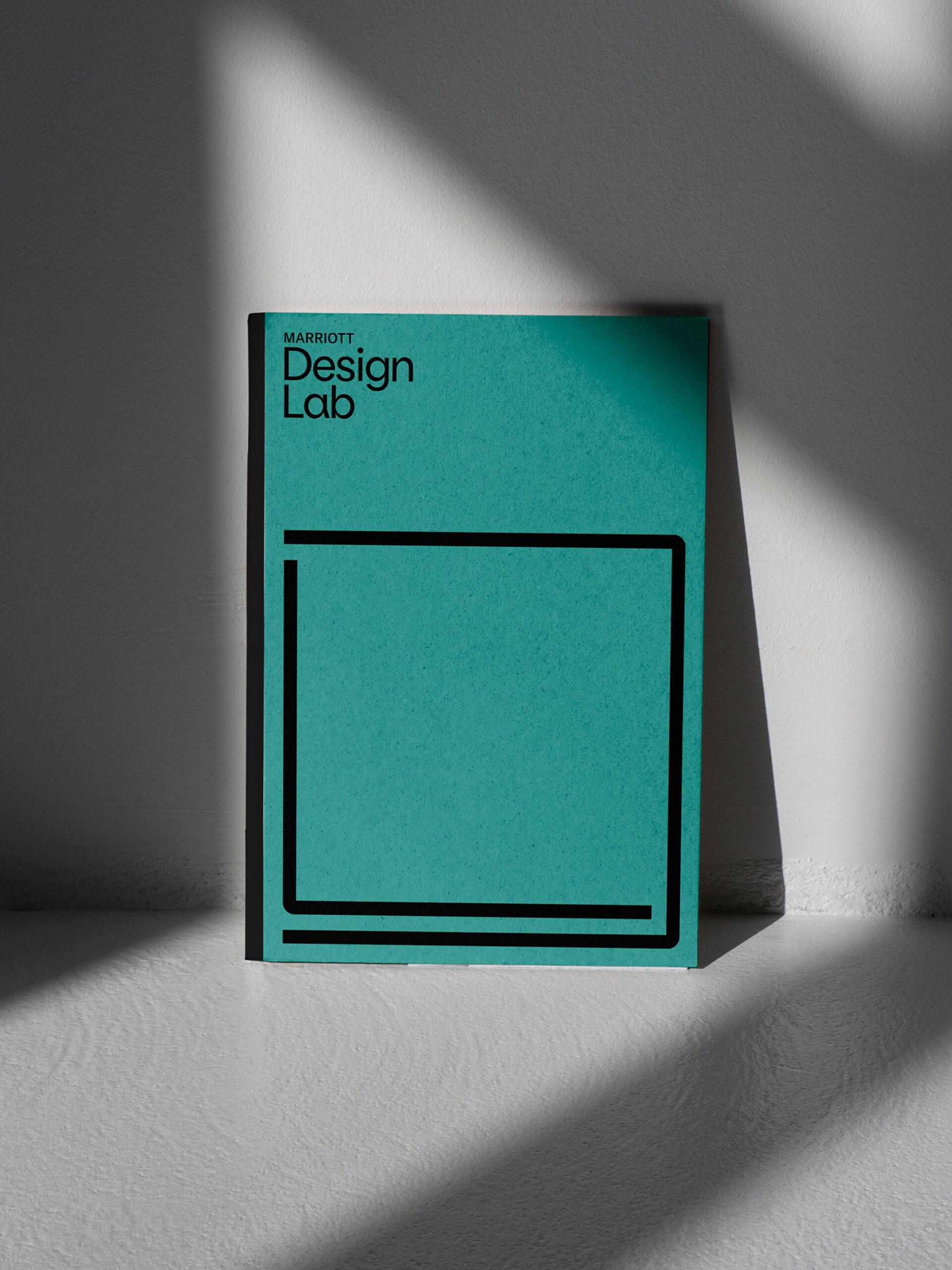
Blue Lagoon, our teal accent color feels fresh and unexpected when paired with simple black and white - allowing us to dial up the contrast or dial it down with a bright white background.
The identity system is responsive to the content in focus and reflects the ever changing process of developing new ideas.
Building brands that
defy convention with sophistication.
Stay in touch.
© 2026 MA'AM Creative, LLC | MA'AM is a registered trademark of MA'AM Creative, LLC.