
The Hub: F&B
THE GOODS
Naming
Brand Identity
Print Collateral
Web Design
We partnered with Hilton to update the name and brand identity of the company’s North America Food & Beverage (F&B) group, with the goal of elevating its positioning and celebrating its diverse portfolio.
The Hub succinctly captures the value and features of the group: It is a central location where tools, resources, and expertise are shared amongst F&B team members and external partners. The brand’s evolved color palette is bright, optimistic, and appetizing.

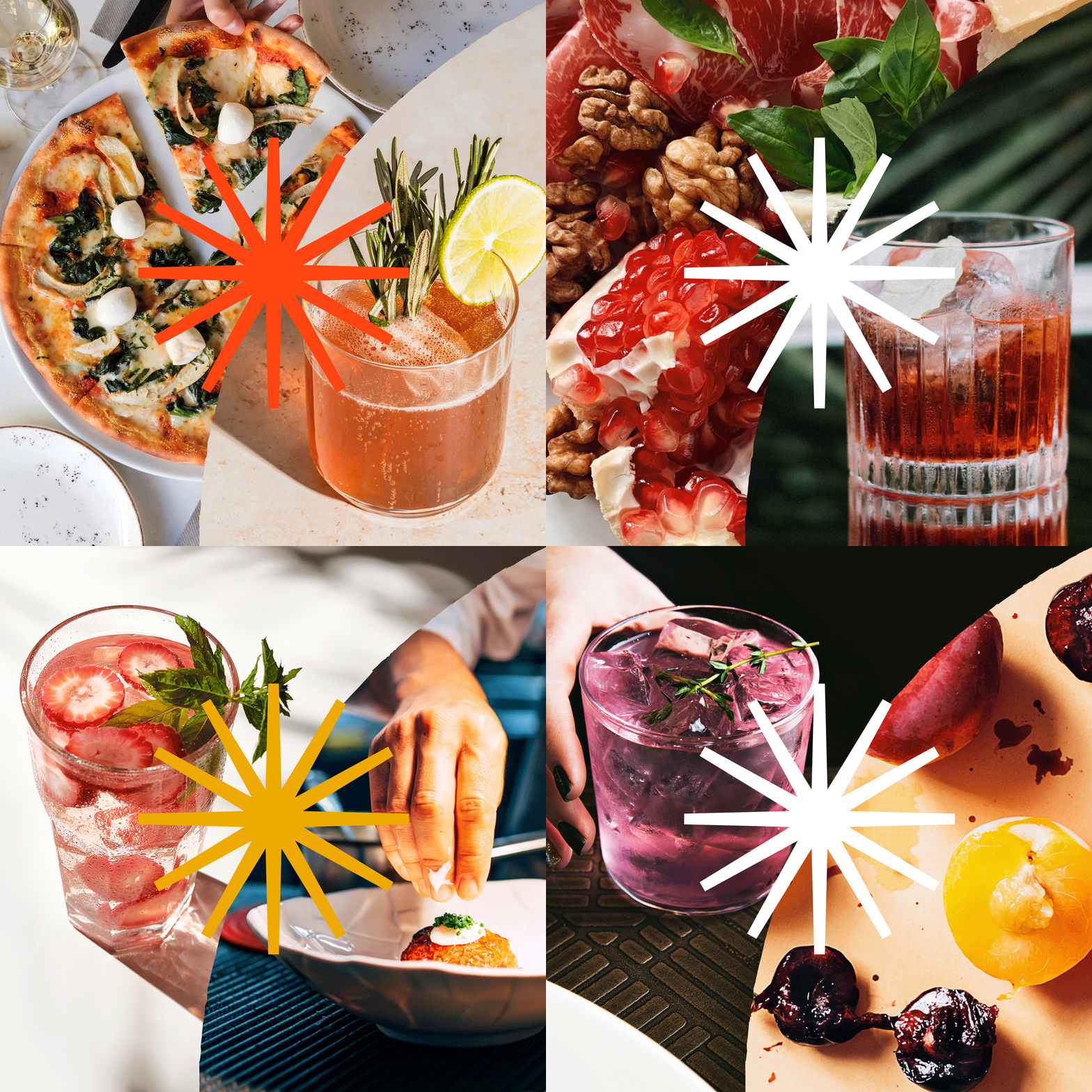
Its symbol, a visual representation of the word “hub” or “focal point,” features the various F&B branches meeting at one central point.
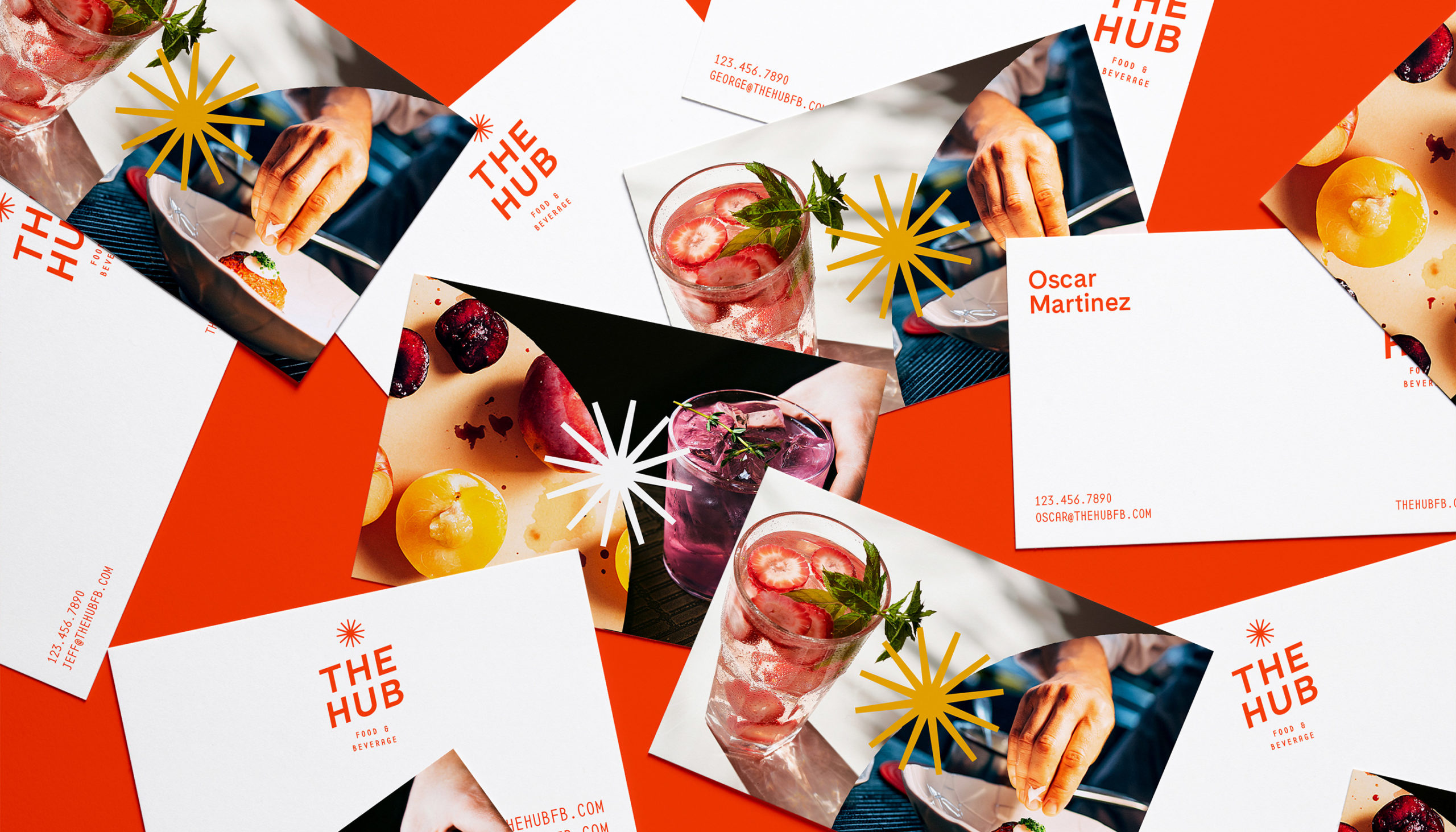
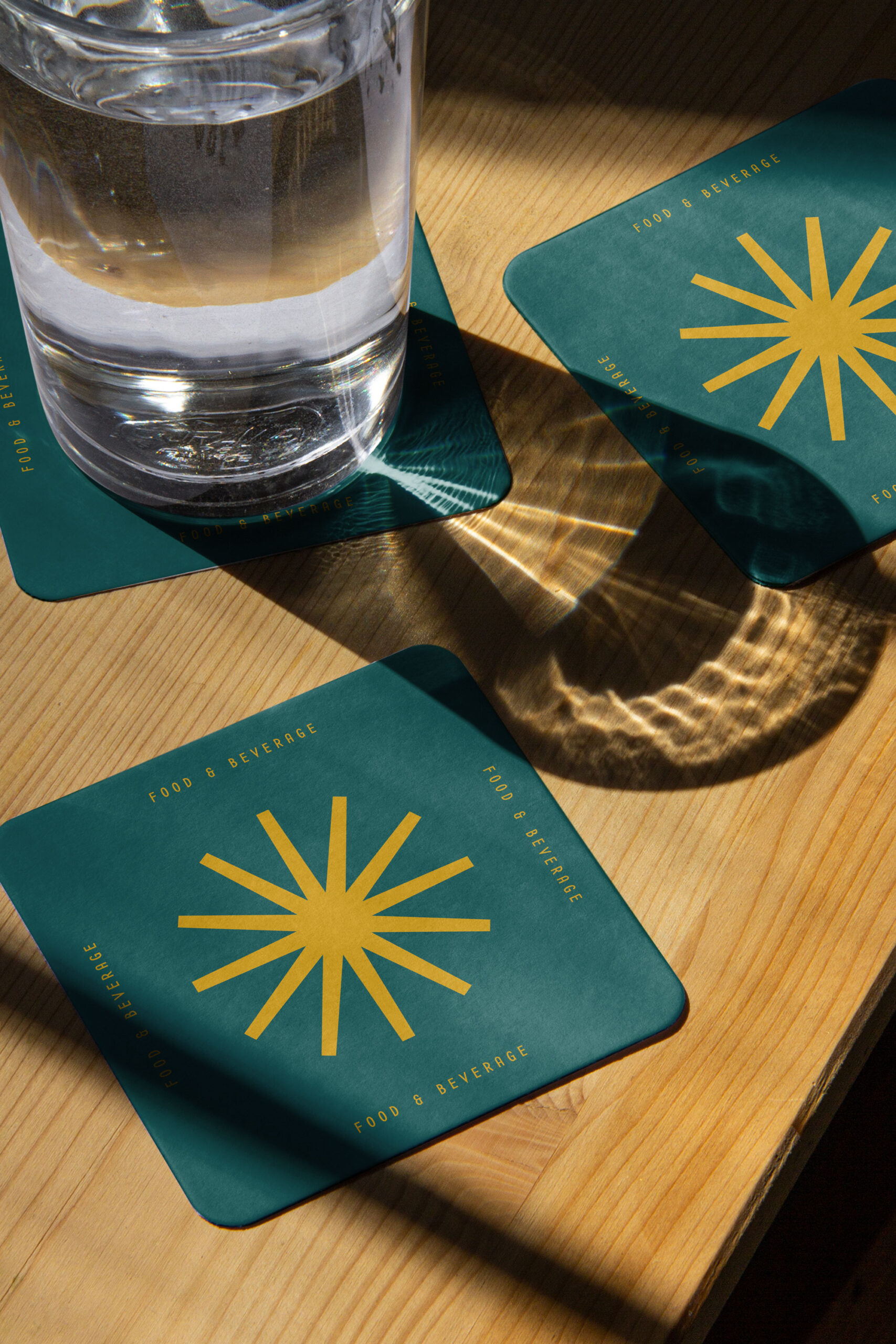
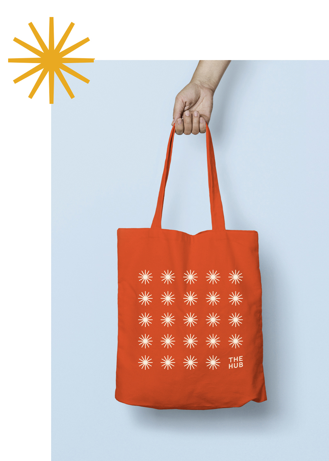
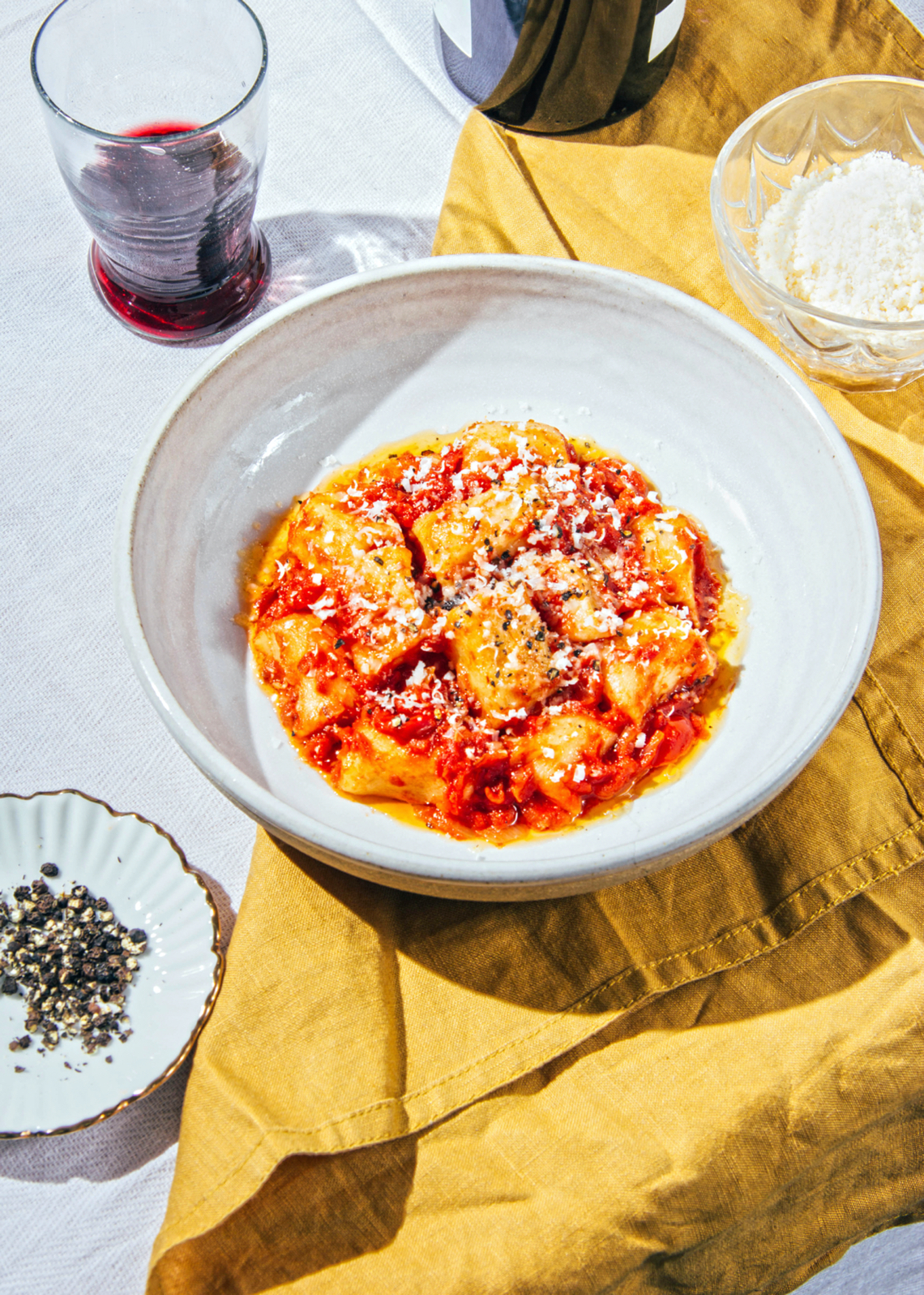
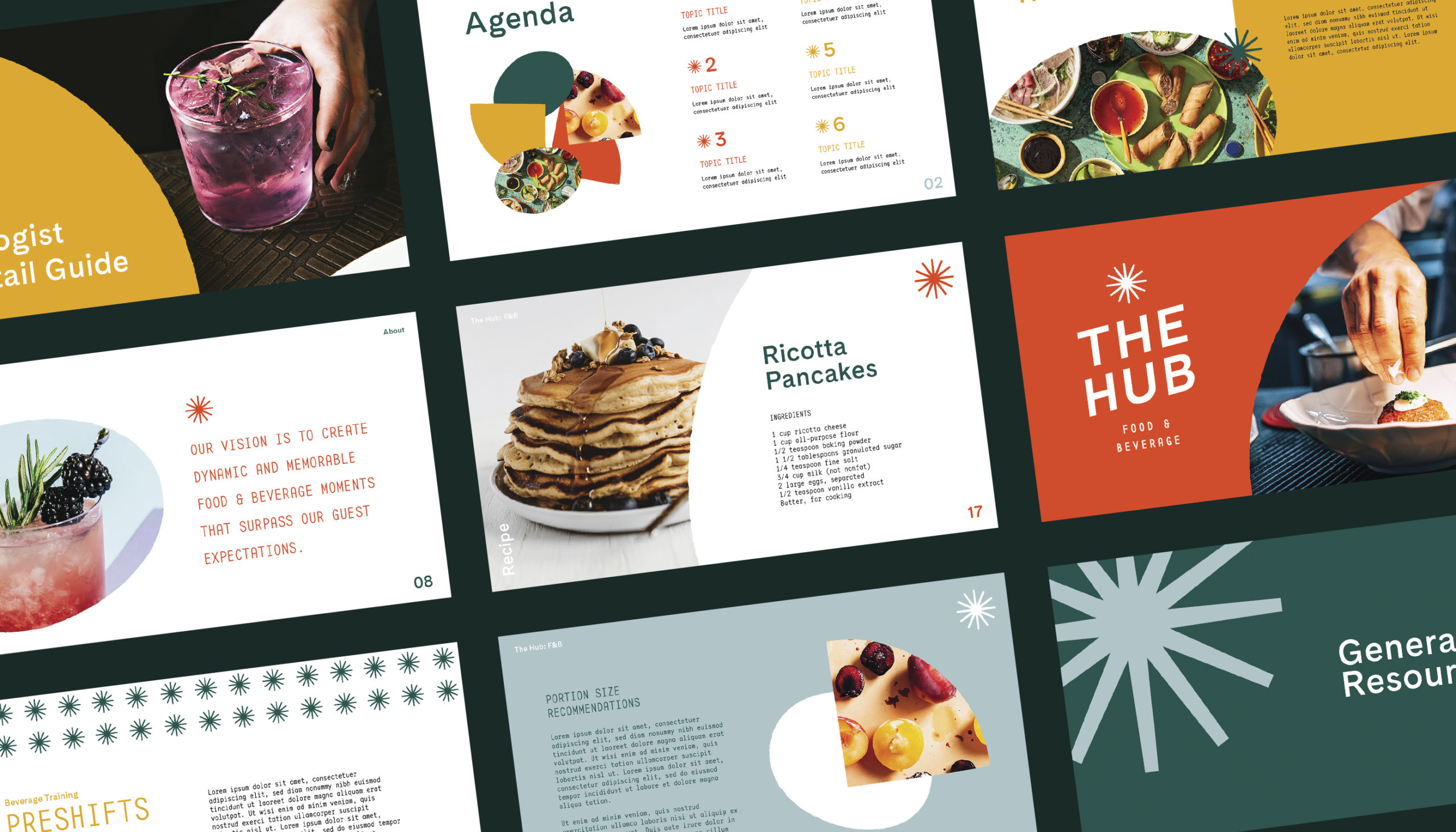
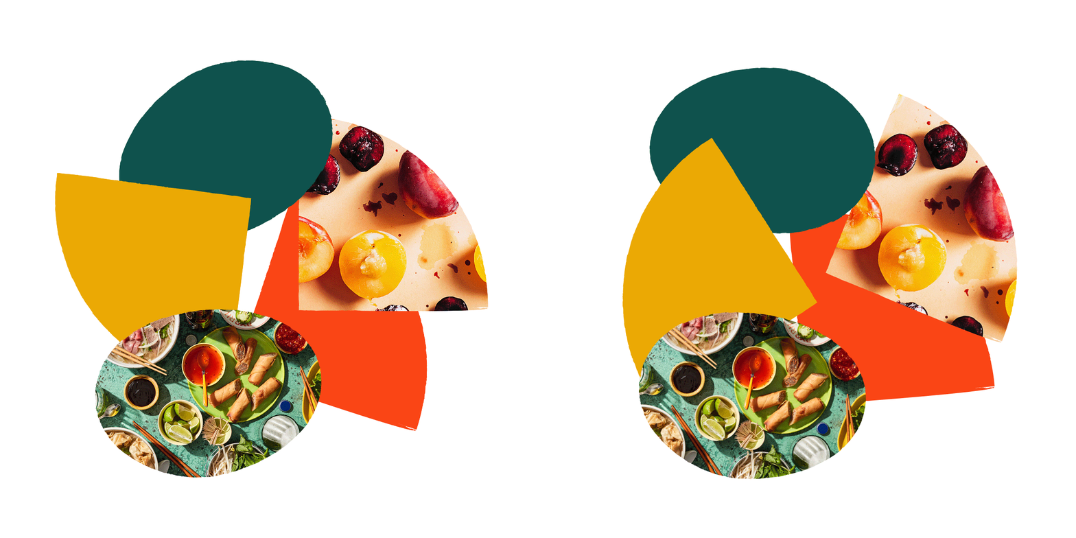
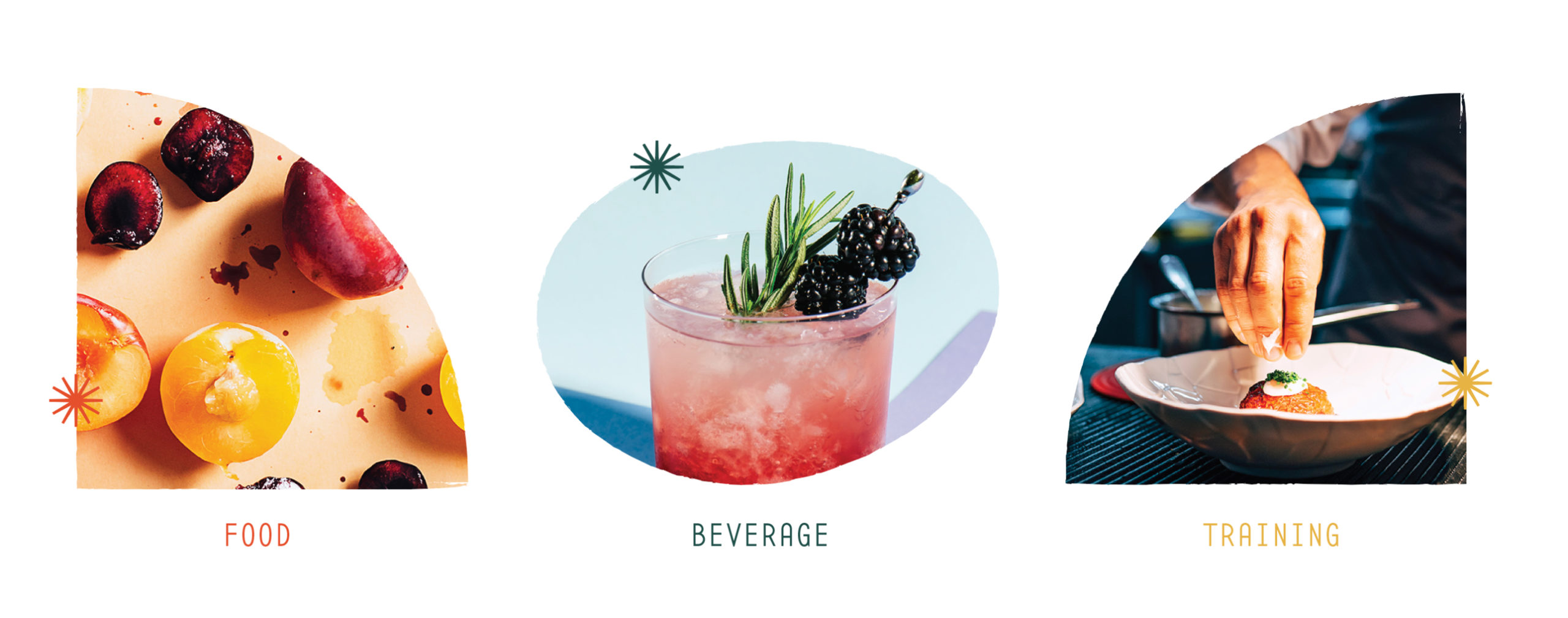
Additionally, we created unique brand shapes inspired by food shapes — like cheese and lemon slices, mangoes, and potatoes — that balance, yet contrast their geometric frame.
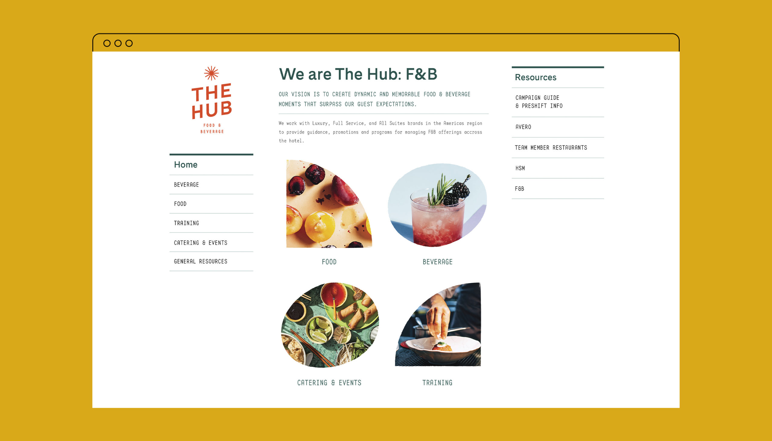
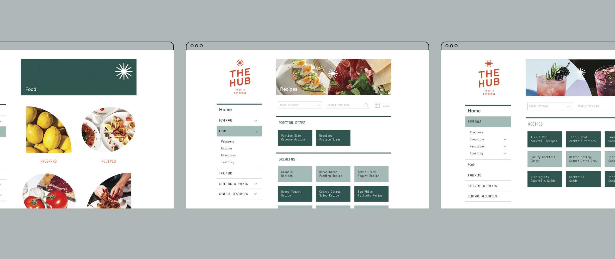
Working within the constraints of a pre-developed template, we also evolved the design of The Hub’s internal sharing platform, using new typography and imagery applications to augment its energy and dynamism.
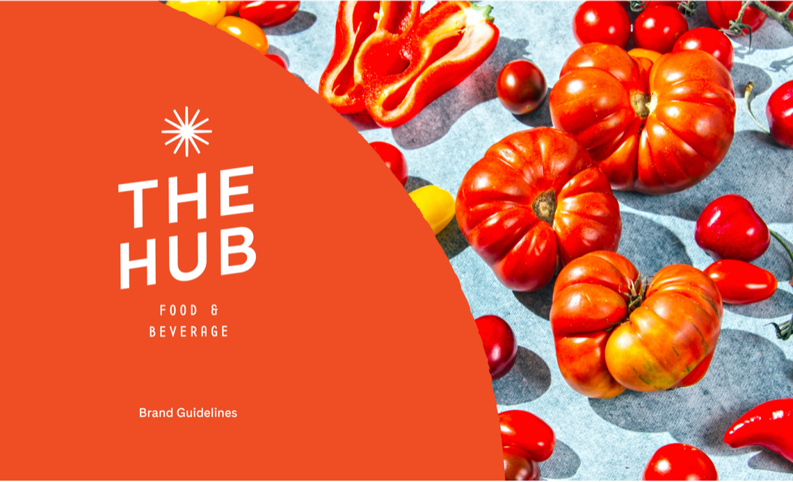
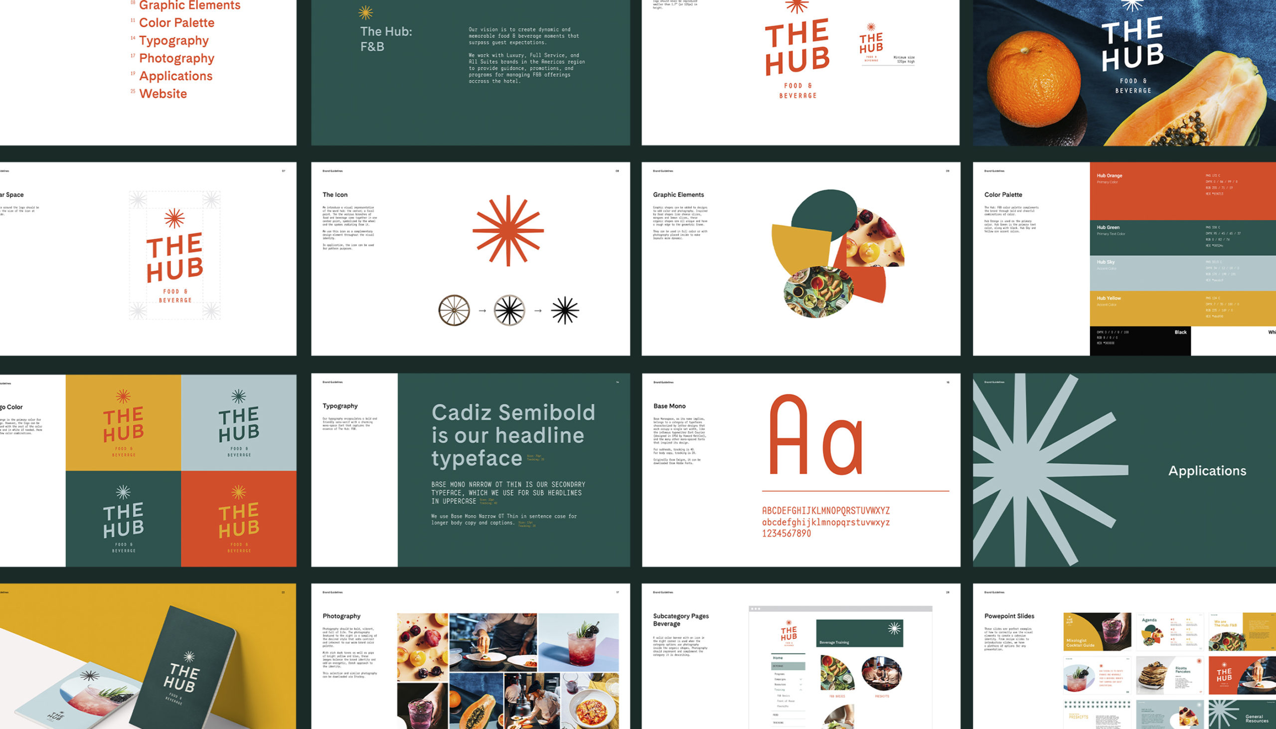
Finally, we collated the assets into a comprehensive brand guide for all internal F&B applications.
Building brands that
defy convention with sophistication.
Stay in touch.
© 2026 MA'AM Creative, LLC | MA'AM is a registered trademark of MA'AM Creative, LLC.